Dundas BI vs. Google Charts

Overview
ProductRatingMost Used ByProduct SummaryStarting Price
Dundas BI
Score 8.9 out of 10
N/A
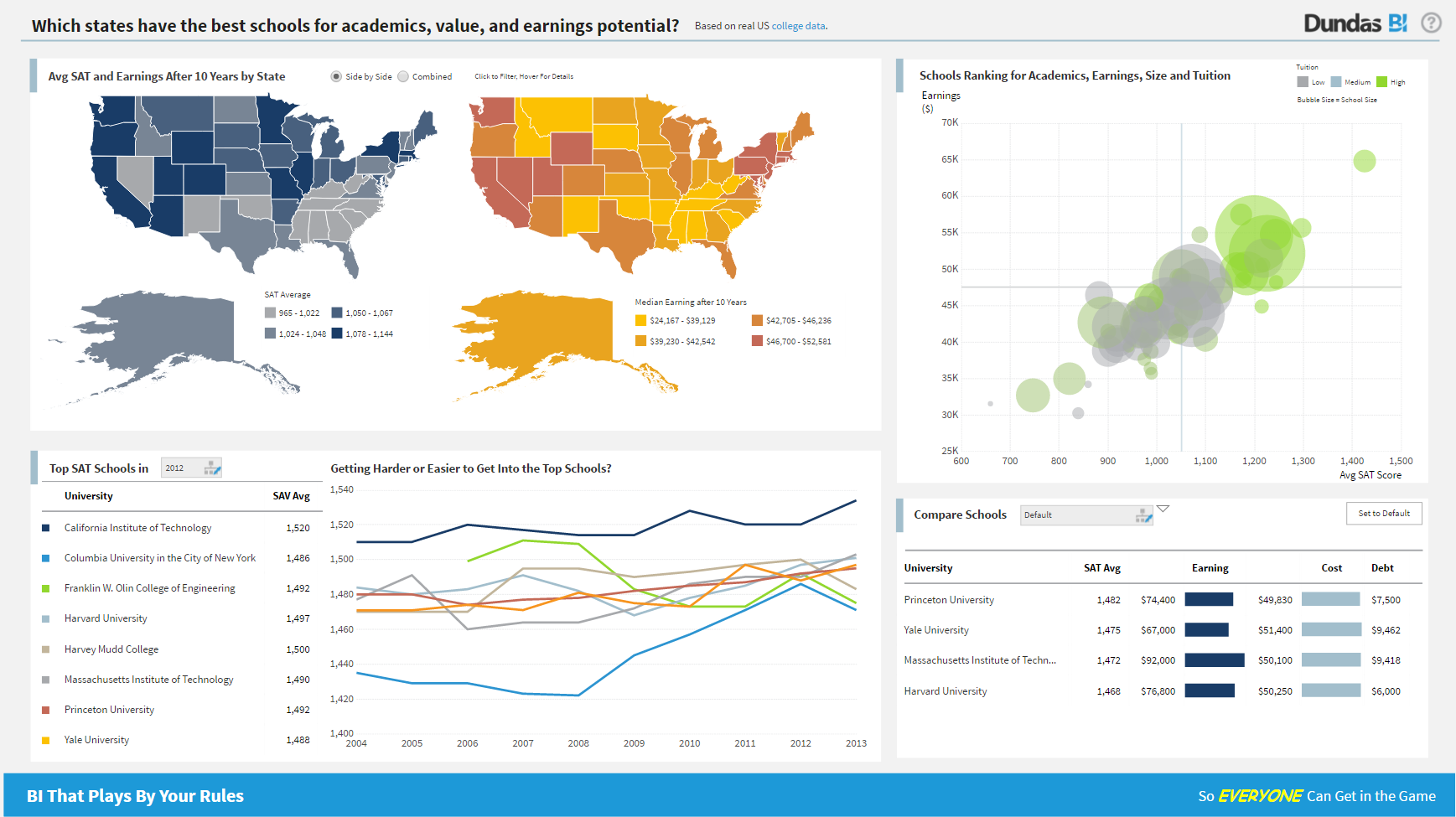
Dundas BI is a business intelligence and data visualization software that includes customizable dashboards, reporting, and visual data analytics. Dundas BI can be integrated into users’ existing business applications and its visualization and reporting tools can be customized to their needs.N/A
Google Charts
Score 8.7 out of 10
N/A
Google Charts provides a way to visualize data on your website - for free. From simple line charts to complex hierarchical tree maps, the chart gallery provides a large number of ready-to-use chart types. The most common way to use Google Charts is with simple JavaScript that you embed in your web page.N/A
Pricing
Dundas BIGoogle Charts
Editions & Modules
No answers on this topic
Offerings
Pricing Offerings
Dundas BIGoogle Charts
Free Trial
YesNo
Free/Freemium Version
NoYes
Premium Consulting/Integration Services
YesNo
Entry-level Setup FeeNo setup feeNo setup fee
Additional Details
More Pricing Information
Community Pulse
Dundas BIGoogle Charts
Top Pros
Top Cons
Features
Dundas BIGoogle Charts
BI Standard Reporting
Comparison of BI Standard Reporting features of Product A and Product B
Dundas BI
8.4
51 Ratings
2% above category average
Google Charts
8.7
50 Ratings
6% above category average
Pixel Perfect reports8.443 Ratings8.145 Ratings
Customizable dashboards8.651 Ratings9.448 Ratings
Report Formatting Templates8.139 Ratings8.744 Ratings
Ad-hoc Reporting
Comparison of Ad-hoc Reporting features of Product A and Product B
Dundas BI
8.1
51 Ratings
0% below category average
Google Charts
9.2
51 Ratings
13% above category average
Drill-down analysis7.951 Ratings8.645 Ratings
Formatting capabilities8.250 Ratings9.451 Ratings
Integration with R or other statistical packages7.633 Ratings9.437 Ratings
Report sharing and collaboration8.645 Ratings9.546 Ratings
Report Output and Scheduling
Comparison of Report Output and Scheduling features of Product A and Product B
Dundas BI
7.9
49 Ratings
6% below category average
Google Charts
9.0
51 Ratings
7% above category average
Publish to Web8.442 Ratings9.549 Ratings
Publish to PDF7.845 Ratings9.546 Ratings
Report Versioning7.838 Ratings8.643 Ratings
Report Delivery Scheduling8.337 Ratings8.637 Ratings
Delivery to Remote Servers7.23 Ratings8.730 Ratings
Data Discovery and Visualization
Comparison of Data Discovery and Visualization features of Product A and Product B
Dundas BI
7.8
49 Ratings
4% below category average
Google Charts
8.8
50 Ratings
9% above category average
Pre-built visualization formats (heatmaps, scatter plots etc.)8.148 Ratings8.949 Ratings
Location Analytics / Geographic Visualization7.941 Ratings8.747 Ratings
Predictive Analytics7.432 Ratings8.739 Ratings
Access Control and Security
Comparison of Access Control and Security features of Product A and Product B
Dundas BI
8.2
49 Ratings
5% below category average
Google Charts
8.8
45 Ratings
2% above category average
Multi-User Support (named login)8.648 Ratings8.844 Ratings
Role-Based Security Model8.045 Ratings8.739 Ratings
Multiple Access Permission Levels (Create, Read, Delete)8.246 Ratings8.841 Ratings
Single Sign-On (SSO)8.25 Ratings8.831 Ratings
Mobile Capabilities
Comparison of Mobile Capabilities features of Product A and Product B
Dundas BI
8.2
45 Ratings
3% above category average
Google Charts
9.0
48 Ratings
12% above category average
Responsive Design for Web Access8.344 Ratings9.546 Ratings
Dashboard / Report / Visualization Interactivity on Mobile8.140 Ratings8.744 Ratings
Mobile Application00 Ratings9.529 Ratings
Application Program Interfaces (APIs) / Embedding
Comparison of Application Program Interfaces (APIs) / Embedding features of Product A and Product B
Dundas BI
7.8
7 Ratings
2% below category average
Google Charts
8.8
40 Ratings
10% above category average
REST API8.25 Ratings8.932 Ratings
Javascript API8.66 Ratings8.839 Ratings
iFrames7.05 Ratings8.826 Ratings
Themeable User Interface (UI)7.76 Ratings8.828 Ratings
Customizable Platform (Open Source)7.52 Ratings8.728 Ratings
Java API00 Ratings8.926 Ratings
Best Alternatives
Dundas BIGoogle Charts
Small Businesses
BrightGauge
BrightGauge
Score 8.9 out of 10
BrightGauge
BrightGauge
Score 8.9 out of 10
Medium-sized Companies
Reveal
Reveal
Score 9.9 out of 10
Reveal
Reveal
Score 9.9 out of 10
Enterprises
TIBCO Jaspersoft Community Edition
Score 9.7 out of 10
TIBCO Jaspersoft Community Edition
Score 9.7 out of 10
All AlternativesView all alternativesView all alternatives
User Ratings
Dundas BIGoogle Charts
Likelihood to Recommend
8.3
(52 ratings)
8.9
(61 ratings)
Likelihood to Renew
7.0
(1 ratings)
7.3
(8 ratings)
Usability
8.0
(6 ratings)
8.9
(33 ratings)
Availability
-
(0 ratings)
10.0
(1 ratings)
Performance
-
(0 ratings)
5.0
(1 ratings)
Support Rating
8.8
(11 ratings)
8.2
(33 ratings)
Online Training
-
(0 ratings)
5.0
(1 ratings)
Implementation Rating
7.3
(1 ratings)
10.0
(1 ratings)
Configurability
-
(0 ratings)
8.0
(1 ratings)
Ease of integration
-
(0 ratings)
10.0
(1 ratings)
Product Scalability
-
(0 ratings)
8.0
(1 ratings)
Vendor post-sale
-
(0 ratings)
10.0
(1 ratings)
Vendor pre-sale
-
(0 ratings)
10.0
(1 ratings)
User Testimonials
Dundas BIGoogle Charts
Likelihood to Recommend
Dundas Data Visualization
For all the scenarios I have so far worked on or I am currently working on, Dundas BI has proved to be more than adequate and apt to handle all of those. It is a very easy-to-use tool with quick shortcuts enabling you to prepare ad-hoc reports or dashboards in a matter of minutes.
Read full review
Google
We can easily recommend Google Charts to any company that needs a way to visually represent their data. Another great thing about Google Charts is that it is free to use and does not require any membership fees. Although it requires a skilled used to be able to use the charts, the results are great and can be beneficial to any company who is looking to make better decisions.
Read full review
Pros
Dundas Data Visualization
  • Project organization from Development to Production, you get a production and development license but I think the best way to do it is with DEV and Prod project in the Production box. Use the development box for testing updates and really crazy things. With the Dev and Prod projects on the same box, you just publish from Dev to Prod and you are done. Users only have access to the Prod projects so no one can mess up what you are working on.
  • Security - If you have a hierarchy (subsidiaries, divisions, department, teams) and you want each group to see only their data, then Security hierarchies are for you!
  • Dependent filters! What's this you ask? Here is an example of how it can be used, in your company you have departments and who works for what department is in your database. You make a dashboard that has a department filter (only show these departments), a managers filter, and employee filter. Not every manager or employee is in multiple departments usually only one. With dependent filters you can say that the manager and employee filter are dependent on what is selected in the departments filter so when you go to filter them they only show the managers or employees that are part of that department, and you can even it do so employees are not only dependent on department but on manager as well. Then it gets even better as it can be done in reverse as well so when you select a manager then go to the department it only shows the departments he works for (there are better situations where this is more useful).
  • It is scriptable! From calculate columns, null replacements, button actions, load actions, hover over events there a way to do what you want.
  • They are constantly improving and listens to your suggestions.
Read full review
Google
  • they're free with Google suite and they have backing in terms of powerful Google apps which can be plugged in to perform multiple actions like using Google sheets to import raw data into Google Charts
  • they're the most simple app to use when it comes to creating charts and visual dashboards
  • ease of customization
  • ease of using custom APIs from developers side to help make any types of charts and dashboards you want
Read full review
Cons
Dundas Data Visualization
  • Not too many cons for how we use the application. It really is easy and powerful. Very powerful.
  • Licensing is one thing that could be looked into. It is simple, but a little confusing. For example, if I get a license today, but a new release comes out tomorrow, it seems that the license doesn't work with the new release. Maybe that is by design, but it would be nice to clearly understand.
Read full review
Google
  • I would like a couple more introductory videos or a live chat option for when you run into an issue. I think this is a Google-wide problem, not only linked to Google Charts.
  • I have run into some issues with the Dynamic Data but also admittedly could potentially dive in deeper and investigate.
  • It would be great if Google Charts made it possible to integrate Google Chat into the platform.
Read full review
Likelihood to Renew
Dundas Data Visualization
No answers on this topic
Google
Google Charts is a good product. It's widely supported with deep documentation and a large community. But for me, it wasn't customizable enough. When we started with simple charts, it was great, but as we got deeper and more complex, our needs outgrew the library. If I was going forward, I would choose a more barebones library with more freedom and extensibility.
Read full review
Usability
Dundas Data Visualization
We are still in the implementation phase, but so far we are finding it to be easy to use and learn. The eLearning courses that they have made available for free, as well as User Forums and other training videos have made even difficult concepts easier to understand.
Read full review
Google
Google Charts is about as easy to use as the rest of their applications. The UI is very well thought out, allowing you to add what you need, and customize it to your exact liking. The default theme is actually really nice, which helps as most of the time, customizing is not needed.
Read full review
Reliability and Availability
Dundas Data Visualization
No answers on this topic
Google
Google charts is always available and provides fast output.
Read full review
Performance
Dundas Data Visualization
No answers on this topic
Google
Connectivity is occasionally very slow.
Read full review
Support Rating
Dundas Data Visualization
We have bi-weekly calls with our Success Manager, as well as access to support as needed. Any question that I have had, multiple people have been willing and able to jump on a call to talk me through it, or send an email with the solution
Read full review
Google
As a free tool with massively powerful, infinitely customisable charts that can be dynamically updated - Google Charts is my favourite data visualisation tool. However, my hatred of JavaScript does jade my view on it. This is the price of the tool though, and I'm glad it's available for me.
Read full review
Online Training
Dundas Data Visualization
No answers on this topic
Google
The online training was solely done through self training on google's guide to charts.
Read full review
Implementation Rating
Dundas Data Visualization
Providing that you have the client's needs well known, creating BI content using Dundas BI is a walk in the park!
Read full review
Google
Easy to implement
Read full review
Alternatives Considered
Dundas Data Visualization
Per dollar spent, it offers the widest range of features of the tools that we evaluated. It offers lots of options for how to configure your environment, though they are not always intuitive to figure out. Having an ETL layer was a must have for us, as well as the ability to host to secure HIPAA compliance. It is not a replacement for ad hoc reporting, but does a great job of creating parameterized reports and dashboards that look great.
Read full review
Google
Google Charts stacks up better since it is free and does not have the constant pressure for cost overruns, add-ons, annual maintenance and implementation services. The speed of using Google Charts is quick, saving users potentially weeks in getting up and going. For the readers of websites with limited resources, the application shows up nicely is look and feel with charts. Great way of showing data visually.
Read full review
Scalability
Dundas Data Visualization
No answers on this topic
Google
Google Charts is essential for quick, easy, reporting. There are opportunities for advanced features.
Read full review
Return on Investment
Dundas Data Visualization
  • Coming from an SQL based standard delivery model, Dundas BI has provided a fantastic rate of ROI.
  • The preparation and delivery time has reduced from weeks to just a few hours.
Read full review
Google
  • teams were easily able to create charts and find out progress on our learning courses and thus take actionable insights to their managers, professors
  • students could also know their progress on various courses from one single view, same for instructors in terms of imparting education
  • sales team could learn which kind of courses sold more to focus more on those areas
Read full review
ScreenShots

Dundas BI Screenshots

Screenshot of Dundas BI Dashboard Sample - EducationScreenshot of Dundas BI Dashboard Sample - Sales Team PerformanceScreenshot of Dundas BI Dahsboard Sample - Sales PerformanceScreenshot of Dundas BI Dashboard Sample - InsuranceScreenshot of Dundas BI Dashboard Sample - EmbeddedScreenshot of Dundas BI Dashboard Sample - Sales and Marketing