Set It Up Right And You Will Be Happy
Use Cases and Deployment Scope
I am a CW PSA/CPQ Consultant and I work with clients all over the world to review, improve and train their systems and people.
Pros
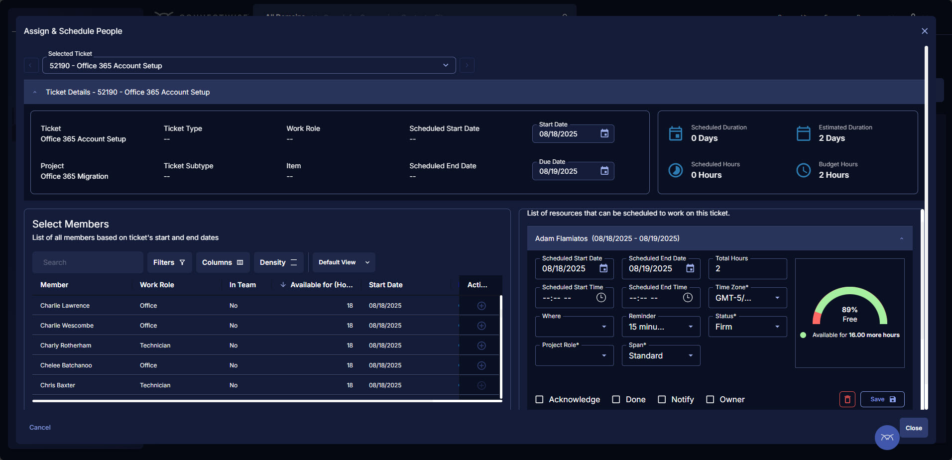
- Time Tracking
- Billing
- Contract Management
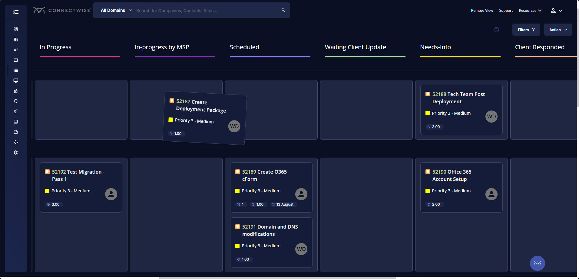
- Ticket Management
Cons
- Notifications
- More all in one package
- Less third party applicaitons
Return on Investment
- improves visibility to our gross profit by agreement
- improves visibility to our gross profit by customer
- improves visibility to utilization of our techs