How to Be Web Accessible 2022
The progress of the modern world increases the power and necessity of the internet with each passing day. Businesses use the internet for commerce, connection to consumers, and spreading information.
Web accessibility evens the playing field for those that would otherwise struggle to use search engines, open social media apps, and buy goods over the internet. Everyone deserves equal access to the same opportunities, and that includes websites on the internet.
What is Web Accessibility?
Website accessibility means that web platforms need to provide alternative solutions so that those with disabilities can use their services. This can be basic things like navigating a website so that they can buy shoes, groceries, or new phones.
One way to do this is by adding alt text to all your images. Those with visual impairments like low vision and color blindness use alt text to interpret what a product is. You can also make your site compatible with keyboards for those with low mobility to use the tab key to navigate pages.
Most importantly, your site should have the functionality to be used with assistive technology. Assistive technology is any tool a disabled person would use to make the web more perceptible and operable. These can be physical devices or software such as braille or browser extensions.
If you are new to web accessibility we have a great article to bring you up to speed. Anyone who is new to digital accessibility should also visit the World Wide Web Consortium, as well as see their web content accessibility guidelines (WCAG).
The W3C also has an introduction video with a very human perspective to teach you about accessibility standards.
Why Does Web Accessibility matter?
One major reason website accessibility matters is that it can be legally enforced. Consumers can report complaints about your site and sue your site for lack of compliance and equality under the Americans with Disabilities Act. To learn more about the legal responsibilities around virtual accessibility, see our article about accessibility laws.
Another important reason for inclusive design for disabled consumers is that the practice is simply good business and great for your reputation. On the flip side, the opposite is quite toxic to brand image.
This all may seem confusing, and the idea of being accessible might seem like an impossible task. It’s actually intuitive and very interesting to learn. One thing that will help is to have examples of accessible sites.
What Does An Accessible Website Look Like?
Appearance and usability are important parts of a website. Sometimes websites with boring and unattractive designs will be compatible with assistive technology. This can mean having alt text, closed captions, and keyboard shortcuts.
A boring design would be much less accessible to neurodivergent people that have trouble focusing because of the dull design, and bland color schemes. On that note, it’s unlikely that it would be a reason for any ADA complaint. Most complaints tend to be when the site relies too much on visual interpretation, like color coding for important information. This would be a big handicap for those with color blindness.
The ideal website has both an engaging use of color and responsive design and accessible code. Accessible code means it is compatible with browser extensions and technologies for disabled persons.
It’s easier to make appearance choices for accessibility, but it still requires thought and care put into the design. There should be repetition of certain elements, distinct colors, and very obvious, well placed navigation. Below, we look at examples of good and bad web design and discuss the good and bad choices made in each one.
Examples of Bad Web Accessibility
A bad website could be beautiful in appearance and still be completely inaccessible. These sites are only judging based on design appearances on what counts as a bad website right now. They were not tested on their compatibility with alternative navigation options. We do have a video in this article if you are very interested to see how that works.
The first website we’re looking at is going to be a shocker. The actual ADA website run by the US Justice Department is not user-friendly. It belongs in a virtual museum for “90s Monstrosities.” In their defense, they do have a more modern beta site which we discuss in the next section.
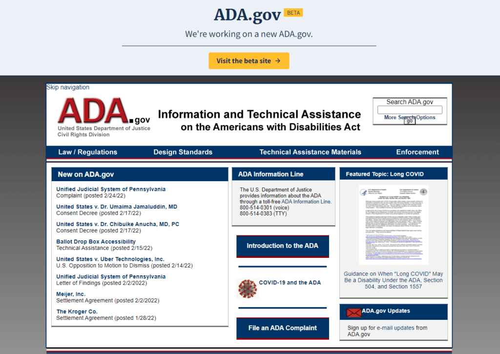
What could be wrong with this website’s appearance? It has blue and white, which is a good color contrast. It uses images and has colored text for links. The navigation is at the top which is standard, and the search bar is clearly labeled.
The problem is the design structure and colors are hideous and hard to look at. Red, white, and blue may be patriotic colors, but the highlighted red hurts the eyes. Their overall structure is crowded and unengaging. The search bar isn’t properly formatted because the elements are literally hitting each other, which is never supposed to happen.
Websites that do not have a responsive design (for mobile and tablet size screens), will often have text floating over navigation and button elements. Text should never float over other text on a website because even those with normal vision will struggle to read it.
The site has information and links, but crams them on a small page. The page is small because they added a shadow gray border around the entire site. This is a very, very outdated design. It’s no wonder why this site is being retired. You will see at the top of the image a link to their beta site they are currently improving on.
Another example of a “bad” website is a popular and useful one for web devs to find jobs. This example of color schemes and structure is, well, horrifying. If you’re photosensitive, and struggle looking at very bright colors, it may help to turn down the brightness of your screen so you can look at it. If you have color blindness or undertone color blindness, we also recommend muting the colors by turning down screen brightness.
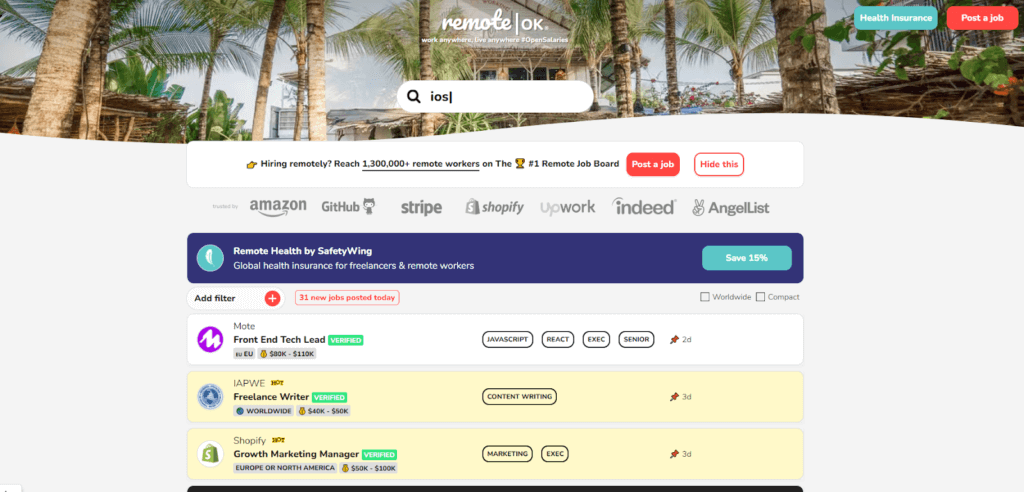
Remote Ok is technically a public site, but it’s more exclusive in it’s users so the general public wouldn’t be on it. Writers, graphics designers, and developers use this site to find remote, usually tech-related jobs.
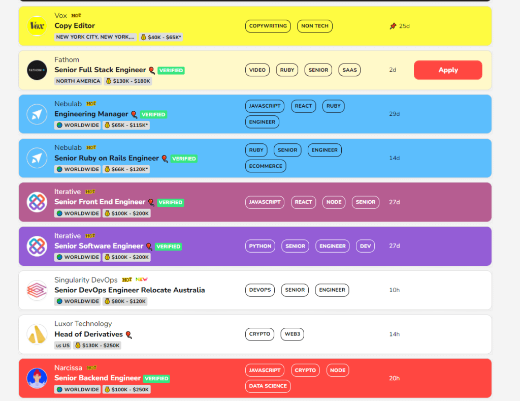
There is a long list of what is wrong with this site, but let’s start with the worst part. It’s overstimulating, especially for neurodivergent individuals. Someone on the Autism spectrum could struggle with the very bright colors and dancing emojis. All the emojis you see in the image wiggle and change color. This is overstimulating and could even cause distress.
Photosensitive individuals and those with color blindness can also struggle with this. Undertone color blindness would have an especially bad response because the colors would bleed into each other and the changing colors would cause a headache.
Your website should never have no more than three colors, but this one uses a rainbow. It utilizes color codes and emojis to indicate important information about the different jobs. This is bad practice to anyone who is color blind and would miss that importance. This is also a fantastic example of, if you highlight everything, you may as well highlight nothing.
The constant changing of text and background colors for different jobs is confusing and hard to understand. Websites need repetition to make their colors and navigation easier to comprehend.
In Remote OK’s defense, web devs aren’t trying to exclude anyone and the website is meant to be fun. Job boards can be very dull and painful to sift through. Remote Ok’s stimulating features can be very engaging to neurotypicals and some neurodivergent.
They also added descriptive titles to the emojis, and they have responsive buttons that change color based on the background. These efforts are important but they don’t fix the problem.
The site still belongs in a ditch with 4Chan and MySpace. The brightness and moving parts are problematic. There’s also a weird bug where it forces you to go back to the jobs instead of looking at the bottom navigation, which is hideous.
It’s as if it didn’t occur to the designer that other web devs can be neurodivergent, color blind, and photosensitive. The site also has non tech jobs as well so it is not that exclusive and still is a public platform.
If you want to learn more about the different disabilities that need web accessibility see our article defining accessibility. There you will find plenty of information to learn about how important the concept is.
Examples of Good Web Accessibility
A good website design has 2-3 colors, repetitions of links, buttons, and other elements, and groups of similar elements so they can be found. The color schemes need contrast so the text and background are easy to differentiate.
The ADA beta website definitely redeems itself. No more harsh reds, but it did keep navy blue which is an important color on standard US government sites. It uses a header with a high-quality image to engage users. The web page is not oversaturated with text or dull color use, and there’s an updated search bar.
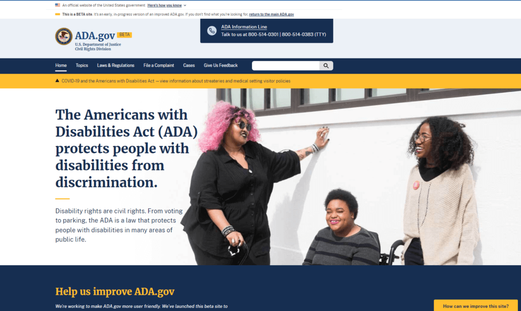
The site also encourages users to send feedback on their new site which is really important for growth and image. If your site encourages users to report issues with accessibility they may not take it a step further and make an ADA complaint. Especially if you do address the issue, and let them know.
This site redesign really shows the importance of updating your site every 2-3 years to stay modern and up to date with new trends and technologies.
If managing your site seems daunting there are tools out there that can really help you. It’s very important that you choose that software carefully.
Web Accessibility and ADA Compliance Software
It’s completely understandable if you can’t or don’t feel comfortable ensuring your site is accessible by yourself. This is an ongoing task that requires vigilance and attention to updates as they come out.
Following web accessibility content guidelines so you can both expand your consumer reach and also not get sued is a full-time job. They’re usually called web accessibility consultants or developers.
They tend to work for companies that offer accessibility as a service. You can also hire them as freelancers. Their rates are different for each person.
Many of these organizations can offer significant resources. They can help your site meet accessibility requirements. The W3C themselves have a super extensive list of web accessibility evaluation tools.
Any tools on the list are checkers, validators, or testing services for you to make sure your site meets current standards. An AI program should never replace an actual person checking your code, but can be a good helping hand.
There are two types of accessibility tool optons. A tool to be used by a person or a tool to be used in place of a person. Any tool that isn’t regulated by an actual human will run you into problems worse than not checking for accessibility at all.
What can go wrong if you use an AI program, code template, or widget instead of updating your code? Adding code or programs without integrating them into your site can cause serious bugs. Bugs can make your site inaccessible and incompatible with assistive technologies.
Slapping in random strings of code is like mashing together the writing of George R.R. Martin, Shel Silversteen, and John Green. It’s not going to work and no one is going to like the result.
A company paid for an AI program instead of paying someone to ensure their code was compatible with assistive technology. The AI made the site less accessible than it would have been without it.
The company that built the AI offers claims they can make digital platforms fully accessible with a single line of code. TrustRadius won’t be shaming any specific companies, but you will find the name of the companies involved in this article.
Other good reasons to use a person to check your code:
- Your underlying code may not be accessible so adding templates and widgets that are “compatible” with assistive technologies won’t fix the real issue.
- An automated AI can flag errors that aren’t really errors, and “fix” them without human judgment.
- AI can make very strange mistakes while unchecked.

We are not saying that you cannot use AI, code templates, or add widgets or plugins to your website. You should be wary of any service that claims they can completely automate the process of ensuring your site is accessible. This falls into the category of “too good to be true”.
A new code template can improve your site greatly if properly integrated. An AI program can certainly make usability testing so much easier. You should 100% streamline this process with tools or software, but you can’t replace a human being.
The W3C definitely recommends using evaluation tools and services to improve your site. They have a great guide for how to figure out what software or platforms you need.
Below is a video from a UX designer that works for the product design and marketing agency ExpandTheRoom. The video is an in-depth tutorial of site audit of their navigation using a keyboard as well as screen reader. This is a super helpful way to actually see what disabled users need to do to operate your site.
What Should You Do to Be Web Accessible?
Anyone who is new to the concept of web accessibility needs to learn and continue to learn about standards and new guidelines. We have here a web accessibility checklist to get you started on the right track. If you read our accessibility laws article, then it will look very similar.
Adopt A Person First Mentality And Educate Yourself And Your Team
The W3C is the best place to start and has accumulated a ridiculous amount of resources to help create accessible websites. There you will find the latest guidelines including WCAG 2.0, WCAG 2.1, WCAG 2.2, WCAG 3.0.
Create Best Practices for Yourself or Your Team to Follow
These policies can be for a number of things like general website accessibility, text, videos, and audio, as well as color schemes. It can also include sensitivity training if you have a bigger team. This way you can ensure social media posts are thoughtful both meaning and presentation wise.
Form A Review System
The bigger the team, the harder it is to enforce policies. If someone’s job is to actually check to make sure you are keeping up with general accessibility then you’re a great step in the right direction.
Add A Sitemap to Your Website
A sitemap is a file or web page on your website that lists all of the content and pages. This way if someone wants to navigate faster without sifting through pages, it’s a lot easier.
Sitemaps are also great for attracting Google’s web crawlers. Web crawlers allow the search engine to find relevant sites for search queries. The use of a sitemap will make your platform more transparent both to people and search engines.
Add An Accessibility Statement Page to Your Website
An accessibility statement is a web page stating your commitment to user experience and then lists all the aspects on the site that were made accessible and compatible with technology.
This is super important for someone that isn’t sure how they can improve their experience on your website. Most Accessibility pages are found in the bottom navigation and you should keep that continuity by keeping yours in the footer navigation.
The Job Accommodation Network of the Office of Disability Employment Policy has a great accessibility statement you can emulate. Essential Accessibility also has a great accessibility statement that’s even more detailed about their compliance and compatible formats.
Add A Suggestion Form for People to Submit Feedback On Your Website
A suggestion form to improve your site can make people feel like you are eager to update your site to be more user-friendly. This can help you avoid receiving ADA complaints. You can add the link to the footer navigation as well as to your accessibility statement.
Sensitivity training for handling complaints will also be helpful for avoiding lawsuits. People want to feel like people, so it is important your teams communicate with them on a personable and empathetic level.
Look At Other Accessible Websites And Their Choices
New modern and usability tested designs are a fast-paced trend in web design. There’s always updates or new creative ways to style websites. We compiled amazing articles that list new ways to format and design elements on your site.
Convince & Convert provides a list of websites that go the extra mile to be accessible with simple but meaningful responsive design changes depending on a user’s need.
The tech giant HubSpot has a list of websites with inspirational use of accessibility. In general, HubSpot’s blog is a great resource for all sorts of web consumer and eCommerce needs.
DBS Interactive explores different features to give your site accessibility. They are a digital agency with a great blog for development, design, SEO, and web accessibility topics.
Web host platform DreamHost lists websites with next level web accessibility including Paralympic.org, and Scope, a charity that strives for equality. DreamHost also has a great blog for web platform tips and improvements you can make.
Go for Web Conformance
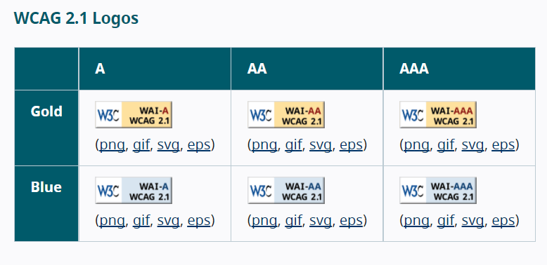
Go for gold and make your site so accessible you have a conformance logo. No, this is not required and you don’t need to do this nor does it protect you or make you immune to future lawsuits. In fact, you should never add a conformance logo unless you actually achieved that level of conformance.
Conformance refers to the level of accessibility requirements in the WCAG you have achieved. There is Level A Conformance which is the bare minimum, Level AA Conformance and Level AAA Conformance. An audio description would be a Level A, closed captions would be Level AA, and sign language would be Level AAA.
Anyone can add the code for a Conformance Logo from the W3C, but when you add this it needs to actually be the level you say it is or the resulting lawsuit won’t be pretty. This is why it’s a little bit rare to see the actual conformance logo.
Use Accessibility Tools But With Caution
ADA compliance checkers, web accessibility checkers, contrast checkers, and similar tools can help you make your site accessible. It’s very important to not let the appeal of any AI program replace using someone trained to test your site’s usability.
Learn Techniques to Make Your Website Accessible
The unfortunate reality is that not all startups or individuals running their eCommerce platforms can afford hiring another person or a freelancer. We do highly recommend working with someone when your budget allows for it, but you can learn the skills to upgrade your site.
There are also free tools for usability and accessibility testing out there. We go into different software you can use in our accessibility tools article. We talk about using website builders and staying accessible in the next section.
Hire Someone
This is an option a lot of small businesses or teams want to avoid, but it’s incredibly important to ensure the code of your website is accessible.
A front end developer, UX designer, and web designers with specific expertise in following in WCAG and coding tested and responsive websites.
Web design and development is a field that’s centered entirely around building the best websites and content for the virtual world. Consulting with a front end developer will help you diagnose and avoid issues in your web platform.
Resources for Non-developers
Web accessibility standards can be followed by non web developers who use website builders for their ecommerce platforms, blogs, or other virtual content.
It’s very helpful to have a front-end developer that’s experienced make sure your site is designed properly, but if there’s no room in the budget you just need to educate yourself on WCAG, and the accessibility features of your chosen website builder.
Website Builders and Accessibility
The appeal of WordPress is it’s a website builder, but not every theme and plugin is optimized for digital accessibility. WordPress, the open-source software project hosted by WordPress.org, aims for Level AA Conformance with WCAG 2.0.
This does not mean every theme for WordPress was created to that standard because separate companies make their own themes. WordPress does not have the power to force separate enterprises to make web accessible themes for a software they’ve made open source.
WordPress mitigates this accessibility issue by offering a list of themes they personally approve of for compliance. You should research your theme first rather than immediately jump to designing because you won’t know which themes are compliant.
WordPress.com is a platform that offers WordPress software as a service, and also has an accessibility-ready themes page. The website Deque also has an article about resources for making and finding accessible themes with WordPress.
If you prefer Wix they have resources for creating accessible websites with their web builder. For those that use other kinds of website builders just make sure to research what they offer for accessibility and contact support teams if you have any questions.
Resources for New Developer Teams
If you’re a new web dev that’s ready to learn about web accessibility, go ahead and jump to the W3C and read all versions of WCAG available. It’s like reading a thousand e-textbooks so maybe break up learning with some helpful tutorials.
We have some particularly fun and interesting video content you can use to get started.
This video is an ARIA HTML tutorial through the channel DesignCourse. You’ll learn a bit about ARIA and accessibility testing and coding.
This tutorial goes into using FireFox’s amazing Accessibility Inspector for color contrast testing.
This video is from Google Chrome Developers and shows you how to conduct usability and accessibility testing. The series is called A11ycasts and is centered around teaching developers accessibility skills.
Even More Resources!
TrustRadius has lists of some amazing products developers and teams can use for usability and accessibility testing. There you will find tools that help you comply with standards and also comprehend the reasoning behind user actions.
A Quick Recap
This list includes materials and websites mentioned in this article as well as other sources to help you understand the ADA and Web Accessibility.
- The World Wide Web Consortium, better known as the W3C offers an amazing introduction to web accessibility, as well as resources to meet accessibility requirements like evaluation tools and conformance. The W3C is the perfect starting and ending point for your research, you will find WCAG 2.0, WCAG 2.1, WCAG 2.2, and even WCAG 3.0 on their site.
- Make sure to go through the ADA.gov site hosted by the Department of Justice.
- For examples of what accessible design actually looks like, see DBS Interactive, HubSpot, DreamHost, and Convince & Convert’s lists.
- If you want to see examples of accessibility lawsuits as well as more reading on how to be accessible, see Essential Accessibilities’ article here.
- Although many don’t consider Wikipedia to be a ‘credible’ source it’s still an amazing and diverse starting point to learn the history behind a topic. It’s worth a quick skim for more background information on the ADA.
- WAI-ARIA is the Web Accessibility Initiative’s Accessible Rich Internet Applications. This is an in-depth guide for creating web content and web applications with inclusive design in mind. You can view the guide here. You will find information about connecting user agents to assistive technologies through APIs.
- WebAIM offers enlightening resources for accessibility, and you can find their quick references here.
Index: Key Terms and Concepts
We know that not all terms in this article will be familiar to everyone, so we have included a list of common and important terms to know.
W3C
The World Wide Web Consortium is one of the important resources for development and international standards for the internet. They comprise a series of organizations that innovate progress and inclusivity for the world wide web.
User Agent
The user agent is a web application you use to retrieve information, like web browsers. User agents are designed with functions to present content in better ways for those with different limitations, such as reading text and accepting speech commands. User agents are also designed to work with assistive technology like screen readers and magnifiers.
Web Design and UX/UI Design
Web Design is the practice of making all kinds of web content. It encompasses graphic design, web developments, and server-side and client-side coding skills.
User Experience and User Interface design is centered around the practice of using graphic design, web design and development to make websites and application structures ready for end users. It’s also used for physical product and mobile app design as well. The core concept is making sure designs are easy to understand and use.
H3 Alternative Text or Alt Text
Alternative text is the description put into alt tags for images and media. This text is used with screen readers to tell those with vision impairments what the image is of. If images are decorative they don’t normally require alt text but it’s good practice to add at least a one-word description.
Was this helpful?
Looking to learn more about what web accessibility is? Click here for our piece on “What is Web Accessibility?”
