TrustRadius: an HG Insights company

Predicte.com vs. Toplyne.io, discontinued

Save this comparison

Save this comparison

Add Product

Recommended Comparisons

    Overview
    ProductRatingMost Used ByProduct SummaryStarting Price

    Predicte.com

    N/A
    Small Businesses (1-50 employees)
    Predicte offers real-time predicive insights from product, sales, and client data. By unifying disparate data sources within its Data Platform (Analytics), Predicte empowers distributors, wholesalers and manufacturers to forecast sales with greater accuracy, detect churn risks before they escalate, and deliver tailored recommendations. The platform’s analytics framework helps teams optimize product usage, enhance sales performance, and continuously improve client outcomes through its…N/A

    Toplyne.io, discontinued

    Score10 out of 10
    N/AToplyne was an AI workspace designed to help you teach agents to automate marketing jobs. The product has been discontinued, and is no longer sold.N/A
    Pricing
    Predicte.comToplyne.io, discontinued
    Editions & Modules
    No answers on this topic
    No answers on this topic
    Offerings
    Pricing Offerings
    Predicte.comToplyne.io, discontinued
    Free Trial
    NoNo
    Free/Freemium Version
    NoNo
    Premium Consulting/Integration Services
    NoNo
    Entry-level Setup FeeRequiredNo setup fee
    Additional Details——
    More Pricing Information
    User Ratings
    Predicte.comToplyne.io, discontinued
    Likelihood to Recommend
    -
    (0 ratings)
    10.0
    (1 ratings)
    Usability
    -
    (0 ratings)
    10.0
    (1 ratings)
    User Testimonials
    Predicte.comToplyne.io, discontinued
    Likelihood to Recommend
    Predicte.com
    No answers on this topic
    Discontinued Products
    Customer retention has taken a massive leap leading to spend analysis Ad campaigns have been streamlined for better efficiency and effectiveness. Are able to focus on target customers and audience
    Incentivized
    Read full review
    Pros
    Predicte.com
    No answers on this topic
    Discontinued Products
    • Ease of implementation and Ease of Use
    • Ease of Integration and Features
    • Budget efficiency
    • Customer retention
    Incentivized
    Read full review
    Usability
    Predicte.com
    No answers on this topic
    Discontinued Products
    Ease of use and implementation
    Incentivized
    Read full review
    Alternatives Considered
    Predicte.com
    No answers on this topic
    Discontinued Products
    Easier use and implementation Better data analysis
    Incentivized
    Read full review
    Return on Investment
    Predicte.com
    No answers on this topic
    Discontinued Products
    • High return on investment
    • Positive ad spends and analysis
    • Effective campaigns
    • Retention of target customers
    Incentivized
    Read full review
    ScreenShots

    Predicte.com Screenshots

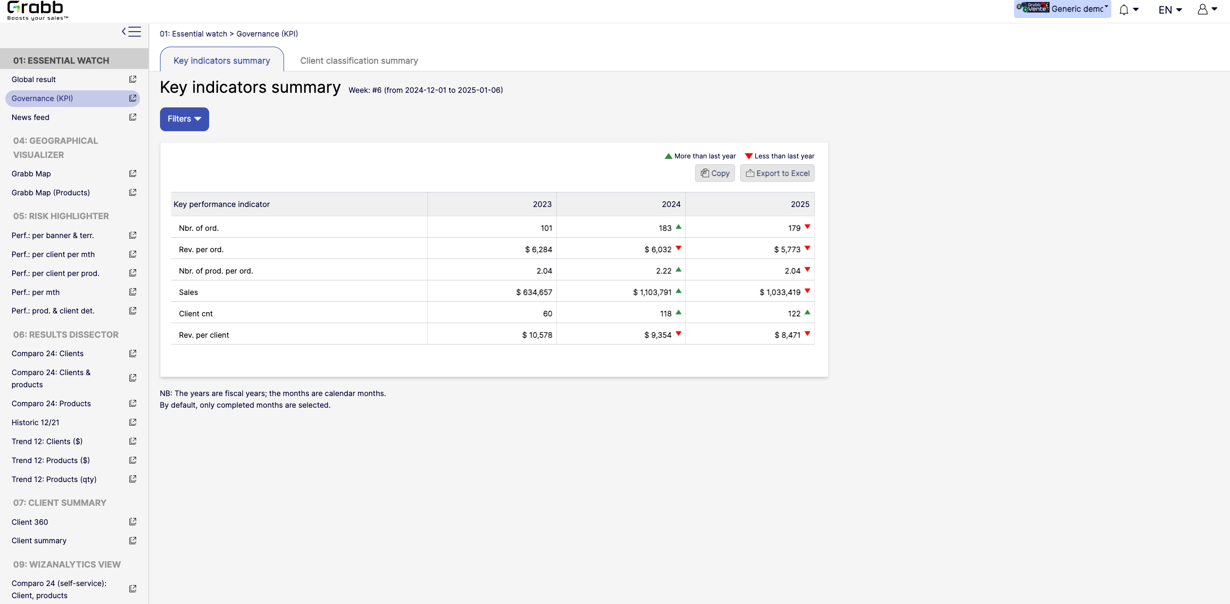
    Screenshot of the dashboard for executives and managers, with various performance metrics:

High‐Level KPIs: Summarizes top metrics (e.g., total sales, revenue per client, average products per order) all in one table, making it easier to spot whether the company is trending up or down.
Year‐to‐Year Comparison: Displays data for each fiscal year, with green/red arrows to show improvement or decline since the previous year.
Immediate Visibility of Trends: Simplifies strategic decision‐making by illustrating whether overall performance is improving or if corrective measures are needed.
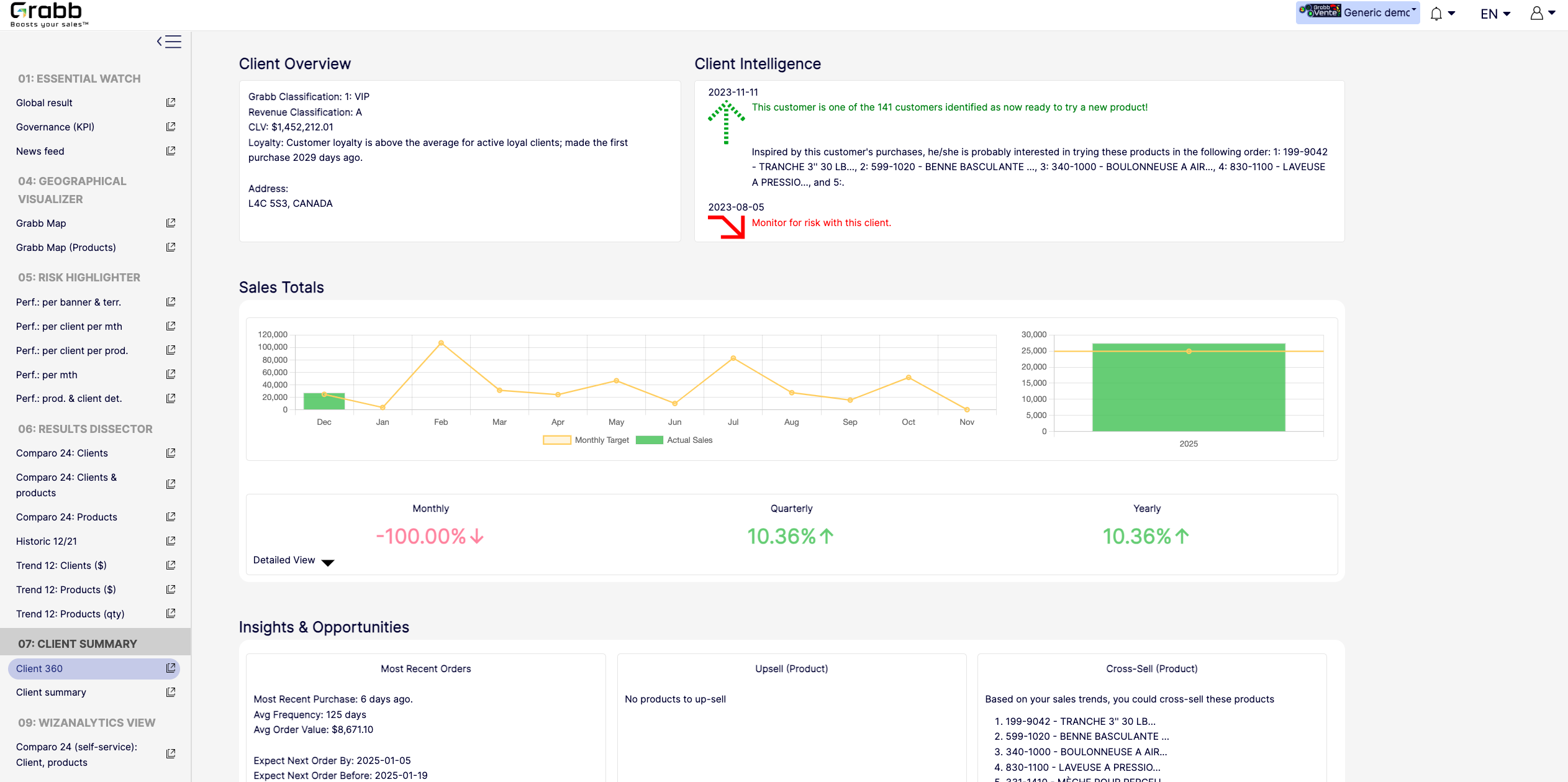
It’s a quick, executive‐friendly scoreboard of the organization’s health, ensuring leaders have the clarity to plan next steps.Screenshot of an at‐a‐glance understanding of a single client’s status, loyalty level, buying behavior, and next best actions that includes data about up‐selling, cross‐selling, and churn risk is often siloed or not immediately visible. This provides:

A Centralized Client Snapshot: Shows the client’s classification (e.g., VIP), revenue category, and CLV, ensuring everyone quickly sees the client’s overall value.
Predictive Intelligence: Highlights whether the client is “ready to try a new product,” or if there’s any “monitor for risk” alert, taking the guesswork out of deciding the next sales move.
Sales Trend & Graphs: Displays monthly, quarterly, and yearly sales to pinpoint performance patterns and quickly identify dips/spikes.
Upsell/Cross‐Sell Suggestions: Automatically suggests which products the client is most likely to buy next, helping reps act on potential revenue opportunities immediately.
Insights & Opportunities: Offers quick reference points such as “Most Recent Purchase,” average order value, frequency, and predicted next order date so you can plan proactive outreach.
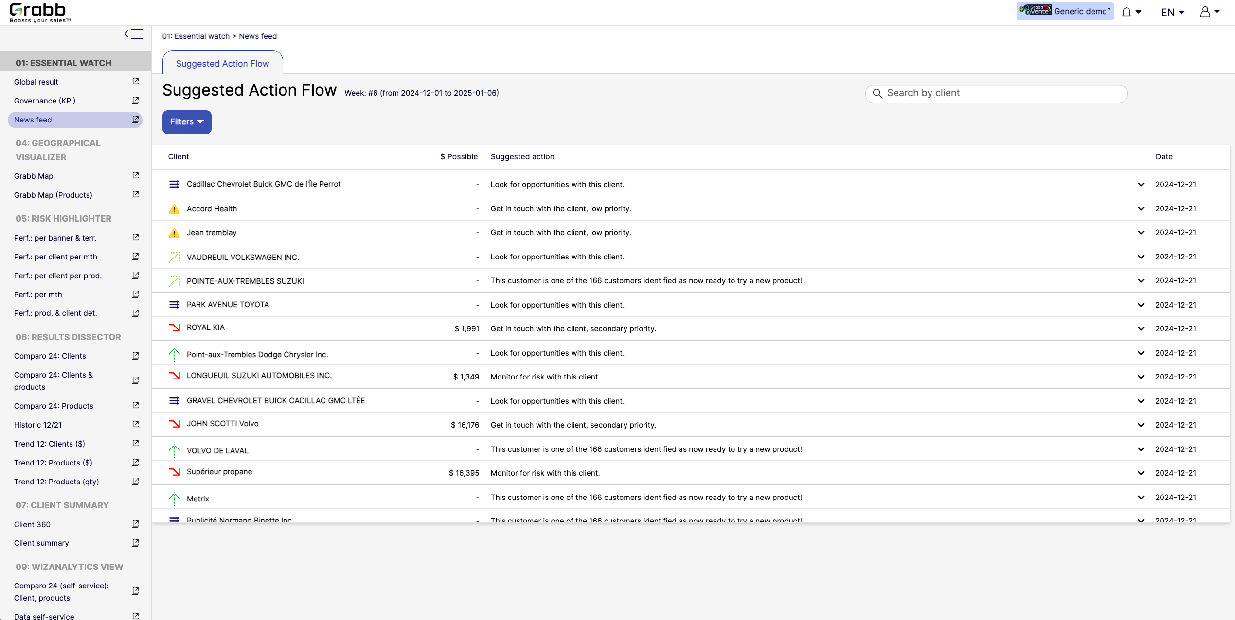
This holistic view enables data‐driven decisions—whether to focus on strengthening loyalty, pitching new products, or preventing churn.Screenshot of A visualization for sales reps and managers, providing:

Prioritized Recommandations: Provides a dynamic feed of next best actions—whether it’s “Look for opportunities with this client” or “Monitor for risk,” ensuring no lead or account slips through the cracks.
Opportunity & Risk Indicators: Quickly flags which clients are “ready to try a new product” versus those at higher risk, so teams can focus their energy where it matters most.
Estimated Upside ($ Possible): In some cases, the screen shows potential revenue if successful, helping reps evaluate the ROI of their outreach efforts.
Search & Filter Capabilities: Salespeople can easily locate a specific client in the list and see suggested actions, which speeds up daily planning and follow‐ups.
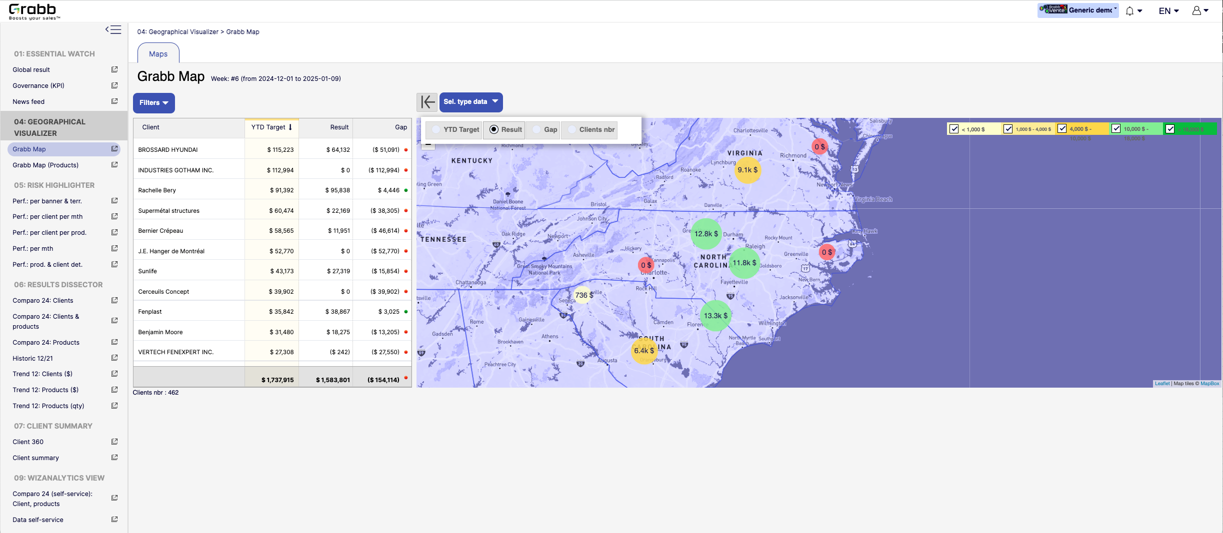
By centralizing these recommended “next steps,” the Suggested Action Flow turns raw data into a practical to‐do list—making each sales call or client interaction more purposeful and timely.Screenshot of a visualization for sales teams that helps them understand how their performance is distributed across different territories or locations. Without geographic context, managers can overlook local trends, regional opportunities, or problem areas.

Solution Provided:

Interactive Territory Overview: Displays each client’s Year‐to‐Date (YTD) target, actual results, and any gap in a color‐coded map, quickly revealing where the biggest mismatches lie.
Client‐Level Details: The list alongside the map allows you to see real‐time data—such as current gap amount or sales performance—sorted by region or client.
Visual Clustering: Bubbles on the map show consolidated sales amounts or gaps for clusters of clients, making it easier to spot hot‐spots or underperforming zones.
Target & Result Comparison: By toggling between metrics (e.g., “YTD Target,” “Result,” “Gap,” “Clients nbr”), managers can instantly pivot the view to see how the team is tracking.
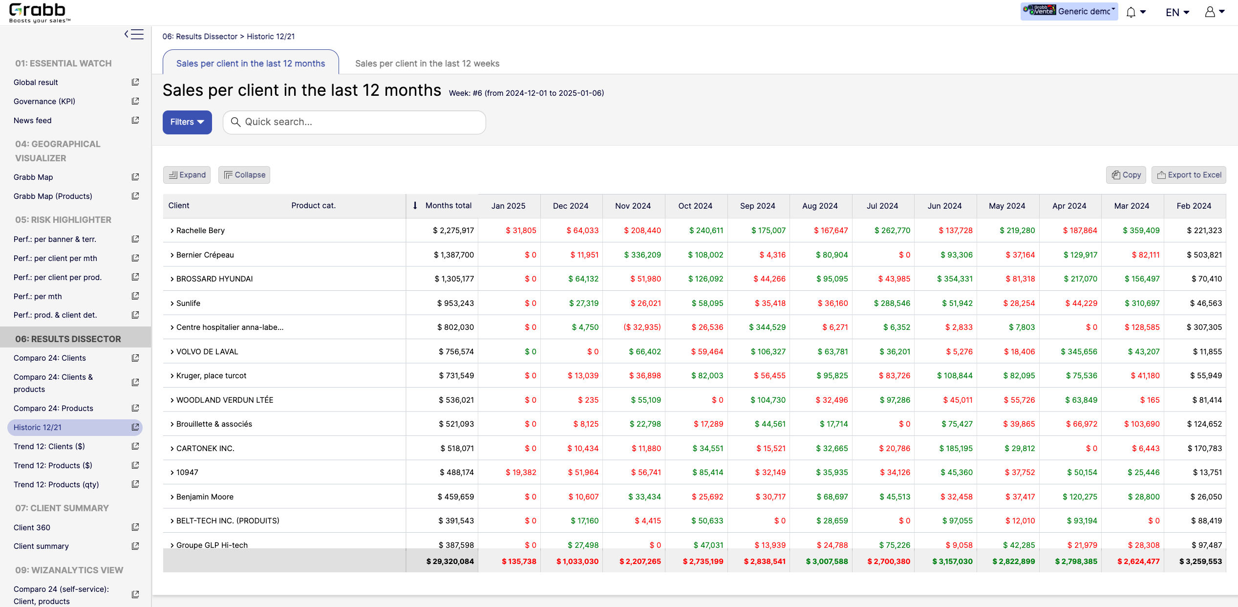
With this map‐based dashboard, leaders can optimize travel routes, allocate resources effectively, and prioritize outreach in areas where the potential impact is greatest.Screenshot of monthly sales trends at the individual‐client level. The visualization provides:

Month‐by‐Month Breakdown: Lists each client with color‐coded monthly sales (green and red), allowing you to see exactly when sales surge or drop off.
Total and Monthly Views: A “Months total” column plus each month’s figure helps you quickly gauge each client’s cumulative performance versus their monthly fluctuations.
Trend Spotting & Seasonality: By laying out 12 consecutive months, it becomes easier to see recurring patterns—helpful for forecasting, inventory planning, and targeted campaigns.
Actionable Insights: Identify which clients need re‐engagement (red cells or big drops) and which clients might be ready for expansion (consistently green or strong increases).
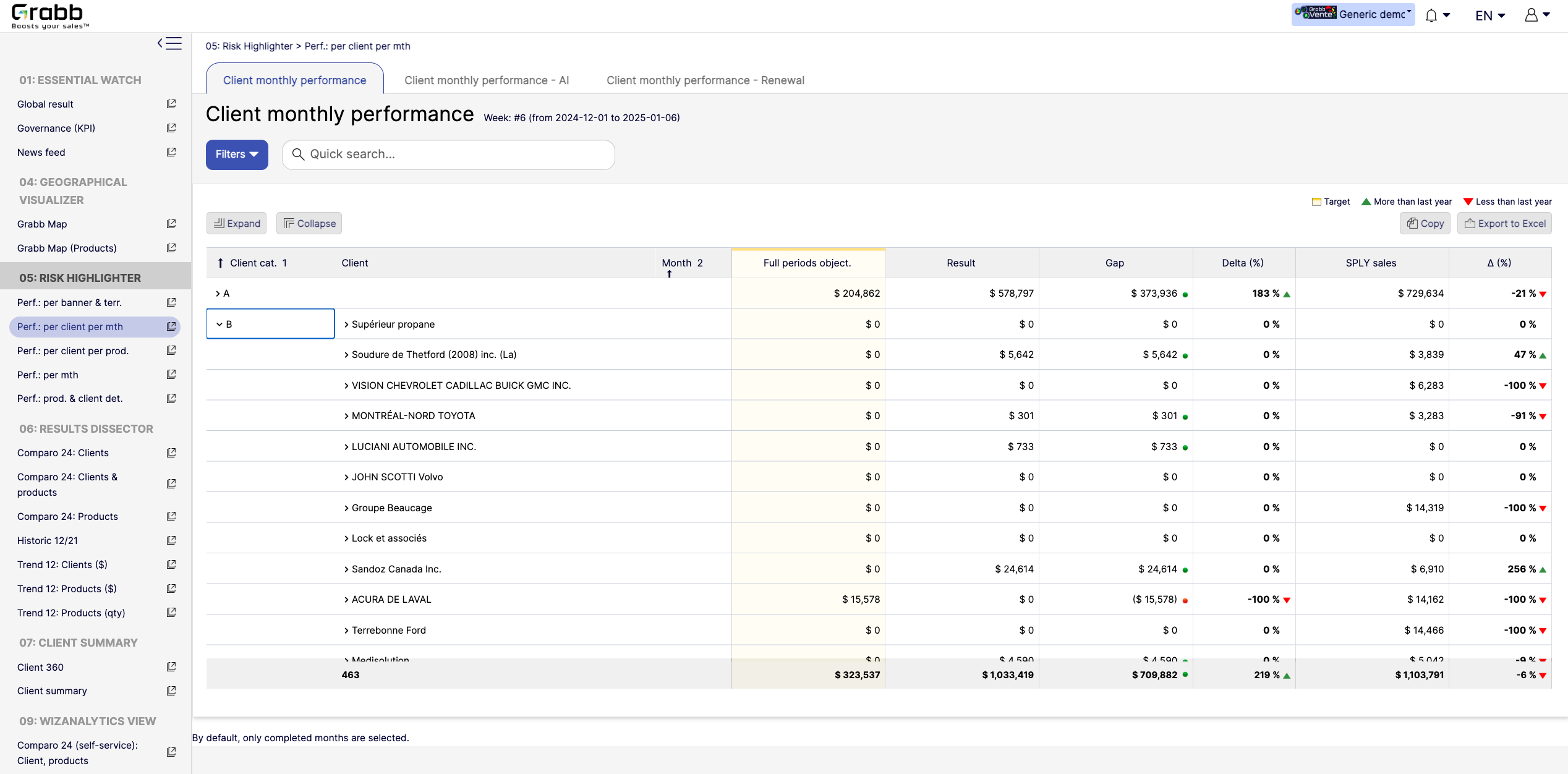
By visualizing an entire year in detail, sales teams can preemptively address potential downturns and capitalize on positive trends.Screenshot of a visualization tracking how each client performs on a month‐to‐month basis, and across accounts. This information provides:

Side‐by‐Side Comparisons: Displays each client’s monthly objectives versus actual results, so sales teams see immediately whether targets are met or missed.
Delta & Gap Analysis: Automatically calculates the variance between the goal and real outcomes—highlighting where shortfalls or over‐performance exist.
Year‐Over‐Year Comparison: “More than last year” or “Less than last year” labels provide quick trend context, guiding strategy for retention or growth.
Easy Filtering & Sorting: Users can filter by client category or name, then expand or collapse details to focus only on accounts that need attention.
With this screen, managers can prioritize which clients need immediate support and which are on track—using precise data rather than guesswork.

    Toplyne.io, discontinued Screenshots

    Screenshot of Customer 360 view

Toplyne offers a 360 view of every account in a connected CRM stitched together from customer data sources:

→ CRMs

→ Warehouses

→ Product analytics

→ Email marketingScreenshot of AI Lead Scoring

Individual lead scoring models can be built on the stitched data for each GTM motion and visualized in a CRM with the Toplyne Chrome ExtensionScreenshot of Targeted SDR workflows

A sequence can be created from a connected CRM.Screenshot of Demand gen automation

Automated demand gen workflows like sales pipeline for CRM, the audience for marketing emails, and targeted in-app nudges can be created from the Toplyne dashboardScreenshot of Usage based segmentation for sales

Segments can be created based on usage, firmographics, and demographics and saved to use across campaignsScreenshot of Sync with  GTM applications

Pipelines sync to downstream GTM destinations with over 35+ integrations