TrustRadius: an HG Insights company

Save this comparison

Save this comparison

Add Product

Recommended Comparisons

    Overview
    ProductRatingMost Used ByProduct SummaryStarting Price

    Plotly Chart Studio

    Score8 out of 10
    N/APlotly headquartered in Montreal offers Chart Studio, a data visualization tool with an open source and free cloud editions, as well as enterprise editions deployable on-cloud or on-premise. The vendor describes Chart Studio as a sophisticated editor for creating D3.js and WebGL charts.

    $99

    per month

    Powerslide

    Score9.5 out of 10
    N/ACreated in 2019, Powerslide is a data storytelling and data visualization solution. This software helps business users to create usages around data. Powerslide is a solution for data analysis, visualization and presentation. Interactive and collaborative, Powerslide aims to answer data issues in a simple, practical and design interface, and help users simplify the analysis and communication of…N/A
    Pricing
    Plotly Chart StudioPowerslide
    Editions & Modules
    Private Hosting
    $99.00
    per month
    No answers on this topic
    Offerings
    Pricing Offerings
    Plotly Chart StudioPowerslide
    Free Trial
    NoYes
    Free/Freemium Version
    NoNo
    Premium Consulting/Integration Services
    NoNo
    Entry-level Setup FeeNo setup feeOptional
    Additional Details—Our rates are flexible and adapt to the size and use of your organization. Contact us and let’s discuss about it.
    More Pricing Information
    Features
    Plotly Chart StudioPowerslide
    BI Standard Reporting
    Comparison of BI Standard Reporting features of Plotly Chart Studio and Powerslide
    Feature
    Plotly Chart Studio
    8.0
    1 Ratings
    1% below category average
    Powerslide
    8.8
    2 Ratings
    9% above category average
    Pixel Perfect reports8.01 Ratings8.52 Ratings
    Customizable dashboards00 Ratings9.02 Ratings
    Report Formatting Templates00 Ratings9.02 Ratings
    Ad-hoc Reporting
    Comparison of Ad-hoc Reporting features of Plotly Chart Studio and Powerslide
    Feature
    Plotly Chart Studio
    9.0
    1 Ratings
    14% above category average
    Powerslide
    9.5
    2 Ratings
    19% above category average
    Integration with R or other statistical packages9.01 Ratings00 Ratings
    Drill-down analysis00 Ratings9.52 Ratings
    Report sharing and collaboration00 Ratings9.52 Ratings
    Data Discovery and Visualization
    Comparison of Data Discovery and Visualization features of Plotly Chart Studio and Powerslide
    Feature
    Plotly Chart Studio
    8.5
    1 Ratings
    9% above category average
    Powerslide
    9.0
    2 Ratings
    15% above category average
    Pre-built visualization formats (heatmaps, scatter plots etc.)9.01 Ratings00 Ratings
    Location Analytics / Geographic Visualization8.01 Ratings9.02 Ratings
    Report Output and Scheduling
    Comparison of Report Output and Scheduling features of Plotly Chart Studio and Powerslide
    Feature
    Plotly Chart Studio
    -
    Ratings
    Powerslide
    9.2
    2 Ratings
    12% above category average
    Publish to Web00 Ratings9.02 Ratings
    Publish to PDF00 Ratings9.52 Ratings
    Report Versioning00 Ratings9.01 Ratings
    Best Alternatives
    Plotly Chart StudioPowerslide
    Small Businesses
    Chartio (discontinued)
    Score7.5 out of 10
    Chartio (discontinued)
    Score7.5 out of 10
    Medium-sized Companies
    Jet Reports
    Score9.5 out of 10
    Jet Reports
    Score9.5 out of 10
    Enterprises
    Kibana
    Score8.4 out of 10
    Kibana
    Score8.4 out of 10
    All AlternativesView all alternativesView all alternatives
    User Ratings
    Plotly Chart StudioPowerslide
    Likelihood to Recommend
    8.0
    (2 ratings)
    9.5
    (2 ratings)
    User Testimonials
    Plotly Chart StudioPowerslide
    Likelihood to Recommend
    Plotly
    [Plotly Chart Studio is] a great tool to make visualizations on a web based portal. For python developers, it can ease of some burden of writing code again and again for the same thing and also refreshing visualizations on old scripts when data changes. All in all, a simple yet effective tool for your report generation and visualization needs[.]
    Incentivized
    Read full review
    Datarocks
    It has allowed us as an organization to clearly deliver our numbers to our collaborators, but above all to the heads of our teams and company. Not being entirely professional, it is easy to use for someone who does not understand the function of these numbers or hard data.
    Incentivized
    Read full review
    Pros
    Plotly
    • Connects to almost every kind of data source like SQL, Excel, MS Access, flat files and more.
    • Charts get saved to the repository and are re-used by multiple users.
    • No need of manual intervention in order to refresh the charts every time the data gets changed.
    Incentivized
    Read full review
    Datarocks
    • Collaborative fractures helped a lot.
    • Dashboards are really unique.
    Read full review
    Cons
    Plotly
    • Lack of customer support
    • Sometimes fails to visualize extremely large datasets ( probably also due to computer resource constraints)
    Incentivized
    Read full review
    Datarocks
    • Increase the variety of fonts
    • Make templates less serious or business
    Incentivized
    Read full review
    Alternatives Considered
    Plotly
    Incentivized
    Read full review
    Datarocks
    Powerslide stands out for having templates that help you easily organize hard data and more delicate information such as numbers and statistics. By having many ways to present and edit it in one place, it makes this a page with variety and empathy with its user.
    Incentivized
    Read full review
    Return on Investment
    Plotly
    • Improvement in productivity as charts can be shared with teams and feedback can be collected, consolidated and incorporated in the design and charts.
    • Charts are aligned with the organization theme and colors and one doesn't need to put in effort every time to do that.
    • No upfront capital expenditure and minimum user criteria helps the organization to keep the costs down.
    Incentivized
    Read full review
    Datarocks
    • Our collaborators do not get bored in meetings and even if it is a lot of information, seeing it in an interesting design makes them pay attention and like to be informed of the numbers they manage to obtain with their work.
    Incentivized
    Read full review
    ScreenShots

    Powerslide Screenshots

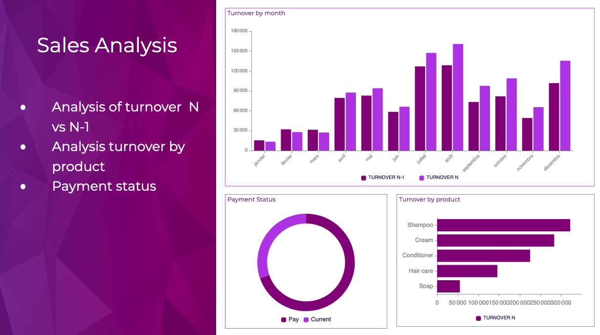
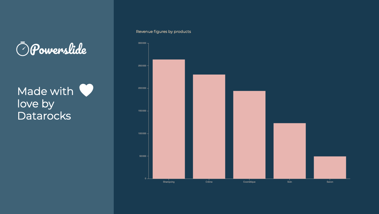
    Screenshot of Reporting and dashboards have never been easier to achieve. Interactive, Powerslide takes you to the heart of your data and helps you take better decisions. Simple to use, you can build your graphics in seconds with drag-and-drop and let our suggestion algorithms guide you.Screenshot of Powerslide complies to your graphic chart. Define your color palette and Powerslide takes care of the rest.Screenshot of Powerslide is THE solution provided with love by DatarocksScreenshot of Take advantage of real-time collaboration to work as a team on the same project. Time-saving and flexibility await you !