Google Charts vs. Panorama Necto
Google Charts vs. Panorama Necto
| Product | Rating | Most Used By | Product Summary | Starting Price |
|---|---|---|---|---|
 Google Charts | N/A | Google Charts provides a way to visualize data on your website - for free. From simple line charts to complex hierarchical tree maps, the chart gallery provides a large number of ready-to-use chart types. The most common way to use Google Charts is with simple JavaScript that you embed in your web page. | N/A | |
 Panorama Necto | N/A | Panorama Necto is a business intelligence solution that provides enterprises with new ways to collaborate and create unique contextual connections. Some key features include: Workboards/Dashboards, Advanced Analytics, and Contextual Discovery. | N/A |
| Google Charts | Panorama Necto | |||||||||||||||
|---|---|---|---|---|---|---|---|---|---|---|---|---|---|---|---|---|
| Editions & Modules | No answers on this topic | No answers on this topic | ||||||||||||||
| Offerings |
| |||||||||||||||
| Entry-level Setup Fee | No setup fee | No setup fee | ||||||||||||||
| Additional Details | — | — | ||||||||||||||
| More Pricing Information | ||||||||||||||||
| Google Charts | Panorama Necto |
|---|
| Google Charts | Panorama Necto | |||||||||||||||||||||
|---|---|---|---|---|---|---|---|---|---|---|---|---|---|---|---|---|---|---|---|---|---|---|
| BI Standard Reporting |
| |||||||||||||||||||||
| Ad-hoc Reporting |
| |||||||||||||||||||||
| Report Output and Scheduling |
| |||||||||||||||||||||
| Data Discovery and Visualization |
| |||||||||||||||||||||
| Access Control and Security |
| |||||||||||||||||||||
| Mobile Capabilities |
| |||||||||||||||||||||
| Application Program Interfaces (APIs) / Embedding |
|
| Google Charts | Panorama Necto | |
|---|---|---|
| Likelihood to Recommend | 9.0 (61 ratings) | 8.0 (25 ratings) |
| Likelihood to Renew | 7.3 (8 ratings) | 8.0 (17 ratings) |
| Usability | 9.0 (33 ratings) | 8.2 (2 ratings) |
| Availability | 10.0 (1 ratings) | - (0 ratings) |
| Performance | 5.0 (1 ratings) | - (0 ratings) |
| Support Rating | 8.3 (32 ratings) | 7.1 (3 ratings) |
| Online Training | 5.0 (1 ratings) | - (0 ratings) |
| Implementation Rating | 10.0 (1 ratings) | 6.7 (2 ratings) |
| Configurability | 8.0 (1 ratings) | - (0 ratings) |
| Ease of integration | 10.0 (1 ratings) | - (0 ratings) |
| Product Scalability | 8.0 (1 ratings) | - (0 ratings) |
| Vendor post-sale | 10.0 (1 ratings) | - (0 ratings) |
| Vendor pre-sale | 10.0 (1 ratings) | - (0 ratings) |
| Google Charts | Panorama Necto | |
|---|---|---|
| Likelihood to Recommend |  Google
|  Panorama Software
 Chittiappa Areyada QA Lead & Test Analyst Disney Consumer Products for Satwic Inc |
| Pros | Google
| Panorama Software
 Sarmista Nath Senior Sofware Engineer |
| Cons | Google
 Sarah Bandy Executive Director | Panorama Software
 Soumya Roy Senior BI Analyst |
| Likelihood to Renew | Google
 Daniel Ma Web Developer | Panorama Software
 Lewis Ewing UI Designer |
| Usability | Google
| Panorama Software
 Milos Milenkovic Senior Business Intelligence/Reporting Developer |
| Reliability and Availability | Google
| Panorama Software No answers on this topic |
| Performance | Google
| Panorama Software No answers on this topic |
| Support Rating | Google
 Alexander Cooper RPA Developer | Panorama Software
 Hema Malini Senior Software Engineer |
| Online Training | Google
| Panorama Software No answers on this topic |
| Implementation Rating | Google
| Panorama Software
Milos Milenkovic Senior Business Intelligence/Reporting Developer |
| Alternatives Considered | Google
| Panorama Software
 Nidhish Khare BI Developer |
| Scalability | Google
| Panorama Software No answers on this topic |
| Return on Investment | Google
| Panorama Software No answers on this topic |
| ScreenShots | Panorama Necto Screenshots 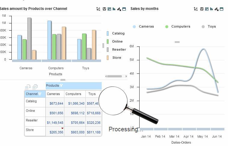 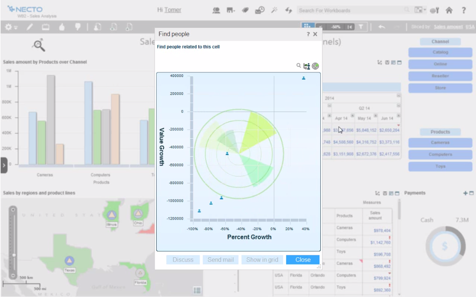   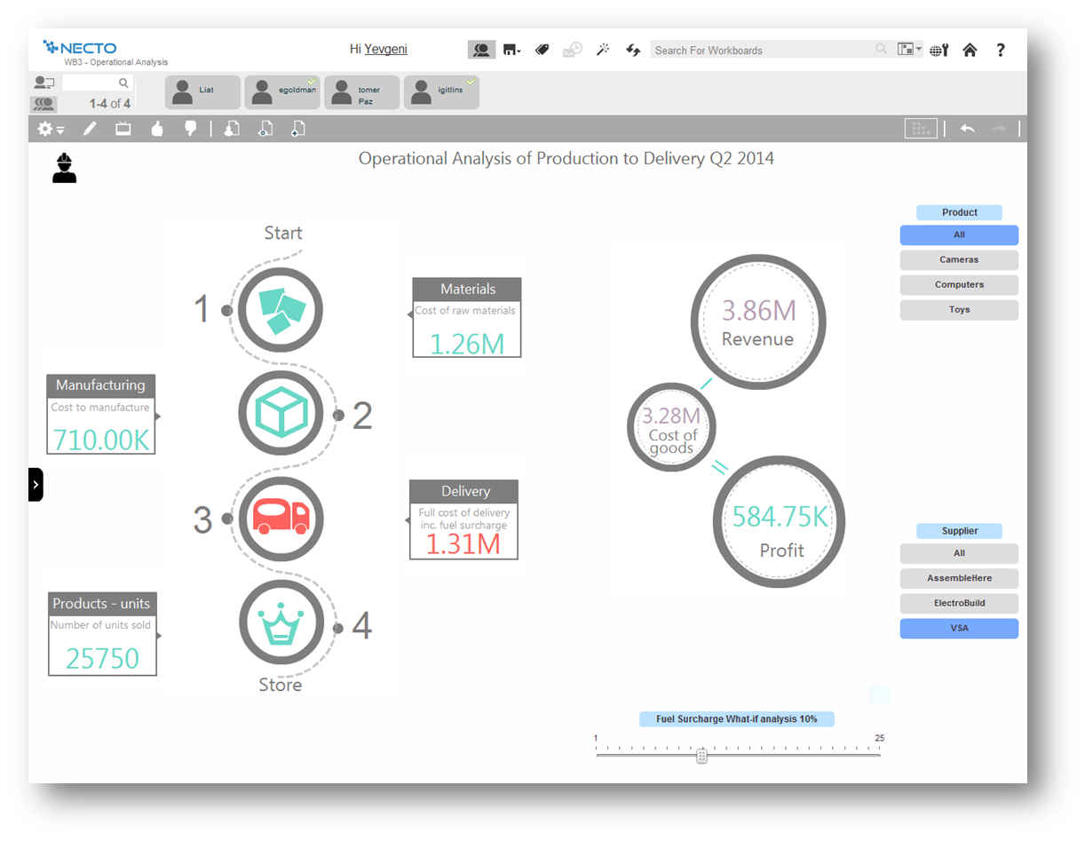 |