Infer vs. Predicte.com
Infer vs. Predicte.com
| Product | Rating | Most Used By | Product Summary | Starting Price |
|---|---|---|---|---|
 Infer | N/A | Infer is a predictive intelligence lead scoring platform with pre-built integrations to Salesforce, Eloqua, and Marketo. | N/A | |
 Predicte.com | Small Businesses (1-50 employees) | Predicte offers real-time predicive insights from product, sales, and client data. By unifying disparate data sources within its Data Platform (Analytics), Predicte empowers distributors, wholesalers and manufacturers to forecast sales with greater accuracy, detect churn risks before they escalate, and deliver tailored recommendations. The platform’s analytics framework helps teams optimize product usage, enhance sales performance, and continuously improve client outcomes through its… | N/A |
| Infer | Predicte.com | |||||||||||||||
|---|---|---|---|---|---|---|---|---|---|---|---|---|---|---|---|---|
| Editions & Modules | No answers on this topic | No answers on this topic | ||||||||||||||
| Offerings |
| |||||||||||||||
| Entry-level Setup Fee | No setup fee | Required | ||||||||||||||
| Additional Details | — | — | ||||||||||||||
| More Pricing Information | ||||||||||||||||
| Infer | Predicte.com |
|---|
| Infer | Predicte.com | |
|---|---|---|
| Small Businesses |  Mediafly Score 7.7 out of 10 | Mediafly Score 7.7 out of 10 |
| Medium-sized Companies |  Clari Score 8.6 out of 10 | Clari Score 8.6 out of 10 |
| Enterprises | Clari Score 8.6 out of 10 | Clari Score 8.6 out of 10 |
| All Alternatives | View all alternatives | View all alternatives |
| Infer | Predicte.com | |
|---|---|---|
| Likelihood to Recommend | 9.0 (2 ratings) | - (0 ratings) |
| Infer | Predicte.com | |
|---|---|---|
| Likelihood to Recommend | IgniteTech
 Melanie Tobiasson SVP Infrastructure & Operations | Predicte.com No answers on this topic |
| Pros | IgniteTech
 Anna Norregaard Partner Executive | Predicte.com No answers on this topic |
| Cons | IgniteTech
Melanie Tobiasson SVP Infrastructure & Operations | Predicte.com No answers on this topic |
| Alternatives Considered | IgniteTech
Anna Norregaard Partner Executive | Predicte.com No answers on this topic |
| Return on Investment | IgniteTech
Melanie Tobiasson SVP Infrastructure & Operations | Predicte.com No answers on this topic |
| ScreenShots | Predicte.com Screenshots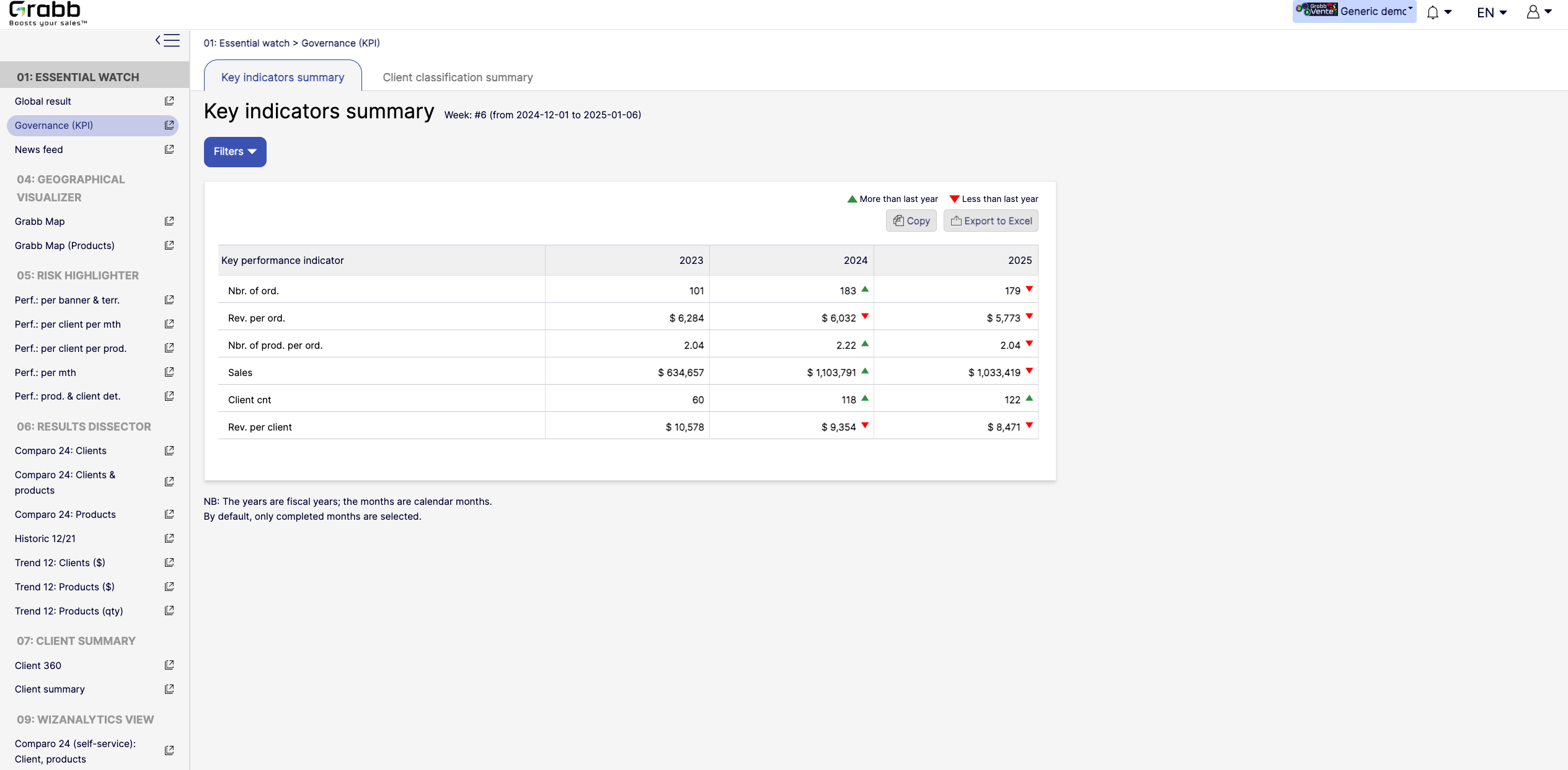 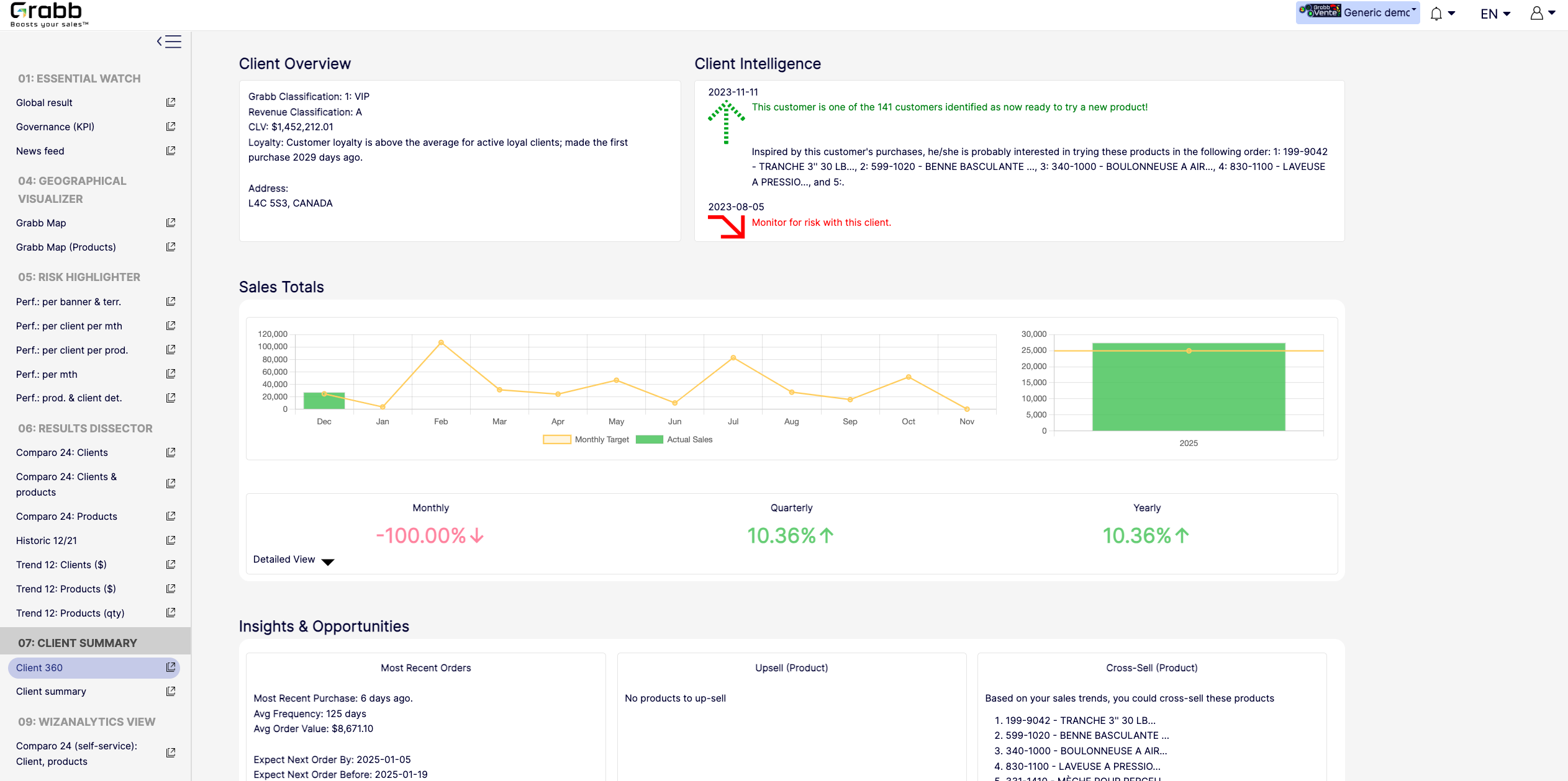 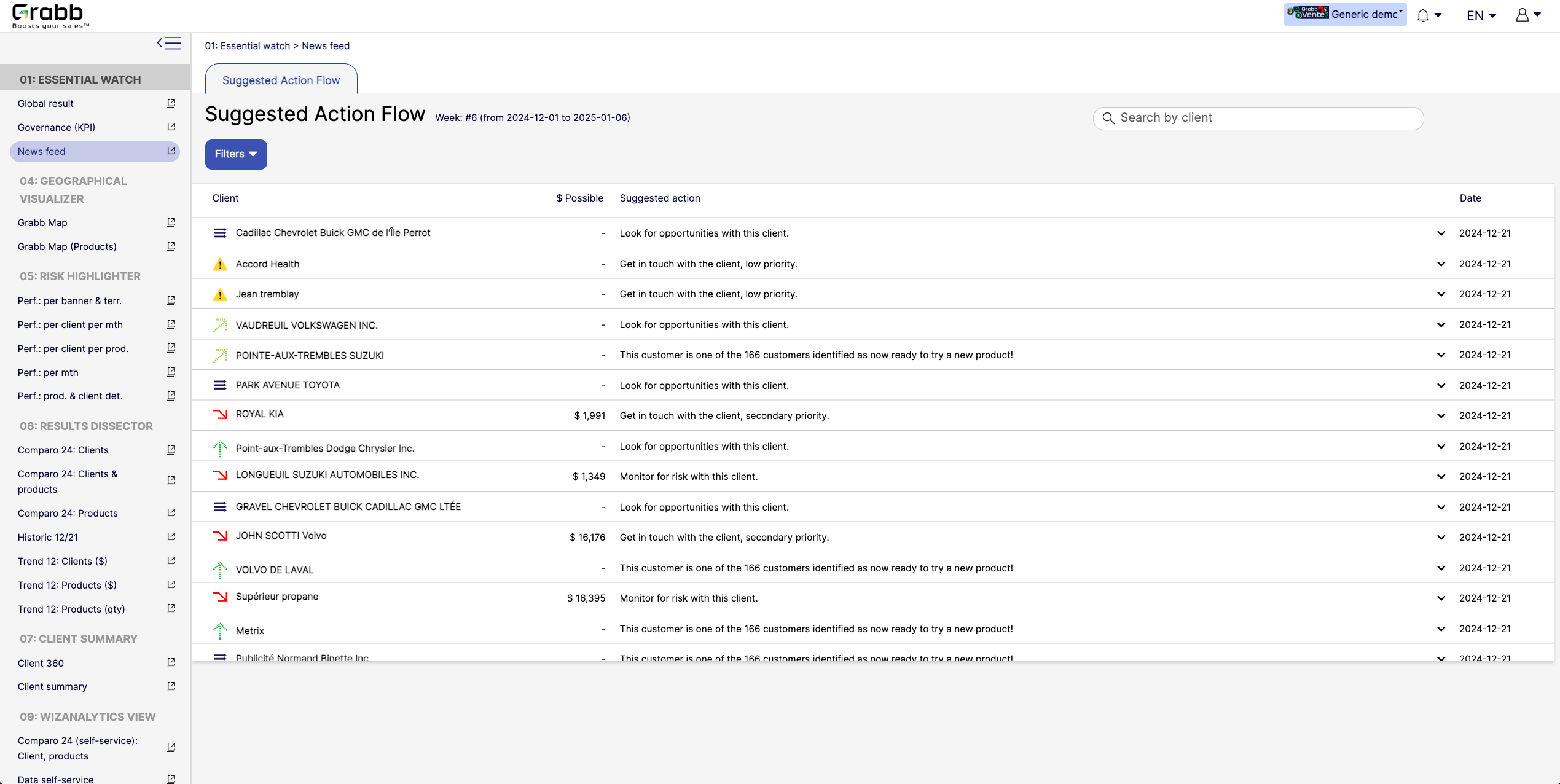    |