Google Charts vs. Yurbi
Google Charts vs. Yurbi
| Product | Rating | Most Used By | Product Summary | Starting Price |
|---|---|---|---|---|
 Google Charts | N/A | Google Charts provides a way to visualize data on your website - for free. From simple line charts to complex hierarchical tree maps, the chart gallery provides a large number of ready-to-use chart types. The most common way to use Google Charts is with simple JavaScript that you embed in your web page. | N/A | |
 Yurbi | N/A | Yurbi is a business intelligence solution that is designed to bridge the gap between business users and intelligent data. It provides the business user with the ability to connect, secure, and collaborate with data to make better business decisions. According to the vendor, Yurbi brings the powerful reporting and analytical capabilities of traditional BI, but takes out the coding jargon – so that people can actually use it themselves. As a 100% HTML5 application, Yurbi gives users and… | $24,000 per year |
| Google Charts | Yurbi | |||||||||||||||
|---|---|---|---|---|---|---|---|---|---|---|---|---|---|---|---|---|
| Editions & Modules | No answers on this topic |
| ||||||||||||||
| Offerings |
| |||||||||||||||
| Entry-level Setup Fee | No setup fee | No setup fee | ||||||||||||||
| Additional Details | — | Yurbi's pricing model is simple and predictable. User licenses start at just $495 per year and that includes all the powerful features of our platform. We offer named users, concurrent users, and public view or anonymous report licensing options. We also offer custom/hybrid pricing for vendors looking to OEM Yurbi. | ||||||||||||||
| More Pricing Information | ||||||||||||||||
| Google Charts | Yurbi |
|---|
| Google Charts | Yurbi | |||||||||||||||||||||
|---|---|---|---|---|---|---|---|---|---|---|---|---|---|---|---|---|---|---|---|---|---|---|
| BI Standard Reporting |
| |||||||||||||||||||||
| Ad-hoc Reporting |
| |||||||||||||||||||||
| Report Output and Scheduling |
| |||||||||||||||||||||
| Data Discovery and Visualization |
| |||||||||||||||||||||
| Access Control and Security |
| |||||||||||||||||||||
| Mobile Capabilities |
| |||||||||||||||||||||
| Application Program Interfaces (APIs) / Embedding |
|
| Google Charts | Yurbi | |
|---|---|---|
| Small Businesses |  Yellowfin Score 8.7 out of 10 | Yellowfin Score 8.7 out of 10 |
| Medium-sized Companies |  Reveal Score 10.0 out of 10 | Reveal Score 10.0 out of 10 |
| Enterprises |  Kyvos Semantic Layer Score 9.5 out of 10 | Kyvos Semantic Layer Score 9.5 out of 10 |
| All Alternatives | View all alternatives | View all alternatives |
| Google Charts | Yurbi | |
|---|---|---|
| Likelihood to Recommend | 9.0 (61 ratings) | 10.0 (1 ratings) |
| Likelihood to Renew | 7.3 (8 ratings) | 10.0 (1 ratings) |
| Usability | 9.0 (33 ratings) | 10.0 (1 ratings) |
| Availability | 10.0 (1 ratings) | 10.0 (1 ratings) |
| Performance | 5.0 (1 ratings) | 10.0 (1 ratings) |
| Support Rating | 8.3 (32 ratings) | - (0 ratings) |
| Online Training | 5.0 (1 ratings) | - (0 ratings) |
| Implementation Rating | 10.0 (1 ratings) | 10.0 (1 ratings) |
| Configurability | 8.0 (1 ratings) | - (0 ratings) |
| Ease of integration | 10.0 (1 ratings) | - (0 ratings) |
| Product Scalability | 8.0 (1 ratings) | 10.0 (1 ratings) |
| Vendor post-sale | 10.0 (1 ratings) | - (0 ratings) |
| Vendor pre-sale | 10.0 (1 ratings) | - (0 ratings) |
| Google Charts | Yurbi | |
|---|---|---|
| Likelihood to Recommend |  Google
| 5000fish
 Samar Chopra, PMP, SCPM, ITIL Program Manager |
| Pros | Google
| 5000fish
Samar Chopra, PMP, SCPM, ITIL Program Manager |
| Cons | Google
 Sarah Bandy Executive Director | 5000fish
Samar Chopra, PMP, SCPM, ITIL Program Manager |
| Likelihood to Renew | Google
 Daniel Ma Web Developer | 5000fish
Samar Chopra, PMP, SCPM, ITIL Program Manager |
| Usability | Google
| 5000fish
Samar Chopra, PMP, SCPM, ITIL Program Manager |
| Reliability and Availability | Google
| 5000fish No answers on this topic |
| Performance | Google
| 5000fish No answers on this topic |
| Support Rating | Google
 Alexander Cooper RPA Developer | 5000fish No answers on this topic |
| Online Training | Google
| 5000fish No answers on this topic |
| Implementation Rating | Google
| 5000fish
Samar Chopra, PMP, SCPM, ITIL Program Manager |
| Alternatives Considered | Google
| 5000fish
Samar Chopra, PMP, SCPM, ITIL Program Manager |
| Scalability | Google
| 5000fish No answers on this topic |
| Return on Investment | Google
| 5000fish No answers on this topic |
| ScreenShots | Yurbi Screenshots   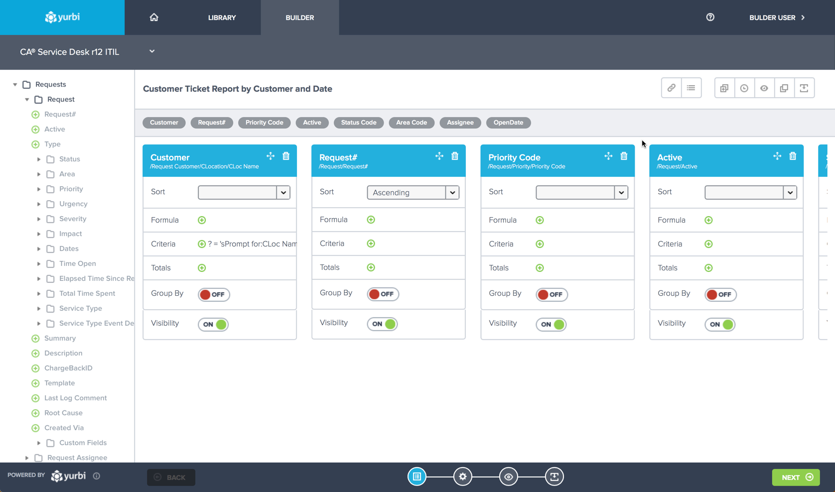  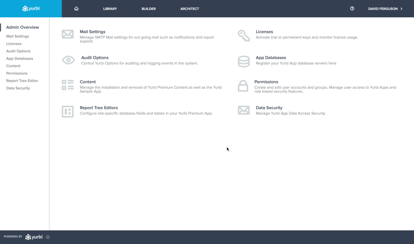 |