Looker Studio vs. Powerslide
Looker Studio vs. Powerslide
| Product | Rating | Most Used By | Product Summary | Starting Price |
|---|---|---|---|---|
 Looker Studio | N/A | Looker Studio is a data visualization platform that transforms data into meaningful presentations and dashboards with customized reporting tools. | $9 per month per user per project | |
 Powerslide | N/A | Created in 2019, Powerslide is a data storytelling and data visualization solution. This software helps business users to create usages around data. Powerslide is a solution for data analysis, visualization and presentation. Interactive and collaborative, Powerslide aims to answer data issues in a simple, practical and design interface, and help users simplify the analysis and communication of… | N/A |
| Looker Studio | Powerslide | |||||||||||||||
|---|---|---|---|---|---|---|---|---|---|---|---|---|---|---|---|---|
| Editions & Modules |
| No answers on this topic | ||||||||||||||
| Offerings |
| |||||||||||||||
| Entry-level Setup Fee | No setup fee | Optional | ||||||||||||||
| Additional Details | — | Our rates are flexible and adapt to the size and use of your organization. Contact us and let’s discuss about it. | ||||||||||||||
| More Pricing Information | ||||||||||||||||
| Looker Studio | Powerslide |
|---|
| Looker Studio | Powerslide | ||||||||||||||||||
|---|---|---|---|---|---|---|---|---|---|---|---|---|---|---|---|---|---|---|---|
| BI Standard Reporting |
| ||||||||||||||||||
| Ad-hoc Reporting |
| ||||||||||||||||||
| Report Output and Scheduling |
| ||||||||||||||||||
| Data Discovery and Visualization |
|
| Looker Studio | Powerslide | |
|---|---|---|
| Small Businesses |  Supermetrics Score 9.7 out of 10 | Supermetrics Score 9.7 out of 10 |
| Medium-sized Companies | Supermetrics Score 9.7 out of 10 | Supermetrics Score 9.7 out of 10 |
| Enterprises |  IBM Analytics Engine Score 7.2 out of 10 | IBM Analytics Engine Score 7.2 out of 10 |
| All Alternatives | View all alternatives | View all alternatives |
| Looker Studio | Powerslide | |
|---|---|---|
| Likelihood to Recommend | 8.6 (56 ratings) | 9.5 (2 ratings) |
| Likelihood to Renew | 9.0 (1 ratings) | - (0 ratings) |
| Usability | 8.5 (7 ratings) | - (0 ratings) |
| Support Rating | 6.7 (10 ratings) | - (0 ratings) |
| Looker Studio | Powerslide | |
|---|---|---|
| Likelihood to Recommend | Google
 Jake Bodmer Mentor | Datarocks
|
| Pros | Google
| Datarocks
 Nitish kumar System Engineer |
| Cons | Google
| Datarocks
|
| Likelihood to Renew | Google
 Janaye Steadman Director of Social Media | Datarocks No answers on this topic |
| Usability | Google
| Datarocks No answers on this topic |
| Support Rating | Google
 Jordan Comstock Digital Marketing Specialist | Datarocks No answers on this topic |
| Alternatives Considered | Google
 Shelby Kolb Data Analyst | Datarocks
|
| Return on Investment | Google
 Scott Walker Director of Digital Marketing | Datarocks
|
| ScreenShots | Powerslide Screenshots 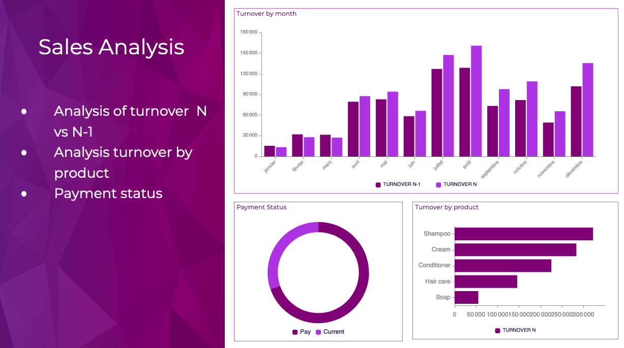 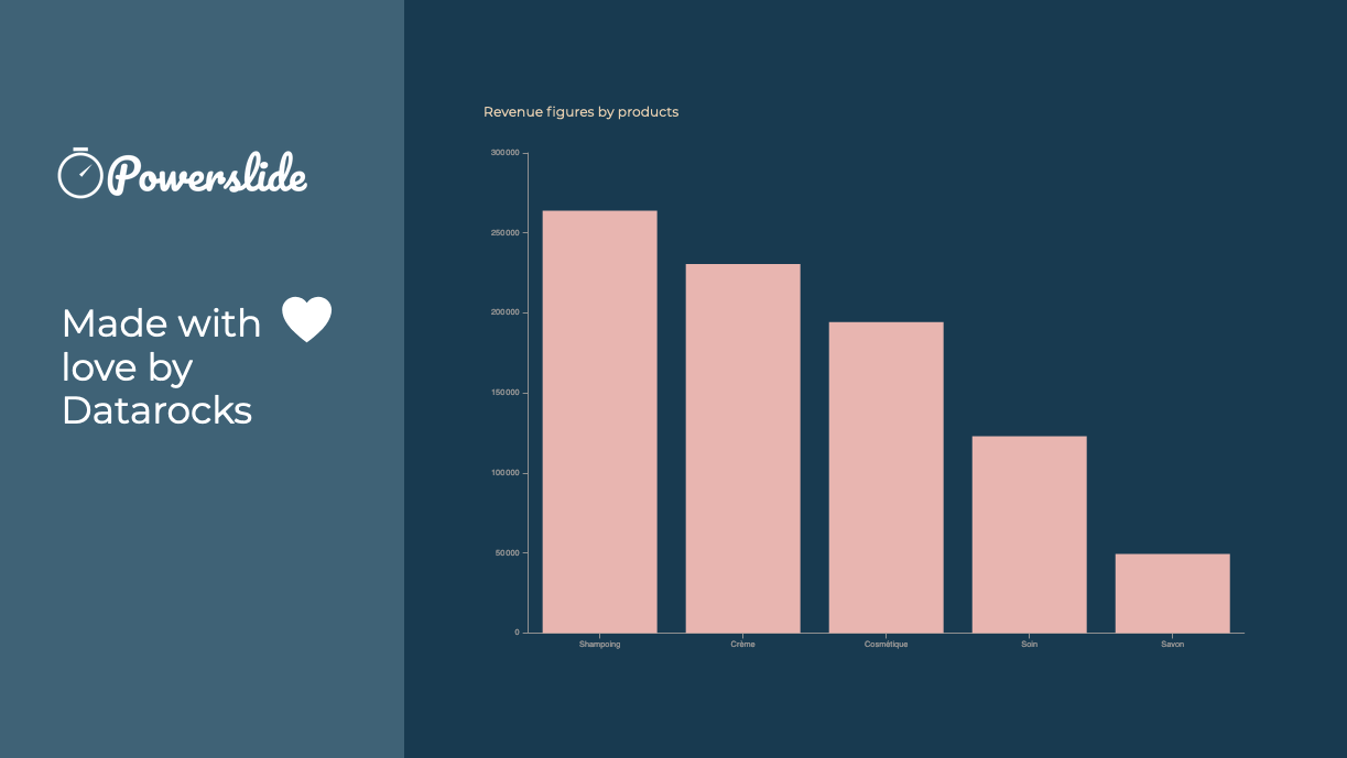  |