
Geckoboard vs. Shiny
| Product | Rating | Most Used By | Product Summary | Starting Price |
|---|---|---|---|---|
 Geckoboard | Score9 out of 10 | Mid-Size Companies (51-1,000 employees) | Geckoboard enables users to create real time dashboards using data from over 80 cloud services. It integrates with other products such as: AWeber, Basecamp, Campaign Monitor and HubSpot. | $35 per month |
 Shiny | Score8 out of 10 | N/A | Shiny allows users to create data visualization apps, and is designed to be easy to write with. These apps let users interact with data and analyses with R or Python. | N/A |
| Geckoboard | Shiny | |||||||||||||||
|---|---|---|---|---|---|---|---|---|---|---|---|---|---|---|---|---|
| Editions & Modules |
| No answers on this topic | ||||||||||||||
| Offerings |
| |||||||||||||||
| Entry-level Setup Fee | No setup fee | No setup fee | ||||||||||||||
| Additional Details | — | — | ||||||||||||||
| More Pricing Information | ||||||||||||||||
| Geckoboard | Shiny | |
|---|---|---|
| Considered Both Products | No answer on this topic | No answer on this topic |
| Key User Insights | ||
| Would buy again | ||
No answers on this topic | 83% Would buy again 5 Answers | |
| Delivers good value for the price | ||
No answers on this topic | 83% Delivers good value for the price 5 Answers | |
| Happy with the feature set | ||
No answers on this topic | 83% Happy with the feature set 5 Answers | |
| Lived up to sales and marketing promises | ||
No answers on this topic | No answers on this topic | |
| Implementation went as expected | ||
No answers on this topic | 100% Implementation went as expected 5 Answers | |
| Geckoboard | Shiny | ||||||||||||||||||||||
|---|---|---|---|---|---|---|---|---|---|---|---|---|---|---|---|---|---|---|---|---|---|---|---|
| BI Standard Reporting |
| ||||||||||||||||||||||
| Ad-hoc Reporting |
| ||||||||||||||||||||||
| Report Output and Scheduling |
| ||||||||||||||||||||||
| Data Discovery and Visualization |
| ||||||||||||||||||||||
| Access Control and Security |
| ||||||||||||||||||||||
| Mobile Capabilities |
| ||||||||||||||||||||||
| Application Program Interfaces (APIs) / Embedding |
| ||||||||||||||||||||||
| Geckoboard | Shiny | |
|---|---|---|
| Small Businesses |  Cyfe Score4 out of 10 |  Chartio (discontinued) Score7.5 out of 10 |
| Medium-sized Companies |  Qlik Cloud Analytics (Qlik Sense) Score8.2 out of 10 |  Jet Reports Score9.5 out of 10 |
| Enterprises |  Jaspersoft Community Edition Score7 out of 10 |  Kibana Score8.4 out of 10 |
| All Alternatives | View all alternatives | View all alternatives |
| Geckoboard | Shiny | |
|---|---|---|
| Likelihood to Recommend | 9.0 | 8.0 |
| Likelihood to Renew | 8.0 | - |
| Usability | 9.0 | - |
| Support Rating | 8.0 | - |
| Data Sharing and Collaboration | 8.0 | - |
| Data Sources | 9.0 | - |
| Geckoboard | Shiny | |
|---|---|---|
| Likelihood to Recommend |
|
|
| Pros |
|
|
| Cons |
|
|
| Likelihood to Renew |
| No answers on this topic |
| Usability |
| No answers on this topic |
| Support Rating |
| No answers on this topic |
| Alternatives Considered |
|
|
| Return on Investment |
|
|
| ScreenShots | Geckoboard Screenshots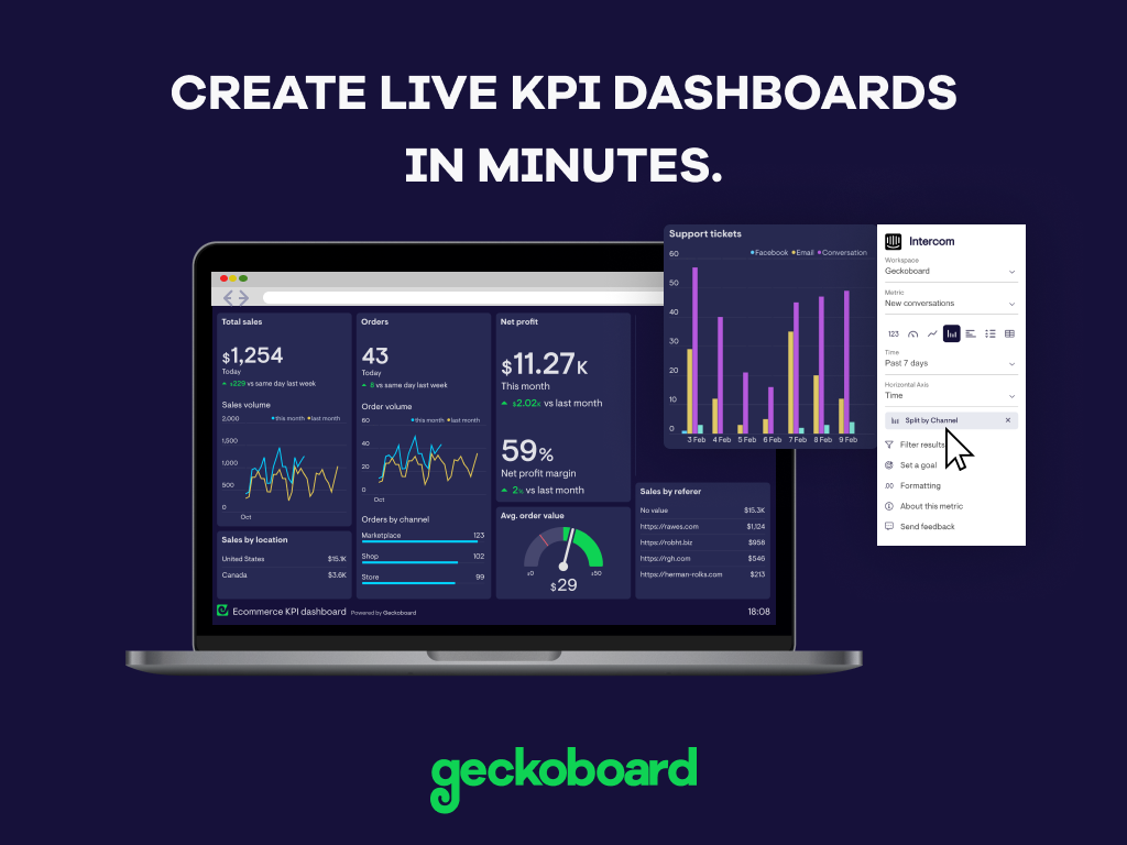     |


