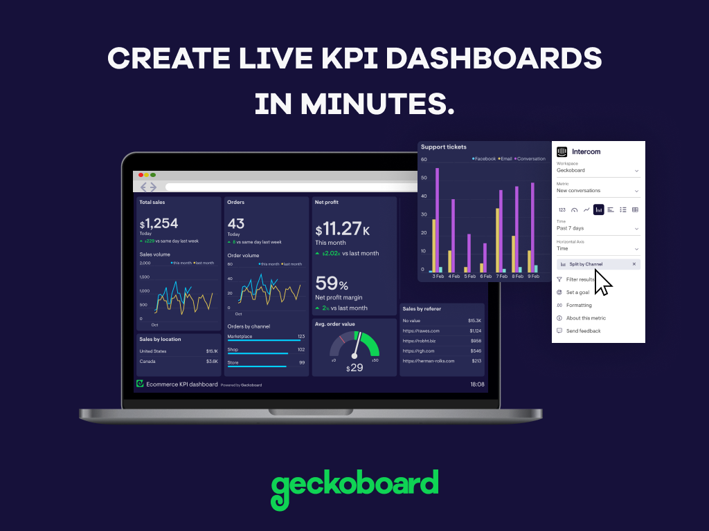
Geckoboard enables users to create real time dashboards using data from over 80 cloud services. It integrates with other products such as: AWeber, Basecamp, Campaign Monitor and HubSpot.
$35
per month
Google Charts
Score 8.2 out of 10
N/A
Google Charts provides a way to visualize data on your website - for free. From simple line charts to complex hierarchical tree maps, the chart gallery provides a large number of ready-to-use chart types. The most common way to use Google Charts is with simple JavaScript that you embed in your web page.
N/A
Pricing
Geckoboard
Google Charts
Editions & Modules
Starter
$35
per month
Team
$159
per month
Team Plus
$275
per month
Company
$599
per month
No answers on this topic
Offerings
Pricing Offerings
Geckoboard
Google Charts
Free Trial
Yes
No
Free/Freemium Version
Yes
Yes
Premium Consulting/Integration Services
No
No
Entry-level Setup Fee
No setup fee
No setup fee
Additional Details
—
—
More Pricing Information
Community Pulse
Geckoboard
Google Charts
Features
Geckoboard
Google Charts
BI Standard Reporting
Comparison of BI Standard Reporting features of Product A and Product B
Geckoboard
9.3
5 Ratings
13% above category average
Google Charts
8.6
50 Ratings
5% above category average
Pixel Perfect reports
8.03 Ratings
8.144 Ratings
Customizable dashboards
10.05 Ratings
9.048 Ratings
Report Formatting Templates
10.04 Ratings
8.843 Ratings
Ad-hoc Reporting
Comparison of Ad-hoc Reporting features of Product A and Product B
Geckoboard
7.7
5 Ratings
4% below category average
Google Charts
9.3
51 Ratings
15% above category average
Drill-down analysis
8.04 Ratings
8.046 Ratings
Formatting capabilities
8.03 Ratings
10.051 Ratings
Integration with R or other statistical packages
7.02 Ratings
9.537 Ratings
Report sharing and collaboration
8.05 Ratings
9.645 Ratings
Report Output and Scheduling
Comparison of Report Output and Scheduling features of Product A and Product B
Geckoboard
9.0
5 Ratings
10% above category average
Google Charts
9.0
50 Ratings
10% above category average
Publish to Web
10.05 Ratings
9.648 Ratings
Publish to PDF
9.01 Ratings
9.645 Ratings
Report Versioning
9.02 Ratings
8.642 Ratings
Report Delivery Scheduling
8.03 Ratings
8.736 Ratings
Delivery to Remote Servers
9.03 Ratings
8.830 Ratings
Data Discovery and Visualization
Comparison of Data Discovery and Visualization features of Product A and Product B
Great value for the money. Excellent for smaller agencies with multiple projects and teams in a smaller space. We can quickly roll out mobile displays to help with a particular deployment push or monitoring a clients website engagement. It's also useful for showing live data without requiring analytics to run reports from a CRM, etc.
We can easily recommend Google Charts to any company that needs a way to visually represent their data. Another great thing about Google Charts is that it is free to use and does not require any membership fees. Although it requires a skilled used to be able to use the charts, the results are great and can be beneficial to any company who is looking to make better decisions.
they're free with Google suite and they have backing in terms of powerful Google apps which can be plugged in to perform multiple actions like using Google sheets to import raw data into Google Charts
they're the most simple app to use when it comes to creating charts and visual dashboards
ease of customization
ease of using custom APIs from developers side to help make any types of charts and dashboards you want
I would like a couple more introductory videos or a live chat option for when you run into an issue. I think this is a Google-wide problem, not only linked to Google Charts.
I have run into some issues with the Dynamic Data but also admittedly could potentially dive in deeper and investigate.
It would be great if Google Charts made it possible to integrate Google Chat into the platform.
Google Charts is a good product. It's widely supported with deep documentation and a large community. But for me, it wasn't customizable enough. When we started with simple charts, it was great, but as we got deeper and more complex, our needs outgrew the library. If I was going forward, I would choose a more barebones library with more freedom and extensibility.
With a simple interface and available templates, creating basic dashboards is easy. Obviously depending on the data you want to visualize, there may be higher learning curves. That being said, they have a huge amount of integrations and extensible frameworks. If you are using anything made in the past ten years there is an API function or integration that can get it talking to the platform. As such, it's pretty easy to hit the main data points you want and get it on a cheap display in front of your team.
Google Charts is about as easy to use as the rest of their applications. The UI is very well thought out, allowing you to add what you need, and customize it to your exact liking. The default theme is actually really nice, which helps as most of the time, customizing is not needed.
The support levels vary based on the level of plan that you have but that's to be expected. Virtually everything except the Enterprise plan has basic chat/email support. While they are responsive they are not going to be much assistance in helping you figure out API calls or implementing 3rd party integrations. That is to be expected and the support community can pretty much get you in the right direction if you look.
As a free tool with massively powerful, infinitely customisable charts that can be dynamically updated - Google Charts is my favourite data visualisation tool. However, my hatred of JavaScript does jade my view on it. This is the price of the tool though, and I'm glad it's available for me.
Google Charts stacks up better since it is free and does not have the constant pressure for cost overruns, add-ons, annual maintenance and implementation services. The speed of using Google Charts is quick, saving users potentially weeks in getting up and going. For the readers of websites with limited resources, the application shows up nicely is look and feel with charts. Great way of showing data visually.
While we originally used this as an internal IS tool, we eventually have expanded it to be used by nearly every department.
Because pricing is monthly, we can grow or decrease our usage based on our current client needs.
Because it is low cost and easy to deploy, we can utilize it in place of considerable resources in analytics and reporting by delivering snapshots of data without pulling reports.