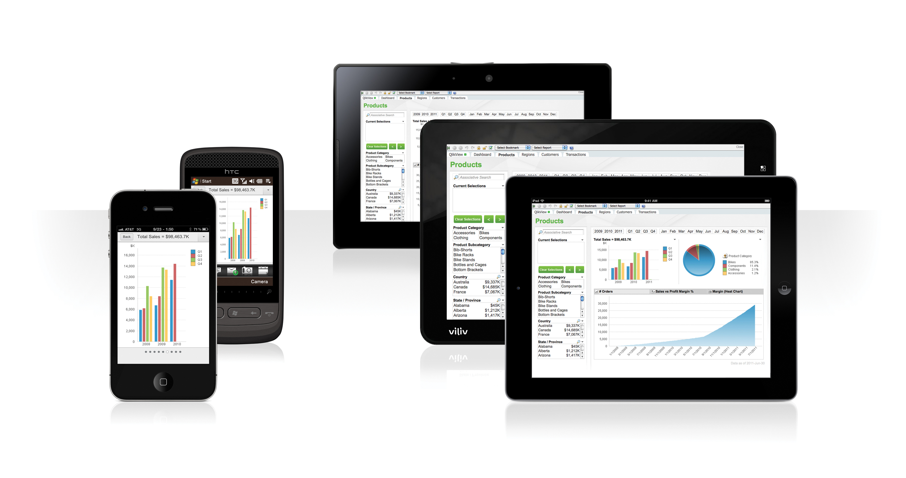
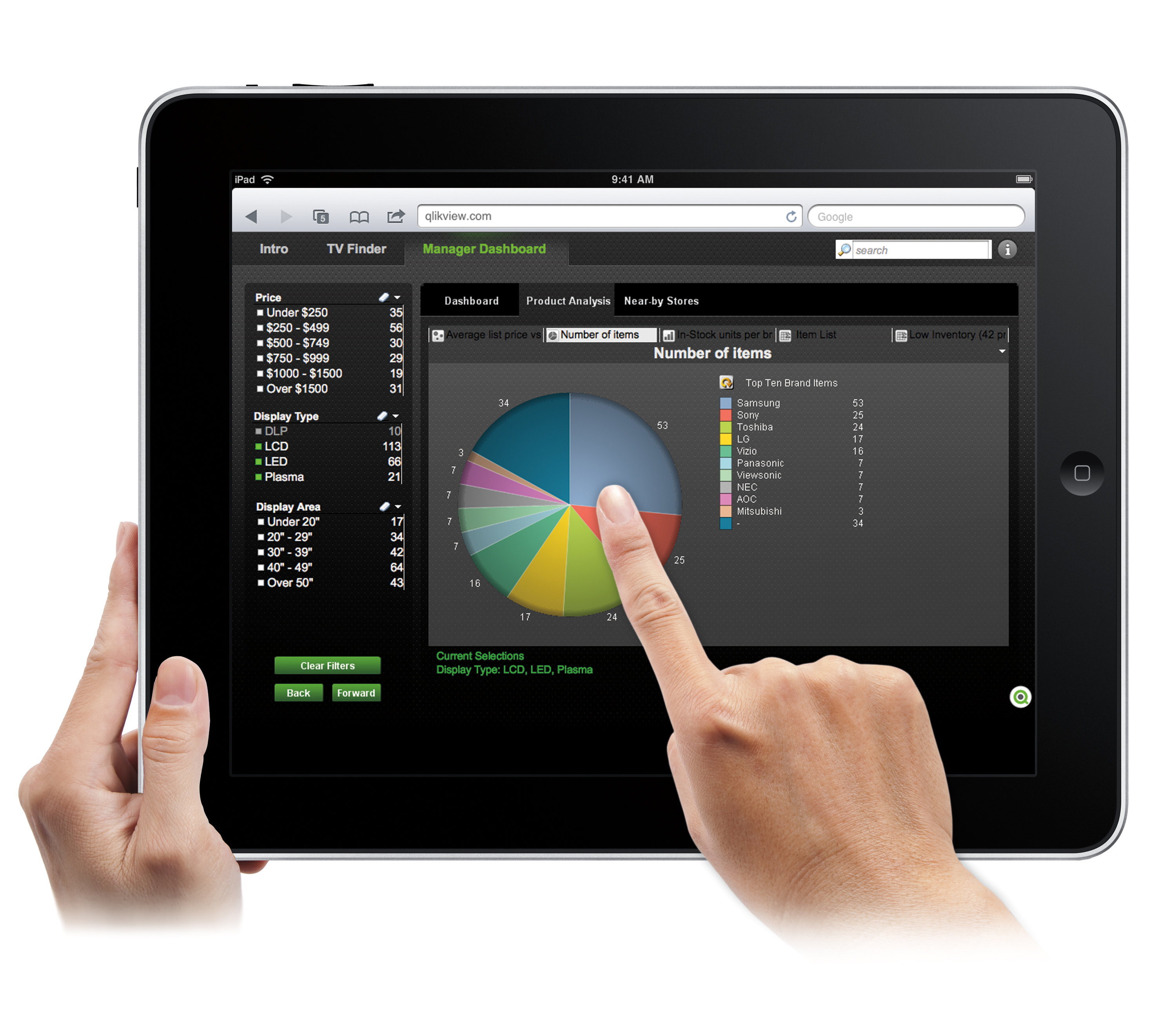
QlikView® is Qlik®’s original BI offering designed primarily for shared business intelligence reports and data visualizations. It offers guided exploration and discovery, collaborative analytics for sharing insight, and agile development and deployment.
N/A
Pricing
Gephi
QlikView
Editions & Modules
No answers on this topic
QlikView
Custom
per user
Offerings
Pricing Offerings
Gephi
QlikView
Free Trial
No
Yes
Free/Freemium Version
Yes
No
Premium Consulting/Integration Services
No
Yes
Entry-level Setup Fee
No setup fee
Optional
Additional Details
Gephi is open-source and free to use.
On an perpetual license basis, based on server plus number of users.
Contact vendor for pricing.
It is well suited for projects that are more discovery related. If this is a one-time project that we create a visual for, this would definitely make sense to use. If this is an ongoing analysis (monthly for example), we might look to another software that we would be able to automate a little further in how the visualization comes together
A de minimis incentive was given to thank the reviewer for their time. The incentive was not used to bias or drive a particular response, nor was the incentive contingent on a positive endorsement. More Info
Sales data validations have helped manage our justifications in the past, especially with regard to new product development and new business introduction. It has also been helpful in identifying trends with business impact and direction specific to quarter and monthly sales from ERP data as well as decisions to purchase equipment of staffing based on run rates and product demand.
One thing that can get out of hand is data output - if you aren't careful in your query, you may be overloaded with data dumps and drown in the amount of info you have to filter through. This is a user caution, not a comment on the software itself.
A de minimis incentive was given to thank the reviewer for their time. The incentive was not used to bias or drive a particular response, nor was the incentive contingent on a positive endorsement. More Info
In comparison to other tools such as GraphWiz or Circos, Gephi comes with an intuitive, easy-to-use interface that makes it easy to load your data, and quickly start building all sorts of different graphs. There's absolutely no code that needs to be written for either loading or modeling. And without downloading additional plug-ins, Gephi ships with quite a few standard graph models, as well as some "fun" extras such as the Sierpinski triangle, and a variety of force atlas types.
Most of the layout types (maybe all) are highly configurable, which can make for extremely customized and unique displays of your data. Again, none of this requires the user to write any code. That said, it is possible to script custom functionality for your models, or even update the Java source code yourself, if you feel like getting technical. Gephi builds are available on GitHub, and the developers encourage people to contribute ideas, improvements, and plug-ins.
There's a plug-in for Gephi that allows for streaming data to update your model. This essentially allows you to create near realtime graphs of your data in motion. This plug-in was by far the biggest reaston we invested time in the product; to create animated data visualizations without exhaustive hours in development.
A de minimis incentive was given to thank the reviewer for their time. The incentive was not used to bias or drive a particular response, nor was the incentive contingent on a positive endorsement. More Info
I (and many others) have had to expand Gephi's memory manually by experimenting with the configuration file. I'm glad it's possible, but it should be easier.
Gephi sometimes crashes inexplicably and loses your work, so I have developed a habit of explicitly exporting versions of my graphs as csv's, but I think this should be handled automatically in Gephi.
Because it is prone to crash, ideally, Gephi would help the user manage his/her use, by estimating processing and memory for very large tasks and prompting the user to confirm their requests before executing. Instead, I just tend to avoid certain functions.
We found that QlikView can be a bit slow in supporting some forms of encryption. It is web-based and we needed to upgrade all of our server to not support the older SSL and TLS 1 protocols, only support TLS 1.2 and TLS 1.3. However, QlikView could not run with TLS 1.2 and TLS 1.3. We had to wait over six months to get a version that would handle the newer TLS versions.
There are so many options with QlikView that you can get lost when developing a visualization. There are still items I have not yet figured out, such as labeling a graph with the name of a selected detail item.
QlikView works by pulling the data it is going to use for visualization into its database. I am a security reviewer and I need to make certain that PII and PHI is not pulled by QlikView for a visualization, otherwise this could become a reportable indecent.
A de minimis incentive was given to thank the reviewer for their time. The incentive was not used to bias or drive a particular response, nor was the incentive contingent on a positive endorsement. More Info
While Gephi isn't perfect, it's a powerful tool for mathematical graph modelling that's hard to find in other products, particularly by way of its interface. It grants non-software developers access to a point-and-click way of creating accurate, beautiful visualizations that would normally take hours in other applications. The fact that it allows for live streaming data is also something that's hard to come by, at least for visualization software
Ease of use, ability to load from pretty much any data source. today I created an application that loaded time sheets from excel that are not in a table format. With Qlik's "enable transformation steps" I was able to automate loads of multiple spreadsheets and multiple tabs easily. Could not do that with any other tool.
A de minimis incentive was given to thank the reviewer for their time. The incentive was not used to bias or drive a particular response, nor was the incentive contingent on a positive endorsement. More Info
Gephi is very intuitive and the fact that it shows its process helps the user understand what's going on. However, the animation features can really slow it down and there isn't a way to shut them off. Furthermore, the failures on saving mean you frequently have to start over. These problems disrupt the workflow and can be frustrating.
QlikView is very easy to implement. The installation is very straight forward. QlikView has several different data connectors that can connect to different data sources very smoothly. The user interface to build the reports is very easy to understand. This helps to have a smaller learning curve. Something very helpful is that QlikView is a browser application for the end users. So, you don't need to install any applications on the user's computer.
A de minimis incentive was given to thank the reviewer for their time. The incentive was not used to bias or drive a particular response, nor was the incentive contingent on a positive endorsement. More Info
My experience with the Qlik support team has been somewhat limited, but every interaction I have had with them has been very professional and I received a response quickly. Typically if there is a technical issue, our IT team will follow up. My inquiries are specific to product functionality, and Qlik has been very helpful in clarifying any questions I might have.
A de minimis incentive was given to thank the reviewer for their time. The incentive was not used to bias or drive a particular response, nor was the incentive contingent on a positive endorsement. More Info
My team attended, but I cannot myself rate, but I think it was good as they've successfully launched a training program at our company themselves for users. It was 3-4 day training.
Training was as expected. The demo environments tend to be more fully featured that our own environment, but the training was clear and well delivered.
"Implementation" can mean a few things... so I'm not sure that this is the answer you want.... but here it goes: To me, implementation means: "Is the user interface intuitive and can I produce meaningful reports with ease?" On that score, I'd say YES. The amount of training required was minimal and the results were powerful. The desktop implementation is a simple, "blank" interface just waiting for your creativity. The pre-populated templates give you a reasonable start to any project -- and a good set of objects to "play around with" if you're just getting started. Finally, note that the "implementation" I used was baked into QuickBooks 2016 Enterprise -- called "Advanced Reporting"..... That integration makes it ultra useful and simple.
A de minimis incentive was given to thank the reviewer for their time. The incentive was not used to bias or drive a particular response, nor was the incentive contingent on a positive endorsement. More Info
The interactivity in Gephi and the quality of the output figures are impressive. However, the selling point was the fact that we were able to link Gephi into our pipeline using Java's interface. Other products were less customizable and lacking of the sophistication Gephi provided without too much pain during the liking process.
A de minimis incentive was given to thank the reviewer for their time. The incentive was not used to bias or drive a particular response, nor was the incentive contingent on a positive endorsement. More Info
The only other vendor product that I have worked with that provides a similar experience to Qlikview is Tableau. I would recommend Tableau if your use case is to build a fixed dashboard. You can share reports for free without needing to buy additional licenses. I would recommend Qlikview if your users are looking for a more interactive experience. They can create new objects to represent the data which can't be accomplished as easily in Tableau
A de minimis incentive was given to thank the reviewer for their time. The incentive was not used to bias or drive a particular response, nor was the incentive contingent on a positive endorsement. More Info
I have only used the product for education purposes. I will not be the best person to provide details about ROI and business efficiency and customer service. I was personally very excited about the tool and am continuing my work on the tool.
You can use the free desktop version to do a lot of reporting and analysis work more quickly so the ROI is huge
QlikView is great at finding outliers such as data entry errors
QlikView is great at helping you quickly discover new insights about your business that can prompt you to take action that can immediately affect your cash flow.
A de minimis incentive was given to thank the reviewer for their time. The incentive was not used to bias or drive a particular response, nor was the incentive contingent on a positive endorsement. More Info