Google Charts vs. Qlik Cloud Analytics (Qlik Sense)
Google Charts vs. Qlik Cloud Analytics (Qlik Sense)
| Product | Rating | Most Used By | Product Summary | Starting Price |
|---|---|---|---|---|
 Google Charts | N/A | Google Charts provides a way to visualize data on your website - for free. From simple line charts to complex hierarchical tree maps, the chart gallery provides a large number of ready-to-use chart types. The most common way to use Google Charts is with simple JavaScript that you embed in your web page. | N/A | |
 Qlik Cloud Analytics (Qlik Sense) | N/A | Qlik Sense® is a self-service BI platform for data discovery and visualization. It supports a full range of analytics use cases—data governance, pixel-perfect reporting, and collaboration. Its Associative Engine indexes and connects relationships between data points for creating actionable insights. | $200 per month |
| Google Charts | Qlik Cloud Analytics (Qlik Sense) | |||||||||||||||
|---|---|---|---|---|---|---|---|---|---|---|---|---|---|---|---|---|
| Editions & Modules | No answers on this topic |
| ||||||||||||||
| Offerings |
| |||||||||||||||
| Entry-level Setup Fee | No setup fee | No setup fee | ||||||||||||||
| Additional Details | — | — | ||||||||||||||
| More Pricing Information | ||||||||||||||||
| Google Charts | Qlik Cloud Analytics (Qlik Sense) |
|---|
| Google Charts | Qlik Cloud Analytics (Qlik Sense) | |||||||||||||||||||||
|---|---|---|---|---|---|---|---|---|---|---|---|---|---|---|---|---|---|---|---|---|---|---|
| BI Standard Reporting |
| |||||||||||||||||||||
| Ad-hoc Reporting |
| |||||||||||||||||||||
| Report Output and Scheduling |
| |||||||||||||||||||||
| Data Discovery and Visualization |
| |||||||||||||||||||||
| Access Control and Security |
| |||||||||||||||||||||
| Mobile Capabilities |
| |||||||||||||||||||||
| Application Program Interfaces (APIs) / Embedding |
|
| Google Charts | Qlik Cloud Analytics (Qlik Sense) | |
|---|---|---|
| Small Businesses |  Yellowfin Score 8.7 out of 10 | Yellowfin Score 8.7 out of 10 |
| Medium-sized Companies |  Reveal Score 10.0 out of 10 | Reveal Score 10.0 out of 10 |
| Enterprises |  Kyvos Semantic Layer Score 9.5 out of 10 | Kyvos Semantic Layer Score 9.5 out of 10 |
| All Alternatives | View all alternatives | View all alternatives |
| Google Charts | Qlik Cloud Analytics (Qlik Sense) | |
|---|---|---|
| Likelihood to Recommend | 9.0 (61 ratings) | 8.3 (331 ratings) |
| Likelihood to Renew | 7.3 (8 ratings) | 8.4 (7 ratings) |
| Usability | 9.0 (33 ratings) | 8.3 (14 ratings) |
| Availability | 10.0 (1 ratings) | - (0 ratings) |
| Performance | 5.0 (1 ratings) | - (0 ratings) |
| Support Rating | 8.3 (32 ratings) | 7.3 (9 ratings) |
| In-Person Training | - (0 ratings) | 9.1 (1 ratings) |
| Online Training | 5.0 (1 ratings) | 9.1 (1 ratings) |
| Implementation Rating | 10.0 (1 ratings) | 7.3 (5 ratings) |
| Configurability | 8.0 (1 ratings) | - (0 ratings) |
| Ease of integration | 10.0 (1 ratings) | - (0 ratings) |
| Product Scalability | 8.0 (1 ratings) | - (0 ratings) |
| Vendor post-sale | 10.0 (1 ratings) | 9.1 (1 ratings) |
| Vendor pre-sale | 10.0 (1 ratings) | 9.1 (1 ratings) |
| Google Charts | Qlik Cloud Analytics (Qlik Sense) | |
|---|---|---|
| Likelihood to Recommend |  Google
|  Qlik
 Gustavo Figueroa IT Developer / Engineer |
| Pros | Google
| Qlik
 Victor Ramirez Benitez Sales Support Team Leader Arg |
| Cons | Google
 Sarah Bandy Executive Director | Qlik
 Anjum Arora Group ICT Head - Technology & Applications |
| Likelihood to Renew | Google
 Daniel Ma Web Developer | Qlik
|
| Usability | Google
| Qlik
 Manjul Malhotra Product Consultant |
| Reliability and Availability | Google
| Qlik No answers on this topic |
| Performance | Google
| Qlik No answers on this topic |
| Support Rating | Google
 Alexander Cooper RPA Developer | Qlik
|
| In-Person Training | Google No answers on this topic | Qlik
|
| Online Training | Google
| Qlik
|
| Implementation Rating | Google
| Qlik
 Mohan Suswaram Enterprise Data Architect |
| Alternatives Considered | Google
| Qlik
 Lucy Daniell Senior Business Analyst |
| Scalability | Google
| Qlik No answers on this topic |
| Return on Investment | Google
| Qlik
|
| ScreenShots | Qlik Cloud Analytics (Qlik Sense) Screenshots   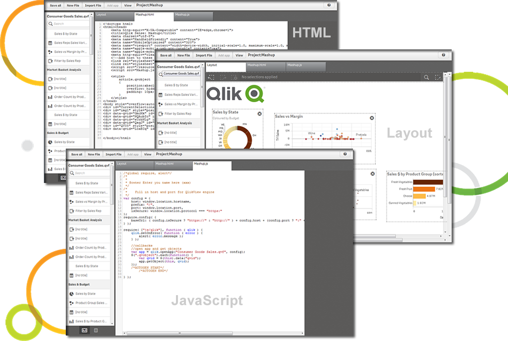   |