Neon CRM is a nonprofit relationship management platform for small and midsize nonprofits, used to make and maintain the personal connections that drive sustainable growth. By centralizing a nonprofit’s data and tools, Neon CRM helps teams save on manual work, deepen relationships with their supporters, and grow their impact. Key Features: Donor Management: Neon CRM provides a 360-degree view of supporters, automatically capturing every…
$99
per month
Tiltify Catalyst
Score8.2 out of 10
N/A
Tiltify Catalyst is a community-driven peer-to-peer fundraising platform designed to help nonprofits turn supporters into active fundraisers and expand donor reach. Built for modern fundraising strategies, Catalyst supports DIY fundraising, team campaigns, fitness challenges, corporate engagement initiatives, livestream fundraising, and large-scale peer-to-peer events. Catalyst prioritizes the volunteer fundraiser experience with built-in engagement tools that…
If you are looking for a quick and easy database option, which integrates breezily with email clients like MailChimp and Constant Contact, and has built-in credit/debit card processing capabilities, NeonCRM is a very good option. An affordable alternative to Salesforce or Raiser's Edge, it does lack some of their "bells and whistles" but gets the job done. On the one hand, Neon features a shallow learning curve and solid user interface, and is web based and mobile friendly. On the other hand, Neon might not be totally appropriate for large or national level organizations because some of the reporting seems less "robust" than pricier alternatives...
A de minimis incentive was given to thank the reviewer for their time. The incentive was not used to bias or drive a particular response, nor was the incentive contingent on a positive endorsement. More Info
I mean, I love having any and all non-profits use Tiltify! From a fundraising standpoint —having all my favorite orgs easily accessible for fundraising across my platforms is SO NICE. That said, I've also worked with orgs that are just getting into the space, and they really struggled with getting set up due to a lack of resources. Yes, I can walk them through everything and encourage the use of all of Tiltify's features, but there isn't a readily available/accessible source to learn what's available to them and how it works.
NeonCRM allows you to build events, take registrations, and customize those events. Customizations include different ticketing options, add-ons, promotions, etc.
NeonCRM does a good job helping you track donors' activities/engagements.
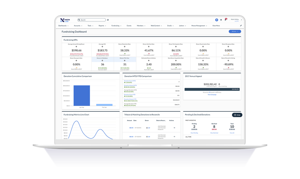
It also provides a variety of reporting mechanisms - from dashboard snapshots to graphical reports - that allow you to review programs at a glance or in-depth.
A de minimis incentive was given to thank the reviewer for their time. The incentive was not used to bias or drive a particular response, nor was the incentive contingent on a positive endorsement. More Info
Learning the ropes is largely accomplished by reading manuals and watching videos. I don't learn that way. I'd much prefer to be shown. I guess I'm old school.
They can be stingy with the customer support. We bought the big package and I still wind up going back to my salesperson to help me cut through any red tape to get what I need.
A de minimis incentive was given to thank the reviewer for their time. The incentive was not used to bias or drive a particular response, nor was the incentive contingent on a positive endorsement. More Info
(1) How Tos for the charity, please! Donors/fundraisers have them available, which we LOVE, but not having a "How Set Up An Event" or "How To Use Your Reporting" for the non-profits, I feel, is a bit of an oversight, as, you know, they're users too!
(2) Event Page Design: Under the Fundraiser Rewards section, there is a tiny corner of pixels that pokes out from behind the "Top 100" or "Raise $200.00" labels, and it BOTHERS ME TO NO END. I understand the labels over the rewards images have curved corners, and the rewards have the hard 90-degree corners, which is why it happened. It's just like when someone goes to erase what's on a whiteboard but leaves a single line in the middle. My current solution has been to just cut that corner off my rewards images prior to upload —anyways, super tiny and just a pet peeve.
(3) Event Page Design: You've given us so many customization options, and I'm not taking those for granted. I would love the option to change the color of the buttons, just as we can change the color of each individual section.
(4) Branding, Social Links: Two things. "Twitter" is still on there (I know it's annoying, but "X"). Would love a "Bluesky" option.
(5) Event Options, Lifetime donor rewards: Is there something we could get for Lifetime Fundraiser rewards?
(6) Reports: When I download the Donations report is has the Date & Time of donation in a single column. I don't know how other people use this report, but I usually have to download the donations, create a new column, delineate the data for date/time, then pivot table from there. Plus, the "time" data we receive is delivered in a way that's borderline unusable. Example: 2023-12-31 07:46:07.667963Z -- *I* know to read this as December 31, 2023 @ 7:46:07 AM , but do we *really* need the ".667963Z" ? All it does is mess up any automated data analysis.
(7) Repots: Could we get a disclaimer at the top of the page that says if you don't toggle the UTC, the reports pulled will be from the time zone of the user pulling them? It took *way* too long to figure out why the report pulled by my colleague in Pacific time was different than the report pulled in Central time.
Neon CRM was difficult and frustrating to use without IT experience, and way to costly for the a small to mid-sized nonprofit. We believe that we lost donors due to the inaccurate report system in Neon CRM
The Neon CRM system is confusing (we had to watch video tutorials and html code to understand many of the features, many of which we did not need). Around 2022, Neon started to go downhill. Bells and whistles were added that were of no benefit (to our nonprofit) and the system became even harder to use
Again, as someone who has been on this platform for a very long time, I find it easy to use. Where I find myself mostly having issues: Navigation. I have built out 40+ events & campaigns over the years (both on the fundraiser & charity side) and still find myself getting lost in the language hierarchy and difference between Setup/Event detail/Brand & marketing/Options (like those all feel semantically the same??).
As stated before, they push you to read the manual or watch the video when what I want is a human being to walk/talk me through it. Like I said, maybe I am old school but that's how I learn. It's been a challenge.
A de minimis incentive was given to thank the reviewer for their time. The incentive was not used to bias or drive a particular response, nor was the incentive contingent on a positive endorsement. More Info
It works. It's easy to customize for nonprofit and industry-specific categories. It does what it does well, and integrates with platforms that specialize in those areas rather than trying to be everything to all users.
A de minimis incentive was given to thank the reviewer for their time. The incentive was not used to bias or drive a particular response, nor was the incentive contingent on a positive endorsement. More Info
A de minimis incentive was given to thank the reviewer for their time. The incentive was not used to bias or drive a particular response, nor was the incentive contingent on a positive endorsement. More Info