Displayr is a survey data discovery and visualization tool, with free tools for publishing dashboards, reports and infographics (e.g. charts, and graphs) to the web or other repositories for sharing and demonstration, as well as support for analysis of large datasets (more than 1,000 rows and 100 column) on paid plans.
N/A
GoodData.AI
Score 8.9 out of 10
N/A
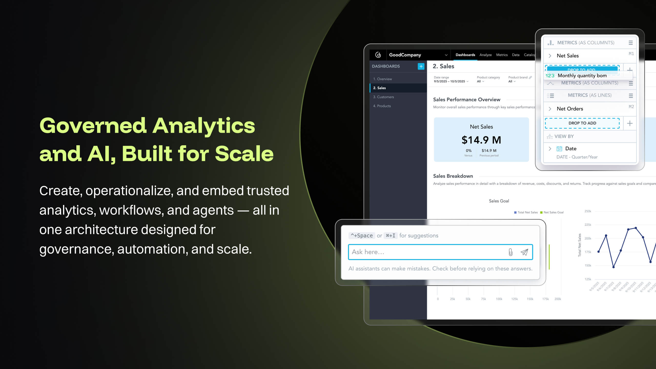
GoodData is an analytics platform used by organizations to deliver real-time, governed insights, embedded into products, customized for users, and integrated into any data environment.
Displayr is perfectly suited for any insights or data people that understand the type of analysis they want to do, but don't know R code - or just want to get to results more quickly than coding themselves. It's probably not the best learning ground, if you've never done any quantitative analysis before, but then neither are traditional tools like SPSS or Q.
GoodData is well suited for classic business intelligence and data analytics solution involving visually driven content using charts and graphs. It's rich collection and drillable interactions make it perfect for embedded analytics where application workflow is tied to analytics. However, GoodData may not be ideal or appropriate for such solutions that require lot of textual content to be displayed with the help of tabular visuals, particularly in regulated industries where the key is in the details. This is all tied to the platform limits that force the default layout to pre-filter
The intuitive interface and menus make it easy to quickly learn Displayr and find the types of data transformation or analysis that we're looking to do.
The support level from Displayr's team is FIRST CLASS. Where othe platforms force you to an FAQ or AI chat bot, Displayr's team will jump in first hand, into our data, or on a live call, and help us run a new type of analysis or troubleshoot a problem.
The ability to work collaboratively, asynchronously and remotely, on the same data set and report is a really huge plus for us.
The in-built options for multivariate analysis cover 99.9% of anything we have - or will - ever need to run.
GoodData provides advanced analytics for predictive modeling. This assists in identifying potential issues before they arise, and making proactive decisions.
GoodData prioritizes data security and compliance, providing features that help IT firms like ours adhere to regulatory requirements.
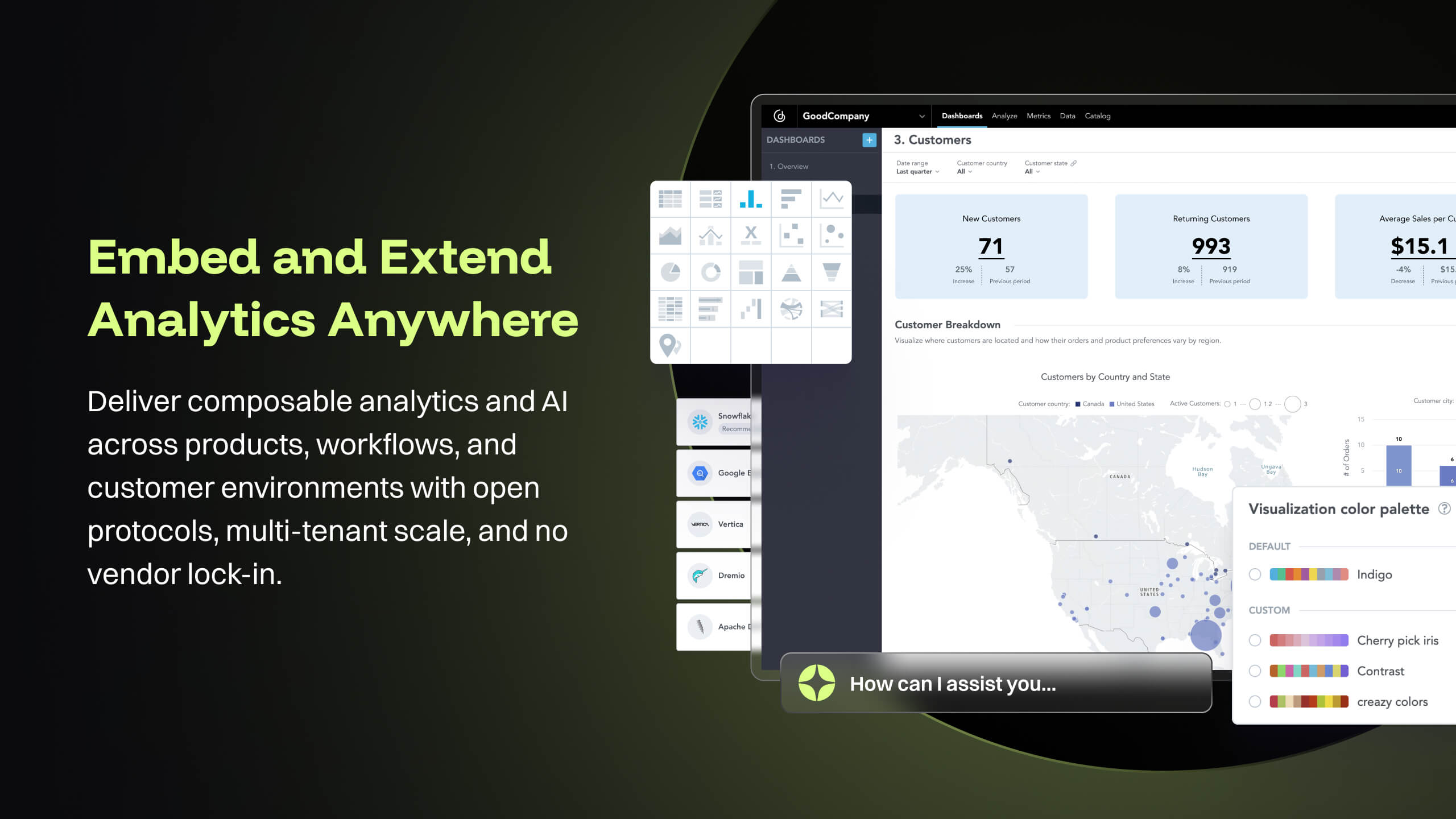
GoodData gives high customization dashboards, allows us professionals to create tailored view of KPI.
The new "glow-up" on the interface has helped make it a bit easier on the eye, but there are some features of working in the "three pane" browser that are a bit frustrating: especially having to 'rearrange' when resizing the window to look at another app simultaneously.
Such a small point, but being able to drag and move multiple elements in a table (eg drag two rows to the top) SIMULTANEOUSLY would help a bunch.
I don't think we take advantage of all the visualisation capabilities in Displayr, and perhaps an AI 'recommendation' engine that sees the data I'm working with and prompts either a specific visualisation, or additional analysis option I might use, would be great.
Good Data is already have certain customizable options. However, having more flexibility in customizing reports and dashboards & control over the visual aspects would enhance the overall user experience.
To make Good Data even more powerful tool, improving the speed and responsiveness of the tool, especially during data-intensive tasks, would be a significantly helpful.
For new users, the interface can be made more user friendly which would promote easy navigation through features of tool.
Because gooddata really helps us in processing data to make reports or dashboards. So we are very satisfied when we use it. What we like is the flexible use of charts. We change at will the use of charts to display in reports or dashboards. Thank you Gooddata for helping companies like us who need flexibility in usage
It's really quite intuitive, but the visual interface could be made a bit more easy to use (window/pane rescaling etc) and I think there could be more 'proactive prompts' to suggest features we're underutilising.
From a customer perspective it is incredibly usable. We have more users building their own reports that would normally need custom work from our support team. The back end can be daunting when trying to configure things like new data elements or push changes to a report to all existing customers.
Support team has been highly responsive and helpful from our first initial deployment to present day. They engage and work with us. know when to escalate for more challenging problems. They also follow up. Overall have had a very good experience with support
Implementations are hard and we had limited technical resources. We relied too heavily on GD care team. When we found technical gaps, they weren't simple to overcome
SPSS (the last version I looked at) still requires much more underlying knowledge and coding ability to get where we want to be. That's not where we add value, so the speed and simplicity with which Displayr allows us to get the data analysis done, and move onto developing insight and delivering value is why I chose Displayr.
GoodData comparing to other platform is very easy to use, customer support and on-boarding support. Set of features, speed of integration in our platform. Also great benefit for us was very competetive pricing.
I think Displayr is quite expensive, but has the biggest impact on our P&L of any of our subscriptions, because it has unlocked our ability to deliver bigger, more complex analytic projects for clients - and hence grow our topline.
The ability to scale the license between years has also been a god-send as our team has gone up or down to deliver the level of quant work available to us.
There's also a bottom line efficiency driven by some of the speed of analysis that Displayr enables.