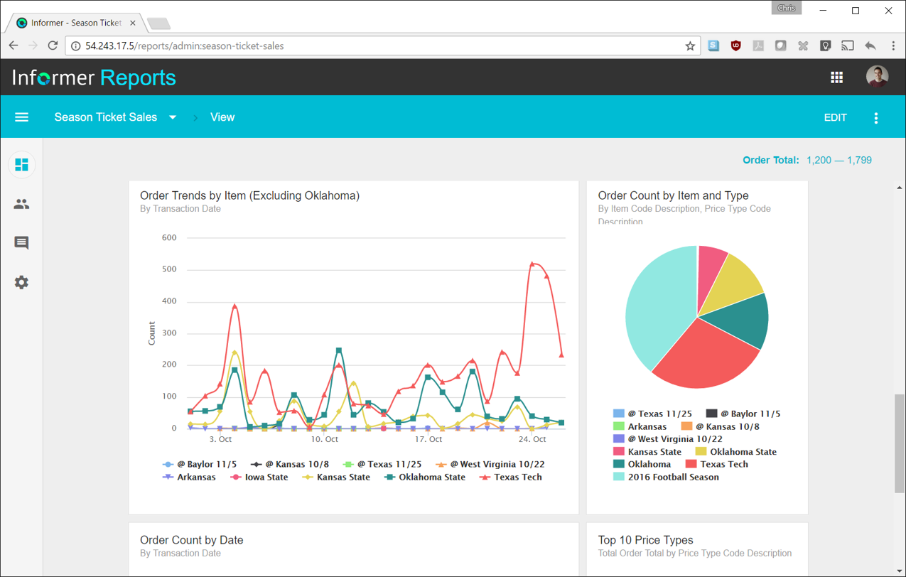
Entrinsik Informer is a web-based reporting and business intelligence application popular in the higher education vertical market. It helps organizations transform real-time data into actionable information by delivering ad-hoc reporting, data analysis, and interactive dashboards.
N/A
Google Charts
Score8.2 out of 10
N/A
Google Charts provides a way to visualize data on your website - for free. From simple line charts to complex hierarchical tree maps, the chart gallery provides a large number of ready-to-use chart types. The most common way to use Google Charts is with simple JavaScript that you embed in your web page.
It makes creating queries very easy for end users so not only research or technicians can do it. The availability for creating Live reports that are accessible via Excel on the network has given many of our users the ability to get the information they need in a format they can use without needing someone to translate the raw data
A de minimis incentive was given to thank the reviewer for their time. The incentive was not used to bias or drive a particular response, nor was the incentive contingent on a positive endorsement. More Info
We can easily recommend Google Charts to any company that needs a way to visually represent their data. Another great thing about Google Charts is that it is free to use and does not require any membership fees. Although it requires a skilled used to be able to use the charts, the results are great and can be beneficial to any company who is looking to make better decisions.
Simple user-interface: Informer is relatively easy to learn and end users can begin running reports and creating new reports quickly.
Email "burst" functionality: This feature allows emails to be sent out based on data in the report. So for example, a report could be scheduled that would email all student employment managers listing out the specific employees that report to them that haven't submitted their time sheets. Each manager would only see the rows that correspond to their email address.
Analytics and grouping: Users can quickly drag columns to group and sub-total, and can use the analytics tab to get deeper insights into the data.
A de minimis incentive was given to thank the reviewer for their time. The incentive was not used to bias or drive a particular response, nor was the incentive contingent on a positive endorsement. More Info
they're free with Google suite and they have backing in terms of powerful Google apps which can be plugged in to perform multiple actions like using Google sheets to import raw data into Google Charts
they're the most simple app to use when it comes to creating charts and visual dashboards
ease of customization
ease of using custom APIs from developers side to help make any types of charts and dashboards you want
A de minimis incentive was given to thank the reviewer for their time. The incentive was not used to bias or drive a particular response, nor was the incentive contingent on a positive endorsement. More Info
There are a lot of reports that we have in Informer that say they have never been run, even though I know they have been run. So that makes it really difficult to determine which reports can be deleted to keep a tidy report list.
The only other complaint I have about Informer is that there doesn't seem to be a properly detailed error code/message when the student information system can't be accessed. For example, I am currently trying to move Informer to its own standalone server and I get an error message saying that our license isn't valid. Informer Support sent a new license, which prompted the same message, and the only explanation they have given me is that Informer can't reach the student information system. I would think that if that were the case, the error message would say that instead of an invalid license.
A de minimis incentive was given to thank the reviewer for their time. The incentive was not used to bias or drive a particular response, nor was the incentive contingent on a positive endorsement. More Info
I would like a couple more introductory videos or a live chat option for when you run into an issue. I think this is a Google-wide problem, not only linked to Google Charts.
I have run into some issues with the Dynamic Data but also admittedly could potentially dive in deeper and investigate.
It would be great if Google Charts made it possible to integrate Google Chat into the platform.
A de minimis incentive was given to thank the reviewer for their time. The incentive was not used to bias or drive a particular response, nor was the incentive contingent on a positive endorsement. More Info
Informer has been handily meeting most of our reporting needs, and we've created a library of hundreds of reports that are used every day. They have a terrific support service to help when you have questions, and I've found them to be great at listening to what customers would like and adding new features. They are a small company that really listens and really cares, and I've been very pleased over the past few years getting to know them.
Google Charts is a good product. It's widely supported with deep documentation and a large community. But for me, it wasn't customizable enough. When we started with simple charts, it was great, but as we got deeper and more complex, our needs outgrew the library. If I was going forward, I would choose a more barebones library with more freedom and extensibility.
A de minimis incentive was given to thank the reviewer for their time. The incentive was not used to bias or drive a particular response, nor was the incentive contingent on a positive endorsement. More Info
From the perspective of the new user and a seasoned user I would say eight would represent both parties. It presents a 'familiar' interface and easy to navigate display. Tagging is quite nice and allows for organization of reports based on those tags. These have to be monitored like anything else to keep them consistent but provides a better than average means of organizing reports.
Google Charts is about as easy to use as the rest of their applications. The UI is very well thought out, allowing you to add what you need, and customize it to your exact liking. The default theme is actually really nice, which helps as most of the time, customizing is not needed.
A de minimis incentive was given to thank the reviewer for their time. The incentive was not used to bias or drive a particular response, nor was the incentive contingent on a positive endorsement. More Info
Always able to get acceptable solutions in reasonable time from friendly support staff. Initial contact is always with knowledgeable person - not someone reading from a script trying to screen calls. Thanks Entrinsik for being in tune with my needs.
A de minimis incentive was given to thank the reviewer for their time. The incentive was not used to bias or drive a particular response, nor was the incentive contingent on a positive endorsement. More Info
As a free tool with massively powerful, infinitely customisable charts that can be dynamically updated - Google Charts is my favourite data visualisation tool. However, my hatred of JavaScript does jade my view on it. This is the price of the tool though, and I'm glad it's available for me.
A de minimis incentive was given to thank the reviewer for their time. The incentive was not used to bias or drive a particular response, nor was the incentive contingent on a positive endorsement. More Info
We bought the product on a Thursday morning, and we were writing reports on Friday afternoon. We did take about a month to manage the Mapping, Linking and Security to allow us to open it up across campus. We are now mapping from as many third-party vendors as we can to enable the creation of more ad-hoc reporting.
I have experience with Advizor AnalystX, and it was just awful. It is advertised as an interactive reporting tool, in which you can use your mouse to select and segment constituents by where they live (by clicking on a map), how much they've given to your institution, when they last gave, etc. In practice, their map feature was unusable; it's a static map image (imagine a paper map hung on your wall), rather than draggable and zoomable Google Maps, and it required hours of work to configure one map region. As far as computing constituents' giving statistics, it required way too much back-end work to build simple giving totals.
A de minimis incentive was given to thank the reviewer for their time. The incentive was not used to bias or drive a particular response, nor was the incentive contingent on a positive endorsement. More Info
Google Charts stacks up better since it is free and does not have the constant pressure for cost overruns, add-ons, annual maintenance and implementation services. The speed of using Google Charts is quick, saving users potentially weeks in getting up and going. For the readers of websites with limited resources, the application shows up nicely is look and feel with charts. Great way of showing data visually.
A de minimis incentive was given to thank the reviewer for their time. The incentive was not used to bias or drive a particular response, nor was the incentive contingent on a positive endorsement. More Info
We have definitely improved customer service due to better reporting using Informer. All departments are better empowered to help our students in a more timely and accurate manner.
Using Informer has given us the ability to eliminate functionality within our ERP system and offload reporting to a data store instead of the transactional system. This has resulted in successfully upgrading our core systems and improved response times.
A de minimis incentive was given to thank the reviewer for their time. The incentive was not used to bias or drive a particular response, nor was the incentive contingent on a positive endorsement. More Info