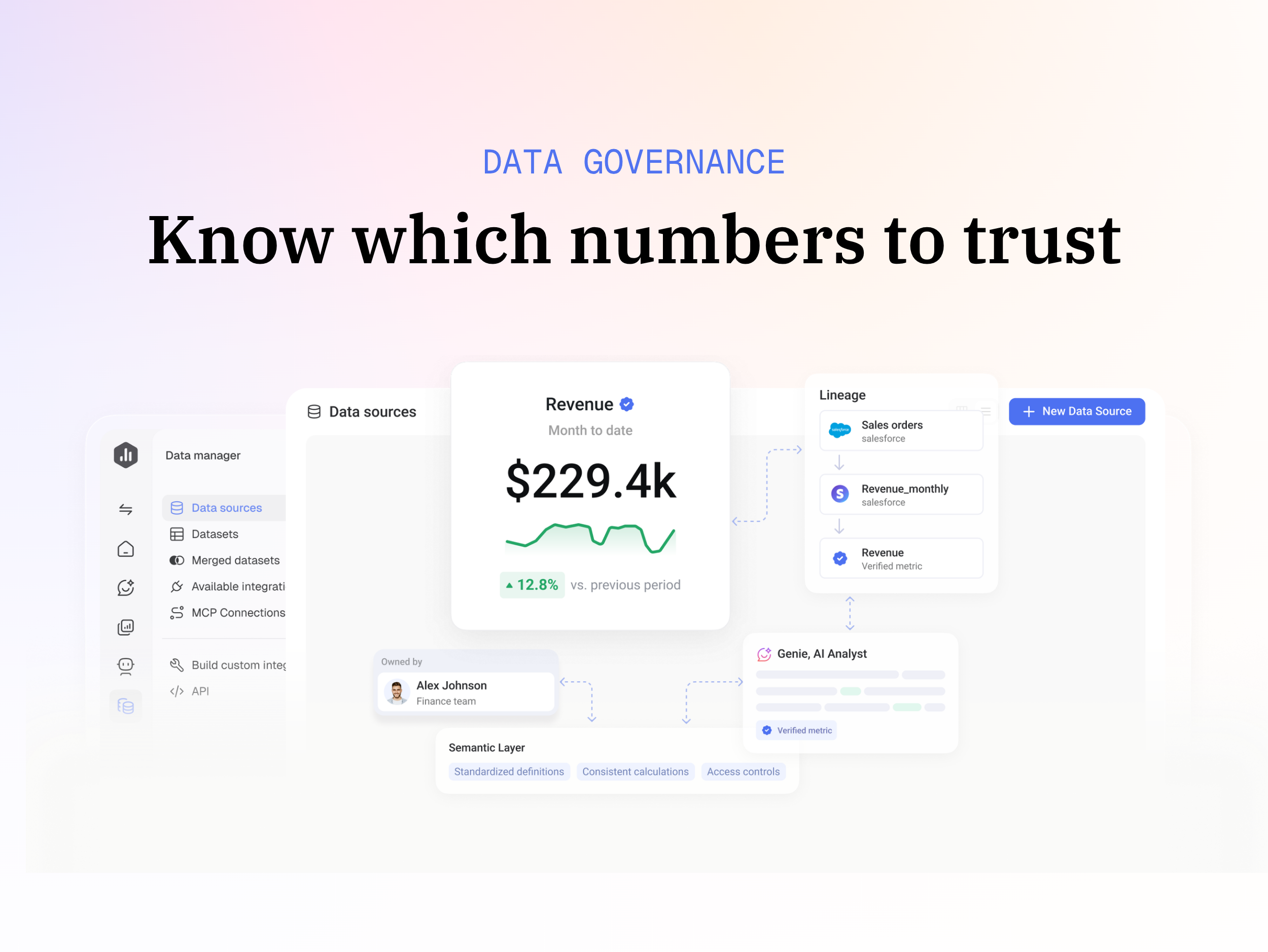
Databox is business intelligence software built for teams that need fast, actionable insights.
$79
per month
Plotly Chart Studio
Score8 out of 10
N/A
Plotly headquartered in Montreal offers Chart Studio, a data visualization tool with an open source and free cloud editions, as well as enterprise editions deployable on-cloud or on-premise. The vendor describes Chart Studio as a sophisticated editor for creating D3.js and WebGL charts.
$99
per month
Pricing
Databox
Plotly Chart Studio
Editions & Modules
Free
$0
1 user, 3 data sources & 50 AI credits/mo included
Analyst
$89
per month 1 user, 5 data sources & 150 AI credits/mo included
Team
$249
per month 3 users, 10 data sources & 500 AI credits/mo included
Agency
Starting at $99
per month 4 clients, unlimited users, 20 data sources & 300 AI credits/mo included
Custom
Contact us
More users, More data sources, More AI credits/mo, We optimize it as your needs
Private Hosting
$99.00
per month
Offerings
Pricing Offerings
Databox
Plotly Chart Studio
Free Trial
Yes
No
Free/Freemium Version
Yes
No
Premium Consulting/Integration Services
Yes
No
Entry-level Setup Fee
No setup fee
No setup fee
Additional Details
20% discount for annual pricing.
—
More Pricing Information
Features
Databox
Plotly Chart Studio
BI Standard Reporting
Comparison of BI Standard Reporting features of Databox and Plotly Chart Studio
Feature
Databox
9.3
8 Ratings
13% above category average
Plotly Chart Studio
8.0
1 Ratings
1% below category average
Pixel Perfect reports
10.05 Ratings
8.01 Ratings
Customizable dashboards
8.98 Ratings
00 Ratings
Report Formatting Templates
8.98 Ratings
00 Ratings
Ad-hoc Reporting
Comparison of Ad-hoc Reporting features of Databox and Plotly Chart Studio
Feature
Databox
8.6
8 Ratings
7% above category average
Plotly Chart Studio
9.0
1 Ratings
14% above category average
Drill-down analysis
8.06 Ratings
00 Ratings
Formatting capabilities
8.98 Ratings
00 Ratings
Integration with R or other statistical packages
7.93 Ratings
9.01 Ratings
Report sharing and collaboration
9.48 Ratings
00 Ratings
Report Output and Scheduling
Comparison of Report Output and Scheduling features of Databox and Plotly Chart Studio
Feature
Databox
8.3
8 Ratings
1% above category average
Plotly Chart Studio
-
Ratings
Publish to Web
8.96 Ratings
00 Ratings
Publish to PDF
8.97 Ratings
00 Ratings
Report Versioning
7.74 Ratings
00 Ratings
Report Delivery Scheduling
8.98 Ratings
00 Ratings
Delivery to Remote Servers
7.13 Ratings
00 Ratings
Data Discovery and Visualization
Comparison of Data Discovery and Visualization features of Databox and Plotly Chart Studio
I believe Databox can be an asset for any company. We are a small company, but I can see the value for large companies too. Databox is a great fit for departments or organizations that need to put their data into a readable form without needing a ton of reports. Databox allows you to save time and put together a nice report without having to do too much extra work. Once it is set up, it basically runs on its own at the frequency you set. I personally receive a daily report and have it sent to the respective people on the day of our meeting so we can quickly review it.
A de minimis incentive was given to thank the reviewer for their time. The incentive was not used to bias or drive a particular response, nor was the incentive contingent on a positive endorsement. More Info
[Plotly Chart Studio is] a great tool to make visualizations on a web based portal. For python developers, it can ease of some burden of writing code again and again for the same thing and also refreshing visualizations on old scripts when data changes. All in all, a simple yet effective tool for your report generation and visualization needs[.]
A de minimis incentive was given to thank the reviewer for their time. The incentive was not used to bias or drive a particular response, nor was the incentive contingent on a positive endorsement. More Info
A de minimis incentive was given to thank the reviewer for their time. The incentive was not used to bias or drive a particular response, nor was the incentive contingent on a positive endorsement. More Info
A de minimis incentive was given to thank the reviewer for their time. The incentive was not used to bias or drive a particular response, nor was the incentive contingent on a positive endorsement. More Info
Some types of data can only be reported on for 1-2 months back. Unless I'm misunderstanding the function of the software this seems really weird. I can't figure out how to report on Activities more than 2 months ago
A de minimis incentive was given to thank the reviewer for their time. The incentive was not used to bias or drive a particular response, nor was the incentive contingent on a positive endorsement. More Info
A de minimis incentive was given to thank the reviewer for their time. The incentive was not used to bias or drive a particular response, nor was the incentive contingent on a positive endorsement. More Info
Databox is an intuitive, well-designed platform that can be used by non-technical marketers. It is easy to learn, and while set up takes time, usability is high and the team has enjoyed creating custom dashboards and clients have also given us great feedback regarding its usability and value. While other BI tools are much more complex to navigate, Databox is a breeze.
A de minimis incentive was given to thank the reviewer for their time. The incentive was not used to bias or drive a particular response, nor was the incentive contingent on a positive endorsement. More Info
I have really enjoyed using Databox and have seen the value of it in many ways. They also continue to improve the functions of it and grow their integrations and templates. I look forward to continuing to use Databox in the future, potentially even finding ways to incorporate it into other departments to help them with reporting as well.
A de minimis incentive was given to thank the reviewer for their time. The incentive was not used to bias or drive a particular response, nor was the incentive contingent on a positive endorsement. More Info
Databox is unique in its ability to report from multiple data sources. Google Analytics is the standard when it comes to web metrics, but it's just one of the tools that integrates with Databox. Tableau is fantastic for data visualizations and reporting, but it's much more expensive than Databox, so it's not ideal for everyone. Tableau is also superior with customization
A de minimis incentive was given to thank the reviewer for their time. The incentive was not used to bias or drive a particular response, nor was the incentive contingent on a positive endorsement. More Info
A de minimis incentive was given to thank the reviewer for their time. The incentive was not used to bias or drive a particular response, nor was the incentive contingent on a positive endorsement. More Info
A de minimis incentive was given to thank the reviewer for their time. The incentive was not used to bias or drive a particular response, nor was the incentive contingent on a positive endorsement. More Info
A de minimis incentive was given to thank the reviewer for their time. The incentive was not used to bias or drive a particular response, nor was the incentive contingent on a positive endorsement. More Info