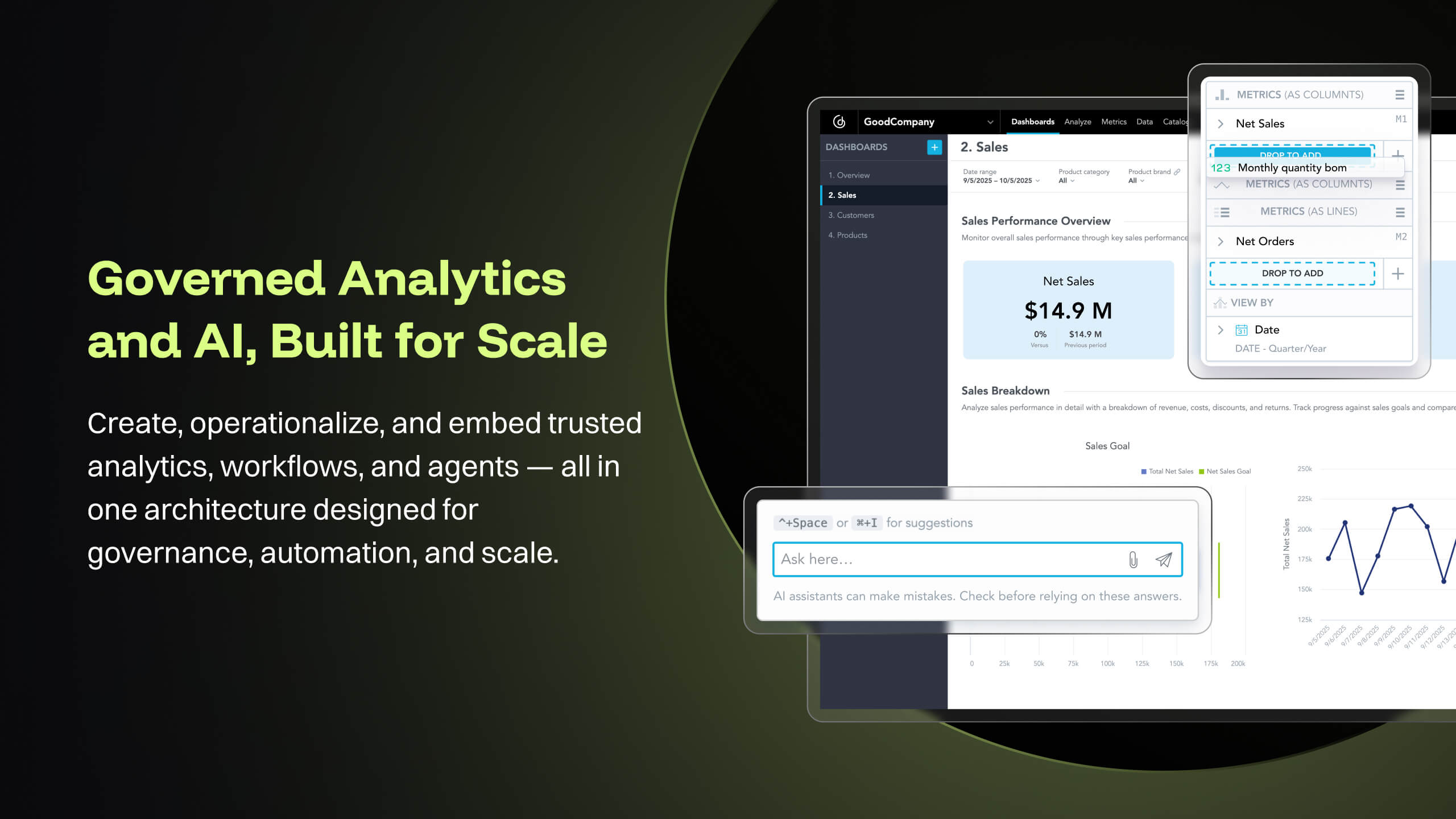
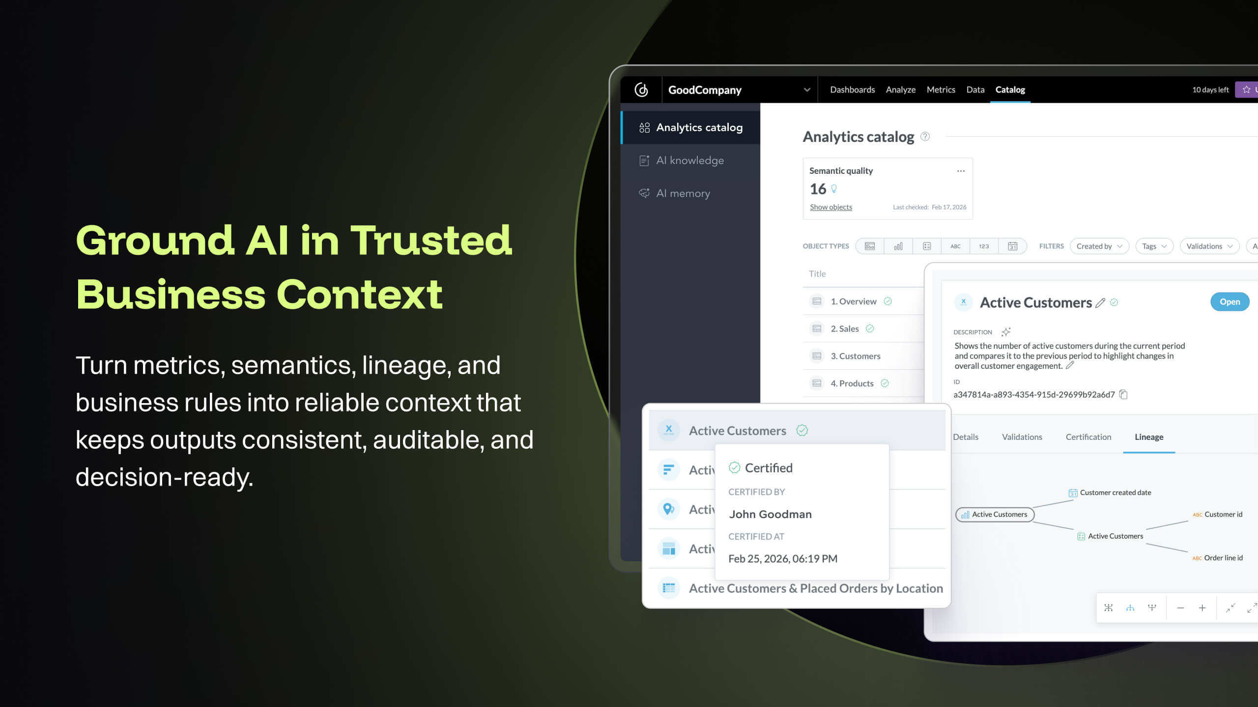
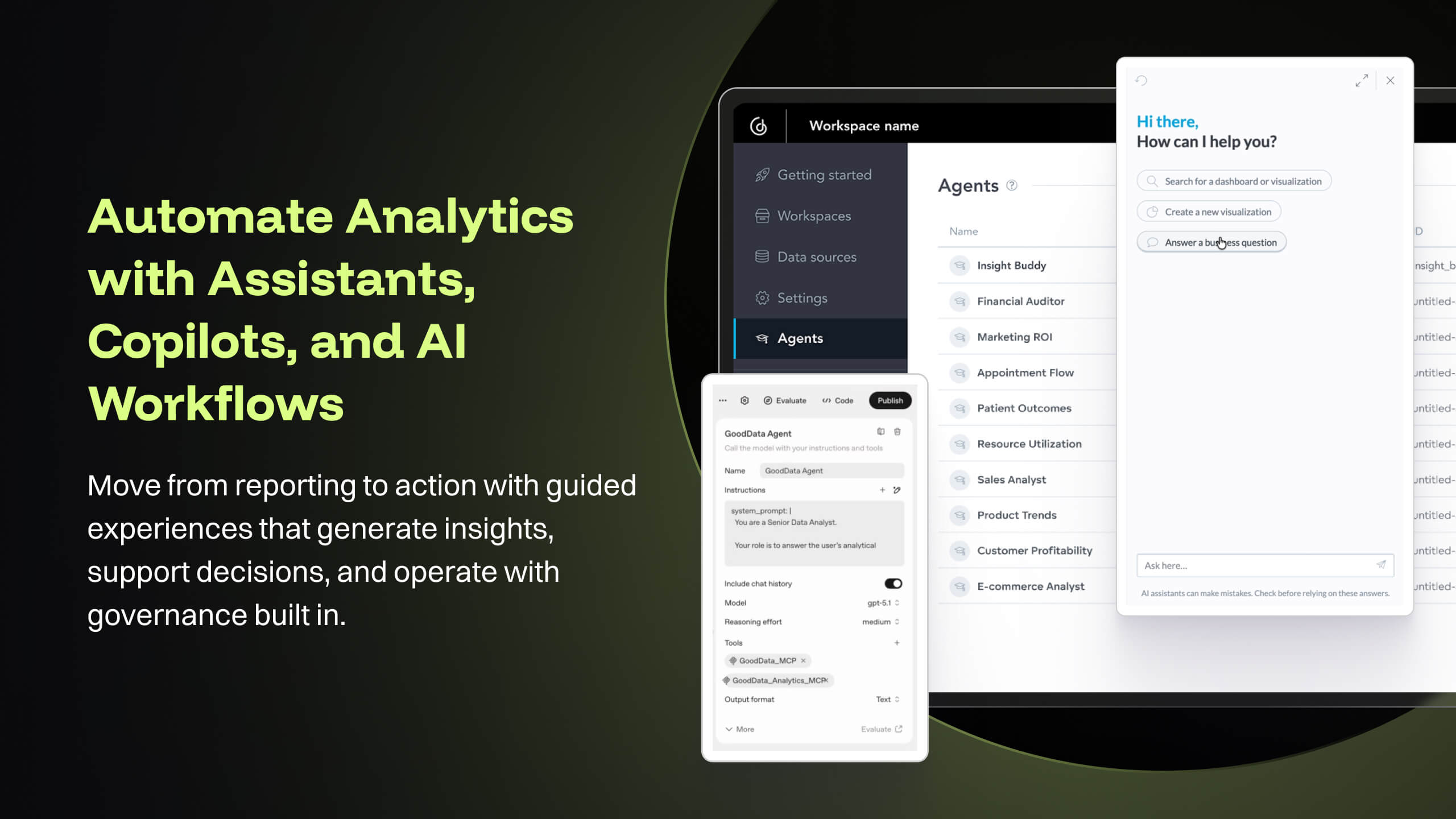
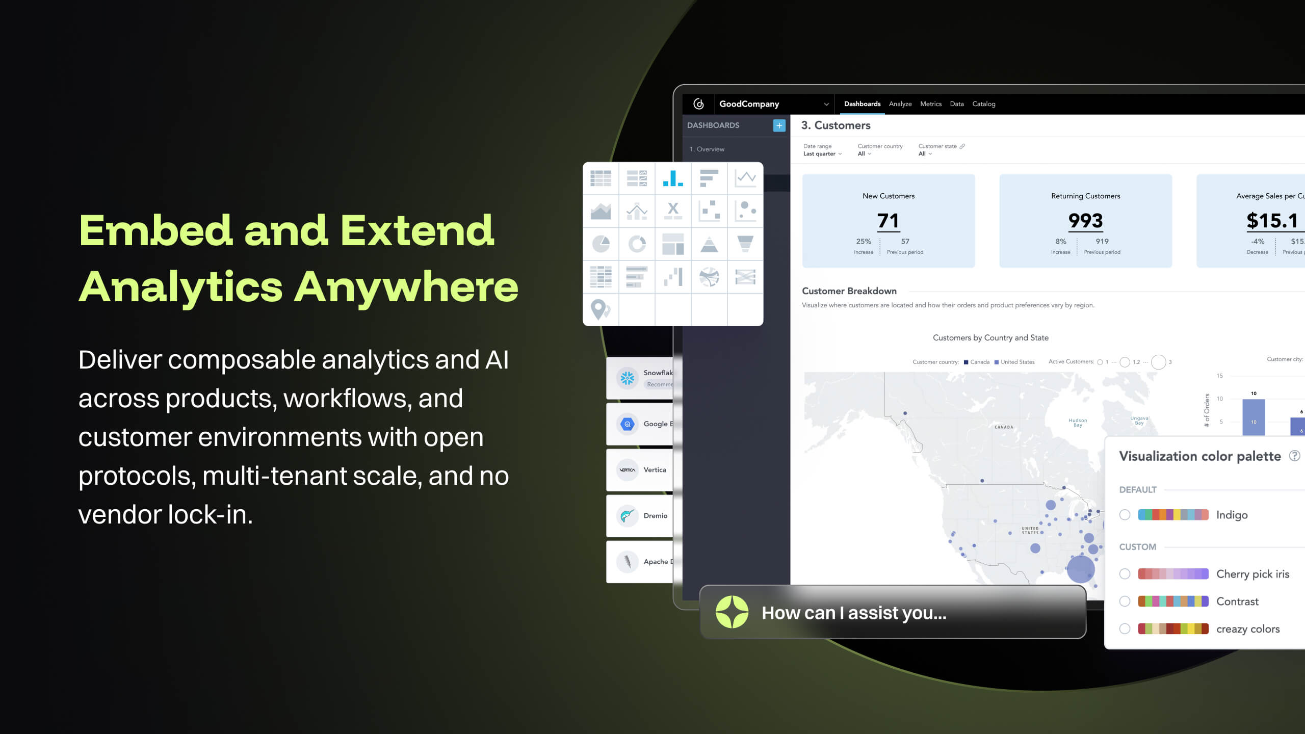
GoodData is an analytics platform used by organizations to deliver real-time, governed insights, embedded into products, customized for users, and integrated into any data environment.
It is well suited for projects that are more discovery related. If this is a one-time project that we create a visual for, this would definitely make sense to use. If this is an ongoing analysis (monthly for example), we might look to another software that we would be able to automate a little further in how the visualization comes together
A de minimis incentive was given to thank the reviewer for their time. The incentive was not used to bias or drive a particular response, nor was the incentive contingent on a positive endorsement. More Info
I think it works nicely for shops that want the analytical power and are ok to host their own infrastructure for the data and etl. For smaller operations with limited budgets but still high demand for analytical features the math may not work out.
A de minimis incentive was given to thank the reviewer for their time. The incentive was not used to bias or drive a particular response, nor was the incentive contingent on a positive endorsement. More Info
In comparison to other tools such as GraphWiz or Circos, Gephi comes with an intuitive, easy-to-use interface that makes it easy to load your data, and quickly start building all sorts of different graphs. There's absolutely no code that needs to be written for either loading or modeling. And without downloading additional plug-ins, Gephi ships with quite a few standard graph models, as well as some "fun" extras such as the Sierpinski triangle, and a variety of force atlas types.
Most of the layout types (maybe all) are highly configurable, which can make for extremely customized and unique displays of your data. Again, none of this requires the user to write any code. That said, it is possible to script custom functionality for your models, or even update the Java source code yourself, if you feel like getting technical. Gephi builds are available on GitHub, and the developers encourage people to contribute ideas, improvements, and plug-ins.
There's a plug-in for Gephi that allows for streaming data to update your model. This essentially allows you to create near realtime graphs of your data in motion. This plug-in was by far the biggest reaston we invested time in the product; to create animated data visualizations without exhaustive hours in development.
The source datasets are often complex, semi-structured and un-linked to key entities. With GoodData, all of these datasets are unified to serve as a central semantic data model layer, building into a galaxy schema with dimensions, bridge, and facts, which then forms the backbone that powers the [...] data intelligence cloud. Building insights and dashboards become a much easier task once the underlying data model is designed. GoodData enforces certain best practices as a BI tool, which must be adhered to get the true value of the raw data. For e.g. the source FDA dashboard may just show inspection data but the Site Profile dashboard built on GoodData goes beyond the standard information and shows more insight into site risk scores and can be drilled into details. There is blog written on this topic: [...].
GoodData provides a rich collection of visualization options that help us create compelling story-telling via dashboards. Being well-prepared for FDA inspections is essential for maintaining product quality, regulatory compliance, and avoiding serious business setbacks. FDA inspections are critical events that can shape a company’s market access and reputation. The FDA itself offers the FDA Data Dashboard, but it doesn’t make every document available. There is a blog written on this topic: [...].
Medical devices and technologies do not stop evolving after they receive regulatory approval. Once a product hits the market, it faces real-world usage, compliance challenges, and an array of regulatory scrutiny. Managing these postmarket dynamics is critical to a product’s long-term success and patient safety. However, many companies struggle to keep track of relevant events across a product’s markets, from adverse event reports to changing regulations. Postmarket Intelligence developed on GoodData platform enables us to solve that problem. It empowers MedTech companies to efficiently monitor, assess, and act on postmarket data—saving time, improving decision-making, and ensuring compliance with industry standards. Anyone who is used to trying to get the data they need from the various FDA, and other regulatory agency websites, knows that collecting, cleaning, and structuring that data takes hours. And that’s before any analysis can get done. We enable customers to free up time to focus only on the high-value analysis and subsequent recommendations to leadership, rather than wrangling the data.
The data pipeline refresh that is provided by GoodData Platform is also quite useful from data engineering perspective. The Automated Data Distribution v2 or commonly called as ADD refresh follows a set pattern of identifying the analytical data model through output stage which helps abstract the complex table definition to simpler views that can help with quick rebuild at the data warehouse level while loading the data into GoodData's ADS storage layer. The import first way of loading data into GoodData's cloud storage, followed by querying for any aggregations or metrics on the GoodData analyzer, makes this simple and fast.
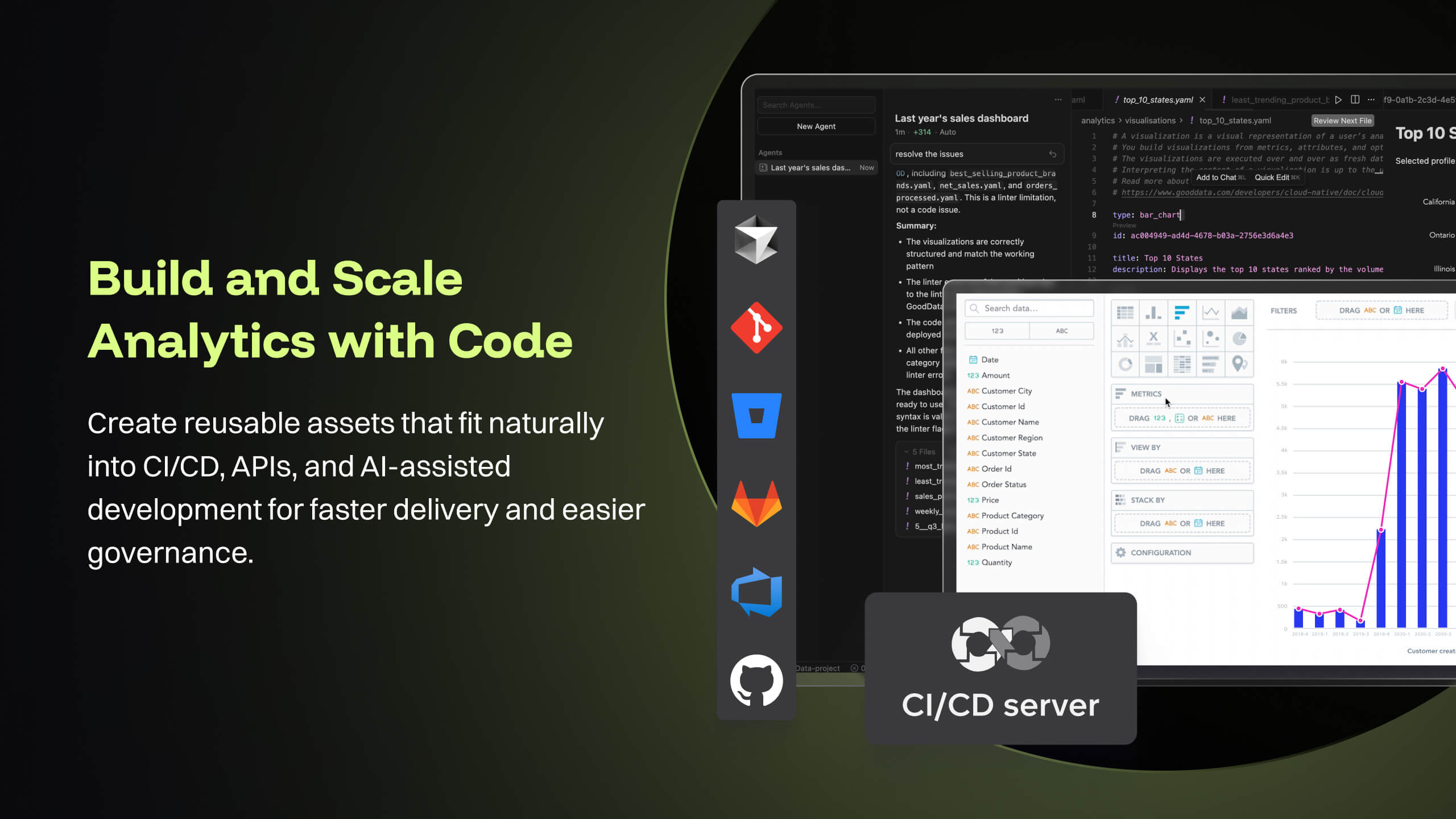
GoodData's latest product i.e. Cloud also offers several good features like Analytics as Code which helps software engineering teams follow a code-first approach to analytics, where building insights, dashboards or even datasets can be done in YAML templates or serviced by REST APIs. This is particularly forward thinking in the modern technology stack and evolving industry requirements. These provide seamless integration options to front-end and backend code, embedded analytics with multiple choices from HTML to React based workloads. At [...], we are currently exploring most of these features while planning for a future migration from Platform to Cloud.
A de minimis incentive was given to thank the reviewer for their time. The incentive was not used to bias or drive a particular response, nor was the incentive contingent on a positive endorsement. More Info
I (and many others) have had to expand Gephi's memory manually by experimenting with the configuration file. I'm glad it's possible, but it should be easier.
Gephi sometimes crashes inexplicably and loses your work, so I have developed a habit of explicitly exporting versions of my graphs as csv's, but I think this should be handled automatically in Gephi.
Because it is prone to crash, ideally, Gephi would help the user manage his/her use, by estimating processing and memory for very large tasks and prompting the user to confirm their requests before executing. Instead, I just tend to avoid certain functions.
Good Data is already have certain customizable options. However, having more flexibility in customizing reports and dashboards & control over the visual aspects would enhance the overall user experience.
To make Good Data even more powerful tool, improving the speed and responsiveness of the tool, especially during data-intensive tasks, would be a significantly helpful.
For new users, the interface can be made more user friendly which would promote easy navigation through features of tool.
A de minimis incentive was given to thank the reviewer for their time. The incentive was not used to bias or drive a particular response, nor was the incentive contingent on a positive endorsement. TR verified that a representative sample of customers was invited. More Info
While Gephi isn't perfect, it's a powerful tool for mathematical graph modelling that's hard to find in other products, particularly by way of its interface. It grants non-software developers access to a point-and-click way of creating accurate, beautiful visualizations that would normally take hours in other applications. The fact that it allows for live streaming data is also something that's hard to come by, at least for visualization software
Because gooddata really helps us in processing data to make reports or dashboards. So we are very satisfied when we use it. What we like is the flexible use of charts. We change at will the use of charts to display in reports or dashboards. Thank you Gooddata for helping companies like us who need flexibility in usage
A de minimis incentive was given to thank the reviewer for their time. The incentive was not used to bias or drive a particular response, nor was the incentive contingent on a positive endorsement. More Info
Gephi is very intuitive and the fact that it shows its process helps the user understand what's going on. However, the animation features can really slow it down and there isn't a way to shut them off. Furthermore, the failures on saving mean you frequently have to start over. These problems disrupt the workflow and can be frustrating.
From a customer perspective it is incredibly usable. We have more users building their own reports that would normally need custom work from our support team. The back end can be daunting when trying to configure things like new data elements or push changes to a report to all existing customers.
A de minimis incentive was given to thank the reviewer for their time. The incentive was not used to bias or drive a particular response, nor was the incentive contingent on a positive endorsement. More Info
A de minimis incentive was given to thank the reviewer for their time. The incentive was not used to bias or drive a particular response, nor was the incentive contingent on a positive endorsement. TR verified that a representative sample of customers was invited. More Info
Support team has been highly responsive and helpful from our first initial deployment to present day. They engage and work with us. know when to escalate for more challenging problems. They also follow up. Overall have had a very good experience with support
A de minimis incentive was given to thank the reviewer for their time. The incentive was not used to bias or drive a particular response, nor was the incentive contingent on a positive endorsement. TR verified that a representative sample of customers was invited. More Info
Implementations are hard and we had limited technical resources. We relied too heavily on GD care team. When we found technical gaps, they weren't simple to overcome
A de minimis incentive was given to thank the reviewer for their time. The incentive was not used to bias or drive a particular response, nor was the incentive contingent on a positive endorsement. TR verified that a representative sample of customers was invited. More Info
The interactivity in Gephi and the quality of the output figures are impressive. However, the selling point was the fact that we were able to link Gephi into our pipeline using Java's interface. Other products were less customizable and lacking of the sophistication Gephi provided without too much pain during the liking process.
A de minimis incentive was given to thank the reviewer for their time. The incentive was not used to bias or drive a particular response, nor was the incentive contingent on a positive endorsement. More Info
GoodData comparing to other platform is very easy to use, customer support and on-boarding support. Set of features, speed of integration in our platform. Also great benefit for us was very competetive pricing.
A de minimis incentive was given to thank the reviewer for their time. The incentive was not used to bias or drive a particular response, nor was the incentive contingent on a positive endorsement. More Info
A de minimis incentive was given to thank the reviewer for their time. The incentive was not used to bias or drive a particular response, nor was the incentive contingent on a positive endorsement. More Info
I have only used the product for education purposes. I will not be the best person to provide details about ROI and business efficiency and customer service. I was personally very excited about the tool and am continuing my work on the tool.
A de minimis incentive was given to thank the reviewer for their time. The incentive was not used to bias or drive a particular response, nor was the incentive contingent on a positive endorsement. TR verified that a representative sample of customers was invited. More Info