Google Charts provides a way to visualize data on your website - for free. From simple line charts to complex hierarchical tree maps, the chart gallery provides a large number of ready-to-use chart types. The most common way to use Google Charts is with simple JavaScript that you embed in your web page.
N/A
ibi WebFOCUS
Score 7.0 out of 10
N/A
The ibi™ WebFOCUS® product is an enterprise business intelligence and analytics solution equipped with data management, visual discovery, predictive analytics, and visualizations. Combining these capabilities and data science in one unified containerized platform, the WebFOCUS® solution can be used to make data-driven decisions across the enterprise and provide reports, dashboards, and customer-facing applications at scale.
N/A
iCharts
Score 8.0 out of 10
Mid-Size Companies (51-1,000 employees)
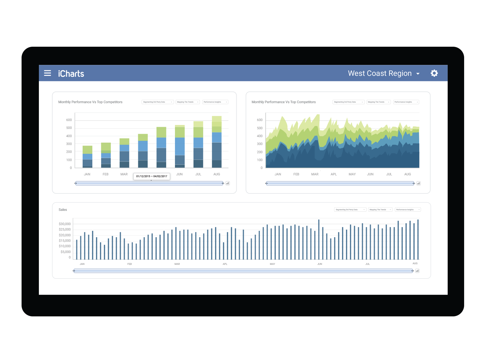
iCharts is a Business Intelligence and Analytics solution for NetSuite. With this solution, users can transform their NetSuite data into interactive, real-time analytics without leaving their NetSuite dashboard. iCharts includes drag-and-drop chart creation and best-practice templates. The vendor’s value proposition is that iCharts accelerates an organization’s analytics strategy by empowering their team with the critical data-driven tools they need.
$10,000
per installation
Pricing
Google Charts
ibi WebFOCUS
iCharts
Editions & Modules
No answers on this topic
No answers on this topic
Professional
$10,000
per installation
Business
15,000
per installation
Elite
$25,000
per installation
Offerings
Pricing Offerings
Google Charts
ibi WebFOCUS
iCharts
Free Trial
No
No
Yes
Free/Freemium Version
Yes
No
No
Premium Consulting/Integration Services
No
No
Yes
Entry-level Setup Fee
No setup fee
No setup fee
$3,000 per installation
Additional Details
—
—
Based on number of NetSuite licenses
More Pricing Information
Community Pulse
Google Charts
ibi WebFOCUS
iCharts
Considered Multiple Products
Google Charts
Verified User
Administrator
Chose Google Charts
I have not used many other software similar to Google Charts because a lot of the software I have used in the past has integrated reporting available to the customer. However, for instances where our software reporting is not accurate, we are able to use this online source to …
We can easily recommend Google Charts to any company that needs a way to visually represent their data. Another great thing about Google Charts is that it is free to use and does not require any membership fees. Although it requires a skilled used to be able to use the charts, the results are great and can be beneficial to any company who is looking to make better decisions.
I would less recommend it because it looks like IBI is receding a bit from the European market. I would not be certain for future support. Knowledge in the market in western Europe is limited Functional wise the application suits almost all situations. I would for sure recommend it purely based on its capabilities
The iCharts has suited our organization work as it has helped us a lot in our internal and external works. As we use iCharts for the internal team in representing the working reports and data of the business in an accurate manner. It helps in representing the presentation to the client to showcase our work and present him the data and work flow through the iCharts. As I don't found anything missing in this software.
they're free with Google suite and they have backing in terms of powerful Google apps which can be plugged in to perform multiple actions like using Google sheets to import raw data into Google Charts
they're the most simple app to use when it comes to creating charts and visual dashboards
ease of customization
ease of using custom APIs from developers side to help make any types of charts and dashboards you want
One thing that has always been good at WebFOCUS is how they interact with the customer on items. They take suggestions and implement them. In addition technical support is timely and very detailed.
I think they keep up with and lead in implementing new technologies in the BI space. One case of this are the ability for user to create their own easy dashboard using the green plus buttons. Also the ability to link d3 into and have the ability to implement new types of graphs is nice.
I have been to a spoke at one of their user conferences and they are worth going to. In addition to all of the great seminars the interaction you get with vendors and other users is key in the growth of your knowledge. I've learned so much for my time at these conferences.
I would like a couple more introductory videos or a live chat option for when you run into an issue. I think this is a Google-wide problem, not only linked to Google Charts.
I have run into some issues with the Dynamic Data but also admittedly could potentially dive in deeper and investigate.
It would be great if Google Charts made it possible to integrate Google Chat into the platform.
The newest versions of WebFOCUS have an unnecessarily complicated security layout that makes configuration difficult to accomplish without bringing in the vendor for installs.
This software tries to cover too many bases allowing you to switch from writing code manually to creating reports using only GUI tools. This sometimes complicates screens and functionality where the two methods don't always work well together. -though its nice to have the choice.
The sales force is not as top notch as many software companies
Google Charts is a good product. It's widely supported with deep documentation and a large community. But for me, it wasn't customizable enough. When we started with simple charts, it was great, but as we got deeper and more complex, our needs outgrew the library. If I was going forward, I would choose a more barebones library with more freedom and extensibility.
This software is deeply engrained with my organization and has become a tool that would not easily be replaced without spending more money and resources to get the same results. License cost is comparable to other report writing tools and the capabilities are greater than the competition without having to buy multiple apps to do the same thing.
Google Charts is about as easy to use as the rest of their applications. The UI is very well thought out, allowing you to add what you need, and customize it to your exact liking. The default theme is actually really nice, which helps as most of the time, customizing is not needed.
Best BI tool/product I have used. The others don't compare overall. Some can look fancier, but when you actually use them with large data and data from numerous systems/sources that is where most of the competition falls away. I also don't like downtime. I have basically none for a large user base with WebFocus. Even SAP Crystal Reports went down for 4 days once - 4 days because the admin password got locked out due to a glitch and we had zero reports for 4 days. WebFocus has never had more than a few minutes of downtime. It's like a tank that just keeps rolling. There is no other choice for reliable BI.
As a free tool with massively powerful, infinitely customisable charts that can be dynamically updated - Google Charts is my favourite data visualisation tool. However, my hatred of JavaScript does jade my view on it. This is the price of the tool though, and I'm glad it's available for me.
They have extremely knowledgeable techs that I have worked with over the years. Some have actually become really good friends of mine. I see them often at local user groups and when we show them how we are using their tools to save millions of dollars throughout the company
Plan ahead on what data will be accessible and the type of security required on the database and if you will want to use security that is built into the software. It is worth consulting with the vendor on what your plan is and how they recommend you proceed in order to get results you are happy with.
Google Charts stacks up better since it is free and does not have the constant pressure for cost overruns, add-ons, annual maintenance and implementation services. The speed of using Google Charts is quick, saving users potentially weeks in getting up and going. For the readers of websites with limited resources, the application shows up nicely is look and feel with charts. Great way of showing data visually.
Webfocus handles the side of our business that is involved with our catalogs. Our catalogs is a huge revenue driver for us and this tool has been extremely useful with planning feature catalogs. Tableau is used more for marketing and merchandising purchases since we can filter data based on website sales.
We are not yet a success story. Though we've been implementing WebFOCUS for over a year, we have very few products in our Production portal. Of course, this is not all the responsibility of Information Builders, but we were ill-advised by our 'training coordinator' in our training of staff and coming up to speed with the tools has been very slow.
Once skilled analysts and professional IT staff achieve a grasp of the products, they are able to very quickly create polished and well-received products.
The DW/BI project has helped us to establish standards and protocols of communication that will allow us to more quickly meet knowledge transfer requirements