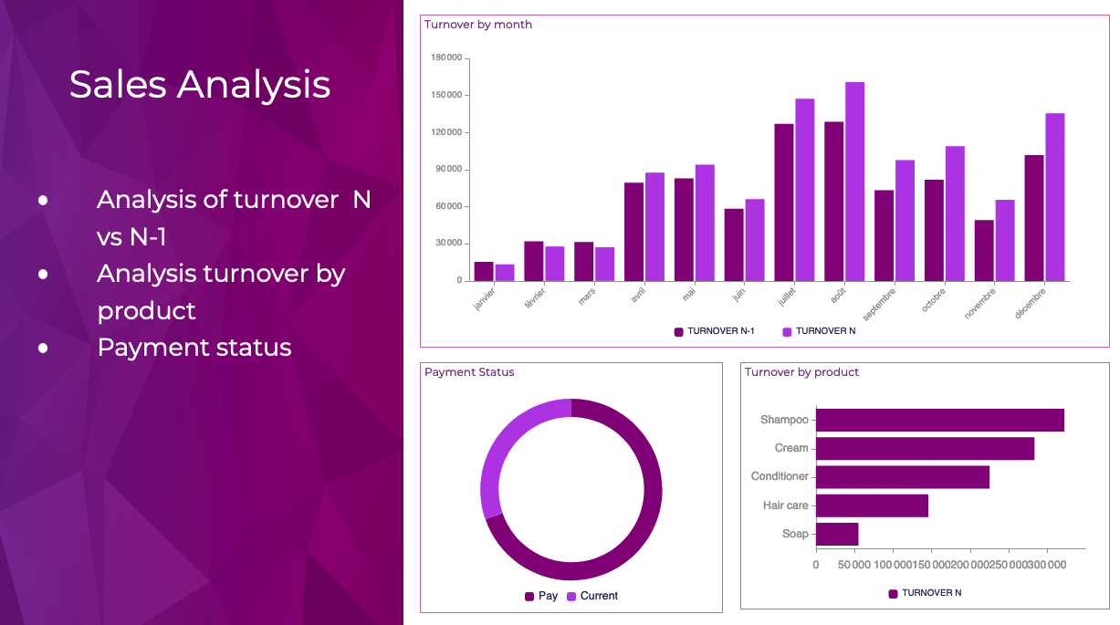
Created in 2019, Powerslide is a data storytelling and data visualization solution. This software helps business users to create usages around data. Powerslide is a solution for data analysis, visualization and presentation. Interactive and collaborative, Powerslide aims to answer data issues in a simple, practical and design interface, and help users simplify the analysis and communication of…
N/A
Cyfe
Score 4.0 out of 10
N/A
Cyfe is all-in-one dashboard software for analyzing data from online services like Google Analytics, Salesforce, AdSense, MailChimp, Amazon, Facebook, etc, from Traject.
$29
per month
Pricing
Powerslide
Cyfe, by Traject
Editions & Modules
No answers on this topic
Starter
$29
per month
Standard
$39
per month
Pro
$65
per month
Premier
$119
per month
Offerings
Pricing Offerings
Powerslide
Cyfe
Free Trial
Yes
Yes
Free/Freemium Version
No
No
Premium Consulting/Integration Services
No
No
Entry-level Setup Fee
Optional
No setup fee
Additional Details
Our rates are flexible and adapt to the size and use of your organization. Contact us and let’s discuss about it.
—
More Pricing Information
Community Pulse
Powerslide
Cyfe, by Traject
Considered Both Products
Powerslide
Verified User
Anonymous
Chose Powerslide
Powerslide stands out for having templates that help you easily organize hard data and more delicate information such as numbers and statistics. By having many ways to present and edit it in one place, it makes this a page with variety and empathy with its user.
Klipfolio probably had a lot of cool features, but it was SO user-UNfriendly that we never got to use them. We had high enough turnover in our company that people always needed Klipfolio training, and it was rarely completed to the satisfaction of trainees or trainers. It was …
These other reporting tools are much better for an agency that is under the scrutiny of cleaner reports with more in-depth analytics and specific KPI's. However, you can use both and provide a Cyfe board as a live additional to the weekly static reporting that many agencies …
Sprout has better reporting for social analytics but doesn't cover as many activities across a company and the reports are only for social...not even web analytics. It's also way more expensive. We're actually evaluating whether or not Cyfe will continue to be our tool of …
My company already subscribed to Cyfe when I began, so for me there wasn't any shopping around. While Cyfe does pull straight from the "back end" side of many social media platforms, or from Google Analytics for websites, the benefit is that you can see all the stats in one …
We used RavenTools in the past as our monthly reporting tool. At the time there wasn't a one-page dashboard available in RavenTools, every single element we incorporate in our reports was included on a separate page. It became very unwieldy for our clients and led to a lot of …
Compared to other tools like Jasper Reports, Cyfe has ZERO impact on the server since it is a totally hosted solution, plus it has several connectors that allow for interacting with no coding at all. It gives the user total freedom on which language to use to provide custom …
We were using different tools to do pieces of what Cyfe does. I was never keen on the idea of spending $150, $200, or even $500+ for an analytics tool so we were pulling analytics directly from each source and creating our own reports. It was a beast of a project to manage and …
Remember that Cyfe is not a true Business Intelligence tool it is a data visualization tool. It is great because it let's you change the time series. It will not let you drill down on the data. You cannot map different data sets together. It is a great tool to pull basic data …
The price was a big selling point but more importantly the third-party integrations that are offered were the deciding factor. Offering support for services that we use regularly like Google Analytics, Apple's iTunes Connect, Facebook, etc., allow us to get real time access to …
Verified User
Anonymous
Chose Cyfe
I investigated a number of options for a digital dashboard, to be honest Cyfe was so much cheaper than the alternatives I was a bit sceptical, but it was so much better once I had mastered adding data sources.
Verified User
Anonymous
Chose Cyfe
The Salesforce dashboard is comparably flexible and intuitive, but designed more to its internal CRM focus. SumAll shares the social media dashboard capabilities, but lacks all others. Its interesting feature is side-by-side graph analysis for cross-channel performance. Cyfe …
Domo was vastly overpriced compared Cyfe and it was far less friendly to use and get used to. I was able to jump right in with Cyfe and get the data I wanted setup right away. When I had a question I was able to get an immediate response directly from Deven without hesitation. …
Features
Powerslide
Cyfe, by Traject
BI Standard Reporting
Comparison of BI Standard Reporting features of Product A and Product B
Powerslide
8.8
Ratings
9% above category average
Cyfe, by Traject
6.6
Ratings
21% below category average
Pixel Perfect reports
8.50 Ratings
6.80 Ratings
Customizable dashboards
9.00 Ratings
4.00 Ratings
Report Formatting Templates
9.00 Ratings
9.10 Ratings
Ad-hoc Reporting
Comparison of Ad-hoc Reporting features of Product A and Product B
Powerslide
9.5
Ratings
19% above category average
Cyfe, by Traject
7.2
Ratings
11% below category average
Drill-down analysis
9.50 Ratings
8.70 Ratings
Report sharing and collaboration
9.50 Ratings
2.00 Ratings
Formatting capabilities
00 Ratings
8.10 Ratings
Integration with R or other statistical packages
00 Ratings
10.00 Ratings
Report Output and Scheduling
Comparison of Report Output and Scheduling features of Product A and Product B
Powerslide
9.2
Ratings
12% above category average
Cyfe, by Traject
5.0
Ratings
48% below category average
Publish to Web
9.00 Ratings
4.00 Ratings
Publish to PDF
9.50 Ratings
4.00 Ratings
Report Versioning
9.00 Ratings
6.80 Ratings
Report Delivery Scheduling
00 Ratings
1.00 Ratings
Delivery to Remote Servers
00 Ratings
9.00 Ratings
Data Discovery and Visualization
Comparison of Data Discovery and Visualization features of Product A and Product B
Cyfe might be for you if you are looking for a cost-effective way to display all of your marketing metrics in one place. If you are looking for a detailed, fine-tuned, niche, or extremely specific metrics, this might not be the best solution. Cyfe is good for a general health check-up of marketing, but not a finely tuned examination.
Cyfe makes it easy to create a professional looking dashboards in a short amount of time. With so many built-in data sources and the intuitive nature of the interface, you can have beautiful looking charts and graphs in no time!
One of the best features of Cyfe is the many data sources built-in and that each dashboard is not constrained to one source. One of the drawbacks I've seen in other tools is the limited ability to pull from multiple Google Analytics profiles, multiple AdWords accounts or from both AdWords and Bing in one dashboard. Cyfe has no such limitation.
Google Spreadsheets - if the data you need to show is not available via an API, being able to pull from Google spreadsheets is a great solution. Once set up, you can add data whenever you need to the spreadsheet and your widgets in the Cyfe dashboard are automatically updated. Huge time saver!
Sometimes the percentages in Cyfe seem off. We'll review the numbers month over month in Google Analytics and the same numbers are pulled into Cyfe, and yet Cyfe reports a different percentage
It would be nice if Cyfe had more styling and layout choices to brand it more to our company's style and look
It has become a part of our internal tools so unless a competitor comes out with similar functionality as a similar price point it is unlikely that we would not renew. One area that would cause us not to renew would be if a competing service came out with more third-party integrations that match our needs. Price at this point is no longer an issue as it would allow us to automate a somewhat manual process that we have now connecting Cyfe widgets to Google Sheets.
I gave it a rating of 7 because it does a good job at what it does, but there are missing that are missing which I would have benefited from. For instance, if I was able to drill down more on the specific metrics I was able to see, that would have been helpful.
Because I had a very minor question and I was able to speak directly to the founder through LinkedIn and through email. I know that as they grow this may not always be an option but the fact that he made himself available to answer my questions said a lot about his passion for the product.
Cyfe is a 15 minutes implementation, then some time to get your data sources created. This is an easy one person job that will not result in down time or unnecessary wasted man hours.
Powerslide stands out for having templates that help you easily organize hard data and more delicate information such as numbers and statistics. By having many ways to present and edit it in one place, it makes this a page with variety and empathy with its user.
My company already subscribed to Cyfe when I began, so for me there wasn't any shopping around. While Cyfe does pull straight from the "back end" side of many social media platforms, or from Google Analytics for websites, the benefit is that you can see all the stats in one place rather than having to log in to so many other platforms to grab those metrics.
Our collaborators do not get bored in meetings and even if it is a lot of information, seeing it in an interesting design makes them pay attention and like to be informed of the numbers they manage to obtain with their work.