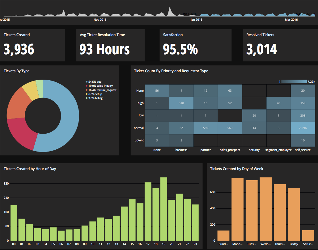
Chartio is a visualization tool designed to enable anyone to explore, transform and visualize data on the fly through a drag-and-drop interface. Chartio was acquired by Atlassian in February 2021 so that it's capabilities could be integrated into the Atlassian product portfolio's capabilities. Chartio is no longer available to new customers, standalone. Existing customers must migrate to alternatives by March 2022, when the service will be retired.
$40
per user/per month
GoodData.AI
Score8.8 out of 10
N/A
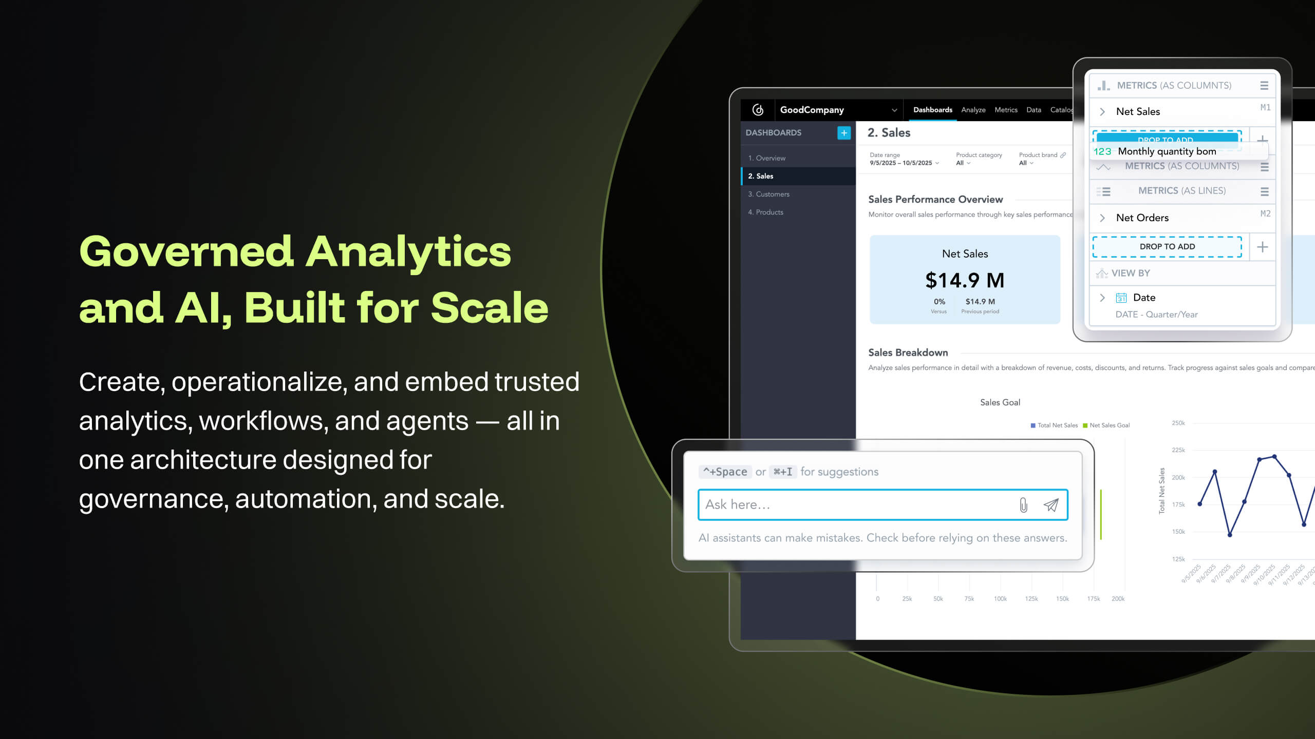
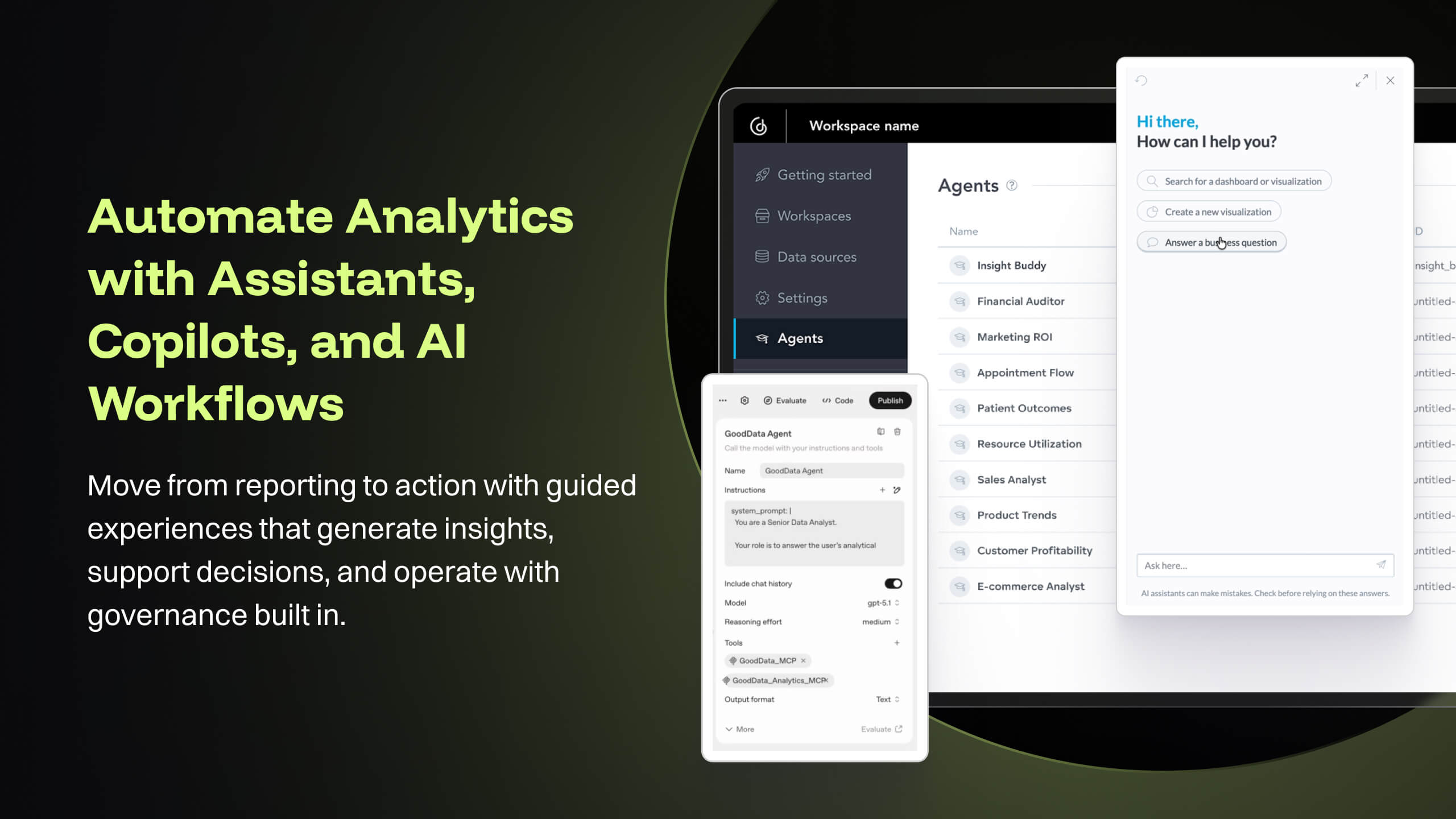
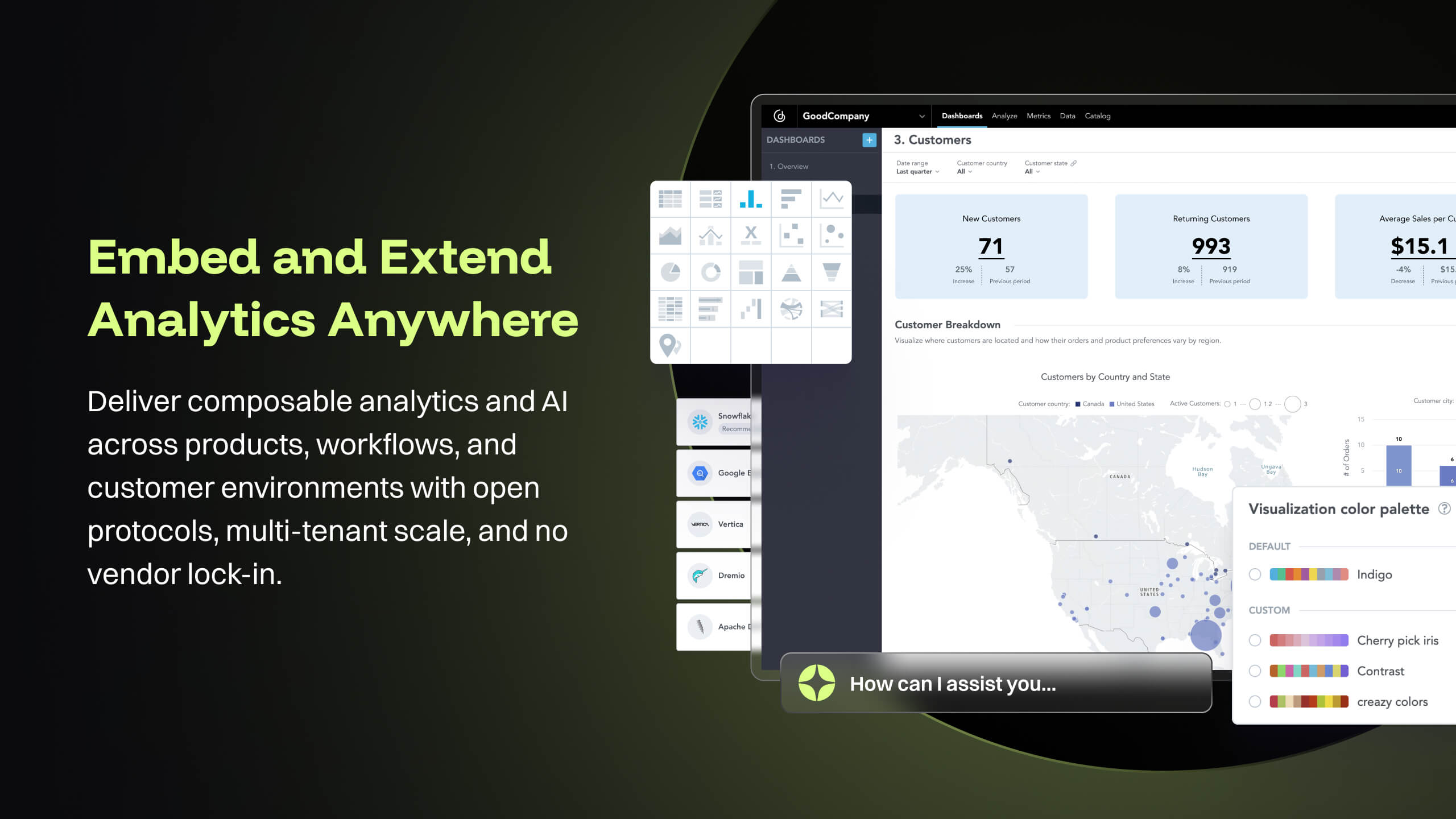
GoodData is an analytics platform used by organizations to deliver real-time, governed insights, embedded into products, customized for users, and integrated into any data environment.
Lead Analyst at Prezi (Internet, 201-500 employees)
Chose Chartio (discontinued)
We used GoodData before Chartio. Our main reason for the change was that GoodData also stored our data and we could not query our own databases. We had to load the data first before creating a new dashboard which made the whole process (and also the maintenance) more difficult. …
A de minimis incentive was given to thank the reviewer for their time. The incentive was not used to bias or drive a particular response, nor was the incentive contingent on a positive endorsement. More Info
Chartio is a great tool for building presentable dashboards. It can export, you can add read-only access, and it has permissions levels by dashboard for users. There are other data analysis tools that help to analyze the data, but few allow for such a nice presentation
I think it works nicely for shops that want the analytical power and are ok to host their own infrastructure for the data and etl. For smaller operations with limited budgets but still high demand for analytical features the math may not work out.
A de minimis incentive was given to thank the reviewer for their time. The incentive was not used to bias or drive a particular response, nor was the incentive contingent on a positive endorsement. More Info
Direct linkage to our databases. Abstracts away the visualization layer so we can focus on the data and the queries.
Host of graphs and tools that permits all types of data visualizations.
Haven't quite used this yet, but there is a new embedding feature that will be very helpful so that we can embed the charts into a company central dash.
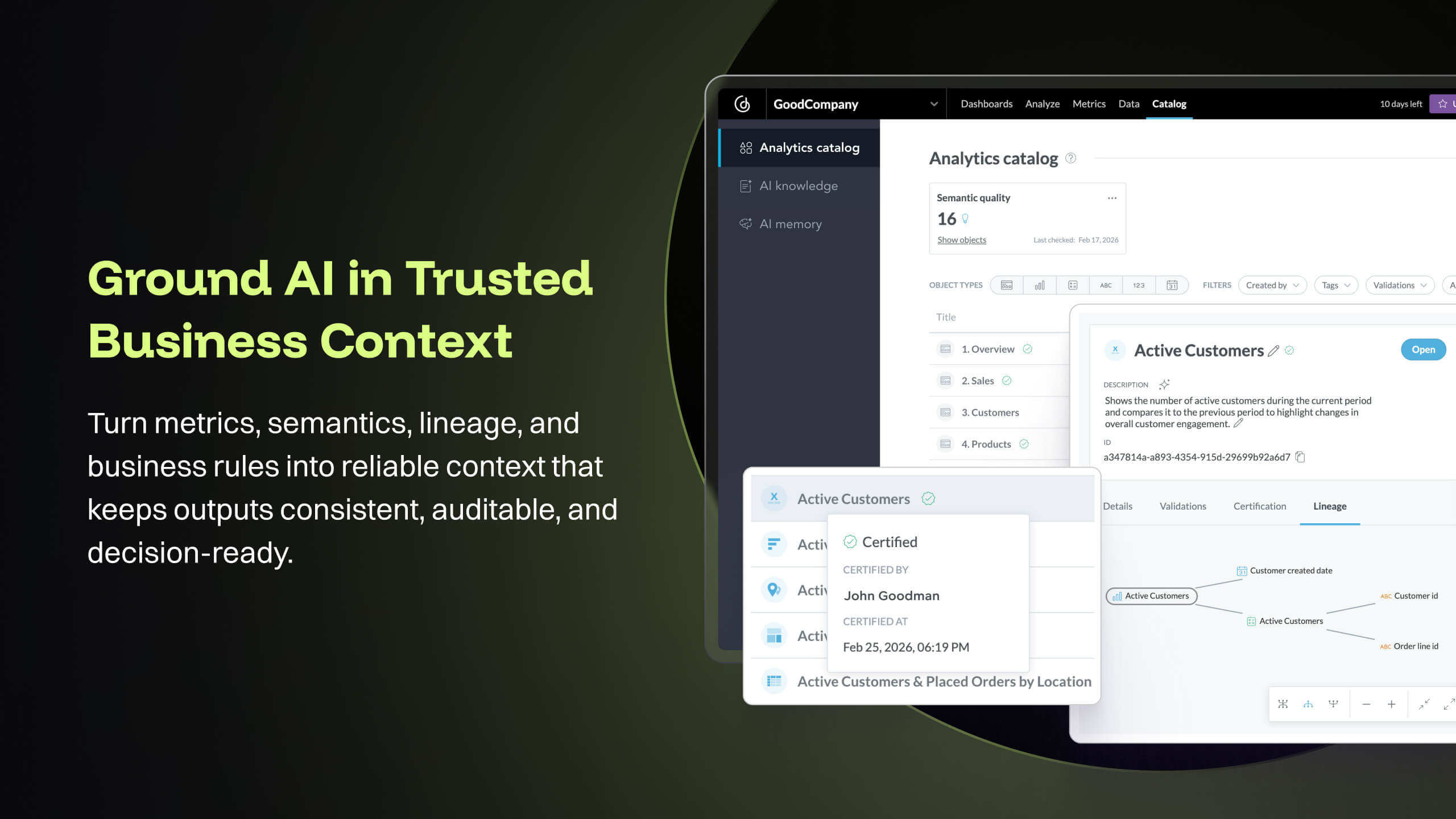
The source datasets are often complex, semi-structured and un-linked to key entities. With GoodData, all of these datasets are unified to serve as a central semantic data model layer, building into a galaxy schema with dimensions, bridge, and facts, which then forms the backbone that powers the [...] data intelligence cloud. Building insights and dashboards become a much easier task once the underlying data model is designed. GoodData enforces certain best practices as a BI tool, which must be adhered to get the true value of the raw data. For e.g. the source FDA dashboard may just show inspection data but the Site Profile dashboard built on GoodData goes beyond the standard information and shows more insight into site risk scores and can be drilled into details. There is blog written on this topic: [...].
GoodData provides a rich collection of visualization options that help us create compelling story-telling via dashboards. Being well-prepared for FDA inspections is essential for maintaining product quality, regulatory compliance, and avoiding serious business setbacks. FDA inspections are critical events that can shape a company’s market access and reputation. The FDA itself offers the FDA Data Dashboard, but it doesn’t make every document available. There is a blog written on this topic: [...].
Medical devices and technologies do not stop evolving after they receive regulatory approval. Once a product hits the market, it faces real-world usage, compliance challenges, and an array of regulatory scrutiny. Managing these postmarket dynamics is critical to a product’s long-term success and patient safety. However, many companies struggle to keep track of relevant events across a product’s markets, from adverse event reports to changing regulations. Postmarket Intelligence developed on GoodData platform enables us to solve that problem. It empowers MedTech companies to efficiently monitor, assess, and act on postmarket data—saving time, improving decision-making, and ensuring compliance with industry standards. Anyone who is used to trying to get the data they need from the various FDA, and other regulatory agency websites, knows that collecting, cleaning, and structuring that data takes hours. And that’s before any analysis can get done. We enable customers to free up time to focus only on the high-value analysis and subsequent recommendations to leadership, rather than wrangling the data.
The data pipeline refresh that is provided by GoodData Platform is also quite useful from data engineering perspective. The Automated Data Distribution v2 or commonly called as ADD refresh follows a set pattern of identifying the analytical data model through output stage which helps abstract the complex table definition to simpler views that can help with quick rebuild at the data warehouse level while loading the data into GoodData's ADS storage layer. The import first way of loading data into GoodData's cloud storage, followed by querying for any aggregations or metrics on the GoodData analyzer, makes this simple and fast.
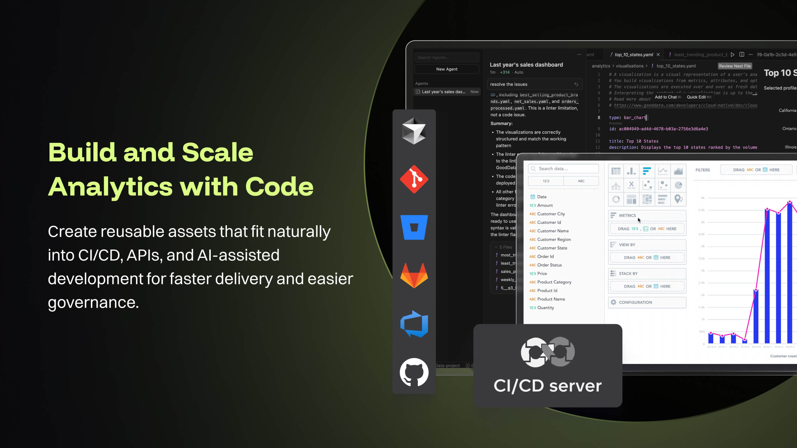
GoodData's latest product i.e. Cloud also offers several good features like Analytics as Code which helps software engineering teams follow a code-first approach to analytics, where building insights, dashboards or even datasets can be done in YAML templates or serviced by REST APIs. This is particularly forward thinking in the modern technology stack and evolving industry requirements. These provide seamless integration options to front-end and backend code, embedded analytics with multiple choices from HTML to React based workloads. At [...], we are currently exploring most of these features while planning for a future migration from Platform to Cloud.
A de minimis incentive was given to thank the reviewer for their time. The incentive was not used to bias or drive a particular response, nor was the incentive contingent on a positive endorsement. More Info
There is not a last full month date range option. You can still get the range that you need, but the dashboards will have to be manually updated to exclusively display one whole month.
When building a chart, the area which displays your tables and fields is finite. You can't adjust the size to make it easier to see. They do allow a mouse-over to see the entire name of your table/field, but I would prefer to adjust the width.
Once you modify a query in the Custom Query tab, there doesn't seem to be a way to go back to using the U.I.
Good Data is already have certain customizable options. However, having more flexibility in customizing reports and dashboards & control over the visual aspects would enhance the overall user experience.
To make Good Data even more powerful tool, improving the speed and responsiveness of the tool, especially during data-intensive tasks, would be a significantly helpful.
For new users, the interface can be made more user friendly which would promote easy navigation through features of tool.
A de minimis incentive was given to thank the reviewer for their time. The incentive was not used to bias or drive a particular response, nor was the incentive contingent on a positive endorsement. TR verified that a representative sample of customers was invited. More Info
Great customer support: You will receive an answer by email usually within 20-30 minutes. Not only that but our CSMs for Chartio go out of their way to help, they have even created charts for some of the less experienced users that wanted an example to work from. We have had nothing but great experiences with this team.
A de minimis incentive was given to thank the reviewer for their time. The incentive was not used to bias or drive a particular response, nor was the incentive contingent on a positive endorsement. More Info
Because gooddata really helps us in processing data to make reports or dashboards. So we are very satisfied when we use it. What we like is the flexible use of charts. We change at will the use of charts to display in reports or dashboards. Thank you Gooddata for helping companies like us who need flexibility in usage
A de minimis incentive was given to thank the reviewer for their time. The incentive was not used to bias or drive a particular response, nor was the incentive contingent on a positive endorsement. More Info
I really like using Chartio. I use it on a daily basis for pulling data from different sources and combining data (the explore tab was a great idea for this use). I think I would give it 8/10 because there needs to be more documentation or maybe blog posts about things people are doing with it. I only have my own ideas about what to do /how to graph things. I know there are some articles, but it would be awesome to have a section on the neat dashboards people are building or how they show data in different ways. Another complaint is how much time it takes to load. I know our databases aren't set up precisely for Chartio and I have been creating data stores. But the data stores have so many more limitations that adds a whole new layer of frustration. Love the product, keep up the good work and the fast fixes.
From a customer perspective it is incredibly usable. We have more users building their own reports that would normally need custom work from our support team. The back end can be daunting when trying to configure things like new data elements or push changes to a report to all existing customers.
A de minimis incentive was given to thank the reviewer for their time. The incentive was not used to bias or drive a particular response, nor was the incentive contingent on a positive endorsement. More Info
A de minimis incentive was given to thank the reviewer for their time. The incentive was not used to bias or drive a particular response, nor was the incentive contingent on a positive endorsement. TR verified that a representative sample of customers was invited. More Info
Support team has been highly responsive and helpful from our first initial deployment to present day. They engage and work with us. know when to escalate for more challenging problems. They also follow up. Overall have had a very good experience with support
A de minimis incentive was given to thank the reviewer for their time. The incentive was not used to bias or drive a particular response, nor was the incentive contingent on a positive endorsement. TR verified that a representative sample of customers was invited. More Info
I use self learning materials. Pretty helpful. I find myself having to go back to the "drilldown" instructions though, and have a hard time finding hidden variables on a dashboard, so perhaps there is room for intuitive improvements (or maybe I'm just being lazy)
Implementations are hard and we had limited technical resources. We relied too heavily on GD care team. When we found technical gaps, they weren't simple to overcome
A de minimis incentive was given to thank the reviewer for their time. The incentive was not used to bias or drive a particular response, nor was the incentive contingent on a positive endorsement. TR verified that a representative sample of customers was invited. More Info
Chartio so far has been the easiest BI tool to setup and has also been the most affordable. There are some other, great, BI tools out there but they were a bit to heavy handed for what we needed. Also - despite the high cost per user in Chartio, the other tools were still more expensive.
A de minimis incentive was given to thank the reviewer for their time. The incentive was not used to bias or drive a particular response, nor was the incentive contingent on a positive endorsement. More Info
GoodData comparing to other platform is very easy to use, customer support and on-boarding support. Set of features, speed of integration in our platform. Also great benefit for us was very competetive pricing.
A de minimis incentive was given to thank the reviewer for their time. The incentive was not used to bias or drive a particular response, nor was the incentive contingent on a positive endorsement. More Info
Chartio has worked well as our datawarehouse has rapidly expanded, and the usability/performance hasn't seemed to have suffered. What we haven't yet realized is additional savings from additional users. We have some dashboard needs for users who truly just view of a few charts, and the licensing structure hasn't yet been structured in a way that would support that type of approach...having 50 "core" licenses, and then potentially several hundred view only licenses for partners that would use the application infrequently.
A de minimis incentive was given to thank the reviewer for their time. The incentive was not used to bias or drive a particular response, nor was the incentive contingent on a positive endorsement. More Info
A de minimis incentive was given to thank the reviewer for their time. The incentive was not used to bias or drive a particular response, nor was the incentive contingent on a positive endorsement. TR verified that a representative sample of customers was invited. More Info