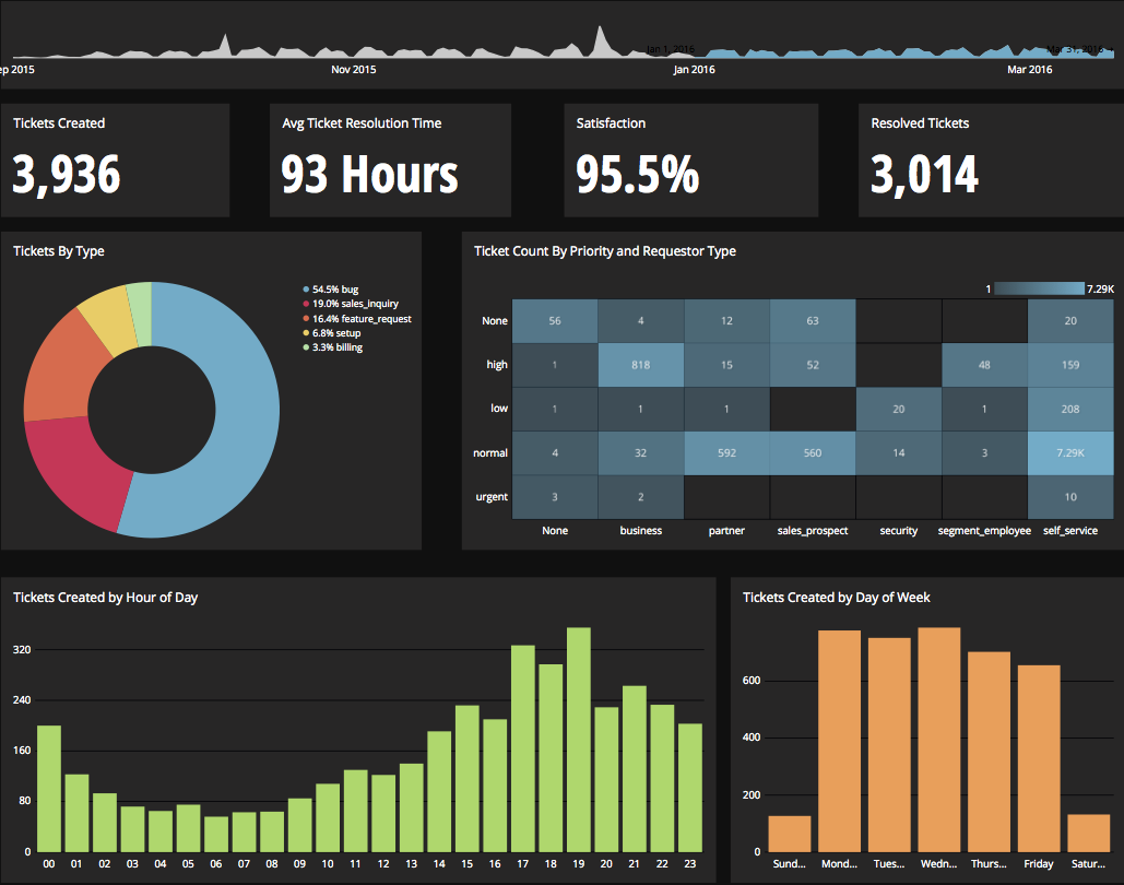
Chartio is a visualization tool designed to enable anyone to explore, transform and visualize data on the fly through a drag-and-drop interface. Chartio was acquired by Atlassian in February 2021 so that it's capabilities could be integrated into the Atlassian product portfolio's capabilities. Chartio is no longer available to new customers, standalone. Existing customers must migrate to alternatives by March 2022, when the service will be retired.
$40
per user/per month
Looker
Score 8.3 out of 10
N/A
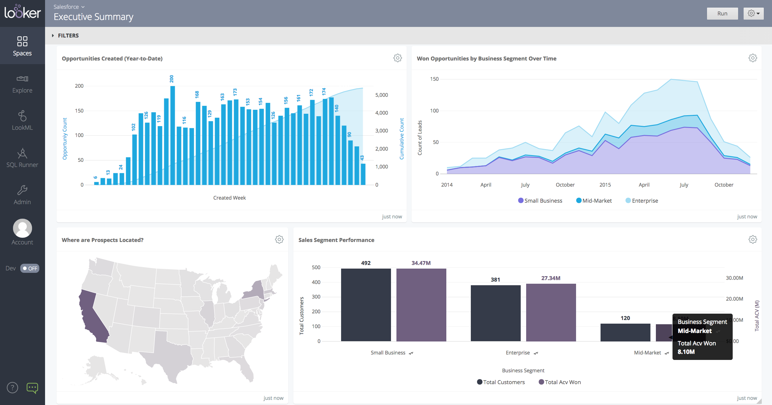
Looker is a BI application with an analytics-oriented application server that sits on top of relational data stores. It includes an end-user interface for exploring data, a reusable development paradigm for data discovery, and an API for supporting data in other systems.
N/A
Pricing
Chartio (discontinued)
Looker
Editions & Modules
Starter
$40
per user/per month
Professional
$60
per user/per month
Organization
Contact sales team
No answers on this topic
Offerings
Pricing Offerings
Chartio (discontinued)
Looker
Free Trial
Yes
Yes
Free/Freemium Version
No
No
Premium Consulting/Integration Services
Yes
Yes
Entry-level Setup Fee
No setup fee
Required
Additional Details
—
Must contact sales team for pricing.
More Pricing Information
Community Pulse
Chartio (discontinued)
Looker
Considered Both Products
Chartio (discontinued)
Verified User
C-Level Executive
Chose Chartio (discontinued)
Chartio so far has been the easiest BI tool to setup and has also been the most affordable. There are some other, great, BI tools out there but they were a bit to heavy handed for what we needed. Also - despite the high cost per user in Chartio, the other tools were still more …
Initially, we selected chartio because it was the easiest to connect to data and get going making visualizations. Ultimately, we moved away from Chartio because we needed a tool that would work as a buffer between our data structure and the visualizations. But majority of BI …
Mode & Chartio require user to write SQL. Looker – Looker has very powerful data modeling layer – LookML that allows data engineers to abstract end users away from the complexity of underlying data (and SQL). End users can perform analysis by selecting dimensions, measures, …
Tableau- Not web based which makes it more difficult to use and share templates etc. Seems more dated. ChartIO - Looker's LookML layer that predefined joins was appealing to us vs a tool like ChartIO which requires more raw SQL comprehension.
Chartio is a great tool for building presentable dashboards. It can export, you can add read-only access, and it has permissions levels by dashboard for users. There are other data analysis tools that help to analyze the data, but few allow for such a nice presentation
When data drives potential for new orders, Looker earns its place in our tech stack. If, on the other hand, we are hoping for pipeline generation, Looker is useful if you are willing to repeatedly go check customer utilizations .... it is not appropriate if you are hoping to automate data analysis for this purpose.
Direct linkage to our databases. Abstracts away the visualization layer so we can focus on the data and the queries.
Host of graphs and tools that permits all types of data visualizations.
Haven't quite used this yet, but there is a new embedding feature that will be very helpful so that we can embed the charts into a company central dash.
Show visited pages - sessions, pageviews - which programs are viewed the most.
Displays session source/medium views to see where users are coming from.
It shows the video titles, URLs, and event counts so we can monitor the performance of our videos.
It gives a graphic face to the numbers, such as using bar charts, pie graphs, and other charts to show user trends or which channels are driving engagement.
Our clients like to see the top pages visited for a month.
I like the drop-and-drag approach, and building charts is a little easier than it was before.
There is not a last full month date range option. You can still get the range that you need, but the dashboards will have to be manually updated to exclusively display one whole month.
When building a chart, the area which displays your tables and fields is finite. You can't adjust the size to make it easier to see. They do allow a mouse-over to see the entire name of your table/field, but I would prefer to adjust the width.
Once you modify a query in the Custom Query tab, there doesn't seem to be a way to go back to using the U.I.
Great customer support: You will receive an answer by email usually within 20-30 minutes. Not only that but our CSMs for Chartio go out of their way to help, they have even created charts for some of the less experienced users that wanted an example to work from. We have had nothing but great experiences with this team.
I give it this rating because it deems as effective, I am able to complete majority of my tasks using this app. It is very helpful when analyzing the data provided and shown in the app and it's just overall a great app for Operational use, despite the small hiccups it has (live data).
I really like using Chartio. I use it on a daily basis for pulling data from different sources and combining data (the explore tab was a great idea for this use). I think I would give it 8/10 because there needs to be more documentation or maybe blog posts about things people are doing with it. I only have my own ideas about what to do /how to graph things. I know there are some articles, but it would be awesome to have a section on the neat dashboards people are building or how they show data in different ways. Another complaint is how much time it takes to load. I know our databases aren't set up precisely for Chartio and I have been creating data stores. But the data stores have so many more limitations that adds a whole new layer of frustration. Love the product, keep up the good work and the fast fixes.
Looker is relatively easy to use, even as it is set up. The customers for the front-end only have issues with the initial setup for looker ml creations. Other "looks" are relatively easy to set up, depending on the ETL and the data which is coming into Looker on a regular basis.
Somehow resources heavy, both on server and client. I recommned at least 50Mbs data rate and high performance desktop comouter to be abke to run comolex tasks and configure larger amount of data. On the other hand, the client does not need to worry when viewing, the performance is usually ok
Never had to work with support for issues. Any questions we had, they would respond promptly and clearly. The one-time setup was easy, by reading documentation. If the feature is not supported, they will add a feature request. In this case, LDAP support was requested over OKTA. They are looking into it.
I use self learning materials. Pretty helpful. I find myself having to go back to the "drilldown" instructions though, and have a hard time finding hidden variables on a dashboard, so perhaps there is room for intuitive improvements (or maybe I'm just being lazy)
Chartio so far has been the easiest BI tool to setup and has also been the most affordable. There are some other, great, BI tools out there but they were a bit to heavy handed for what we needed. Also - despite the high cost per user in Chartio, the other tools were still more expensive.
Looker Studio, you can easily report on data from various sources without programming. Looker Studio is available at no charge for creators and report viewers. Enterprise customers who upgrade to Looker Studio Pro will receive support and expanded administrative features, including team content management. So it's good.
Chartio has worked well as our datawarehouse has rapidly expanded, and the usability/performance hasn't seemed to have suffered. What we haven't yet realized is additional savings from additional users. We have some dashboard needs for users who truly just view of a few charts, and the licensing structure hasn't yet been structured in a way that would support that type of approach...having 50 "core" licenses, and then potentially several hundred view only licenses for partners that would use the application infrequently.
Looker has a poignant impact on our business's ROI objectives. As an advertising exchange we have specific goals for daily requests and fill, and having premade Looks to monitor this is an integral piece of our operational capability
To facilitate an efficient monthly billing cycle in our organization, Looker is essential to track estimated revenue and impression delivery by publisher. Without the Looks we have set up, we would spend considerably more time and effort segmenting revenue by vertical.
Looker's unique value proposition is making analytical tools more digestible to people without conventional analytical experience. Other competing tools like Tableau require considerably more training and context to successfully use, and the ability to easily plot different visualizations is one of its greatest selling points.