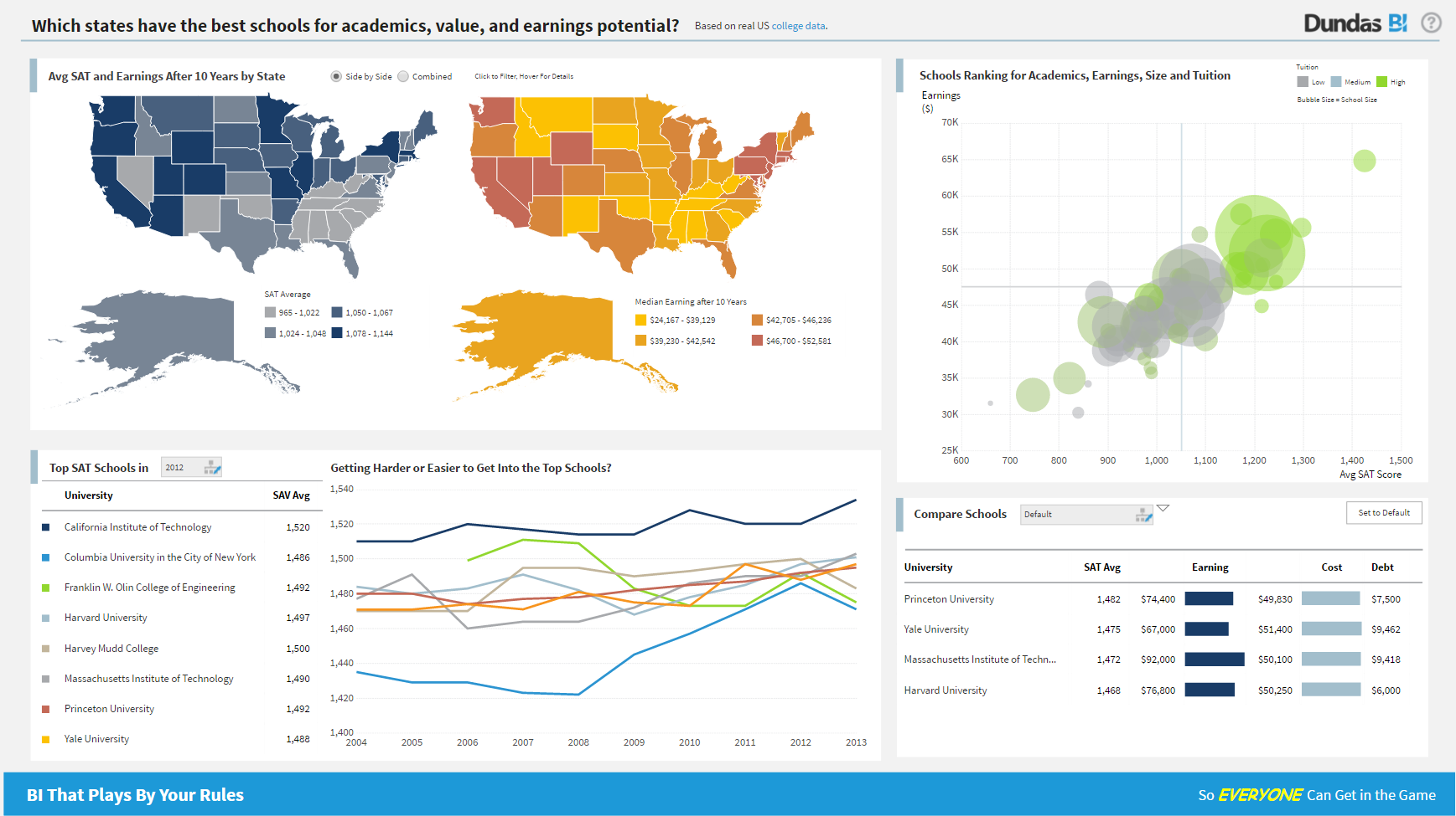
Logi Symphony is a business intelligence and data visualization software that includes customizable dashboards, reporting, and visual data analytics. It can be integrated into users’ existing business applications and its visualization and reporting tools can be customized.
N/A
Cyfe
Score 4.0 out of 10
N/A
Cyfe is all-in-one dashboard software for analyzing data from online services like Google Analytics, Salesforce, AdSense, MailChimp, Amazon, Facebook, etc, from Traject.
$29
per month
Pricing
Logi Symphony
Cyfe, by Traject
Editions & Modules
No answers on this topic
Starter
$29
per month
Standard
$39
per month
Pro
$65
per month
Premier
$119
per month
Offerings
Pricing Offerings
Logi Symphony
Cyfe
Free Trial
Yes
Yes
Free/Freemium Version
No
No
Premium Consulting/Integration Services
Yes
No
Entry-level Setup Fee
No setup fee
No setup fee
Additional Details
—
—
More Pricing Information
Community Pulse
Logi Symphony
Cyfe, by Traject
Features
Logi Symphony
Cyfe, by Traject
BI Standard Reporting
Comparison of BI Standard Reporting features of Product A and Product B
Logi Symphony
8.4
51 Ratings
3% above category average
Cyfe, by Traject
6.6
28 Ratings
21% below category average
Pixel Perfect reports
8.443 Ratings
6.817 Ratings
Customizable dashboards
8.651 Ratings
4.028 Ratings
Report Formatting Templates
8.139 Ratings
9.120 Ratings
Ad-hoc Reporting
Comparison of Ad-hoc Reporting features of Product A and Product B
Logi Symphony
8.1
51 Ratings
1% above category average
Cyfe, by Traject
7.2
26 Ratings
11% below category average
Drill-down analysis
7.951 Ratings
8.715 Ratings
Formatting capabilities
8.250 Ratings
8.120 Ratings
Integration with R or other statistical packages
7.633 Ratings
10.09 Ratings
Report sharing and collaboration
8.645 Ratings
2.026 Ratings
Report Output and Scheduling
Comparison of Report Output and Scheduling features of Product A and Product B
Logi Symphony
7.9
49 Ratings
4% below category average
Cyfe, by Traject
5.0
23 Ratings
49% below category average
Publish to Web
8.442 Ratings
4.015 Ratings
Publish to PDF
7.845 Ratings
4.021 Ratings
Report Versioning
7.838 Ratings
6.89 Ratings
Report Delivery Scheduling
8.337 Ratings
1.017 Ratings
Delivery to Remote Servers
7.23 Ratings
9.04 Ratings
Data Discovery and Visualization
Comparison of Data Discovery and Visualization features of Product A and Product B
For all the scenarios I have so far worked on or I am currently working on, Dundas BI has proved to be more than adequate and apt to handle all of those. It is a very easy-to-use tool with quick shortcuts enabling you to prepare ad-hoc reports or dashboards in a matter of minutes.
Cyfe might be for you if you are looking for a cost-effective way to display all of your marketing metrics in one place. If you are looking for a detailed, fine-tuned, niche, or extremely specific metrics, this might not be the best solution. Cyfe is good for a general health check-up of marketing, but not a finely tuned examination.
Project organization from Development to Production, you get a production and development license but I think the best way to do it is with DEV and Prod project in the Production box. Use the development box for testing updates and really crazy things. With the Dev and Prod projects on the same box, you just publish from Dev to Prod and you are done. Users only have access to the Prod projects so no one can mess up what you are working on.
Security - If you have a hierarchy (subsidiaries, divisions, department, teams) and you want each group to see only their data, then Security hierarchies are for you!
Dependent filters! What's this you ask? Here is an example of how it can be used, in your company you have departments and who works for what department is in your database. You make a dashboard that has a department filter (only show these departments), a managers filter, and employee filter. Not every manager or employee is in multiple departments usually only one. With dependent filters you can say that the manager and employee filter are dependent on what is selected in the departments filter so when you go to filter them they only show the managers or employees that are part of that department, and you can even it do so employees are not only dependent on department but on manager as well. Then it gets even better as it can be done in reverse as well so when you select a manager then go to the department it only shows the departments he works for (there are better situations where this is more useful).
It is scriptable! From calculate columns, null replacements, button actions, load actions, hover over events there a way to do what you want.
They are constantly improving and listens to your suggestions.
Not too many cons for how we use the application. It really is easy and powerful. Very powerful.
Licensing is one thing that could be looked into. It is simple, but a little confusing. For example, if I get a license today, but a new release comes out tomorrow, it seems that the license doesn't work with the new release. Maybe that is by design, but it would be nice to clearly understand.
I'd love to see additional functionality to customize colors. The light/dark option is very nice, but a little more flexibility in the colors would go a long way, especially if it was possible at the dashboard level rather than just the account level. Along the same lines, being able to customize the charts a little more, for example being able to show an x-axis on single data type graphs, could make them easier to read in some cases.
Being able to choose to report on converted clicks or conversions in AdWords would be helpful.
Needs the ability to show the date range on the shared URL dashboards. Would be even better if the date range was adjustable on that view, too.
It has become a part of our internal tools so unless a competitor comes out with similar functionality as a similar price point it is unlikely that we would not renew. One area that would cause us not to renew would be if a competing service came out with more third-party integrations that match our needs. Price at this point is no longer an issue as it would allow us to automate a somewhat manual process that we have now connecting Cyfe widgets to Google Sheets.
We are still in the implementation phase, but so far we are finding it to be easy to use and learn. The eLearning courses that they have made available for free, as well as User Forums and other training videos have made even difficult concepts easier to understand.
I gave it a rating of 7 because it does a good job at what it does, but there are missing that are missing which I would have benefited from. For instance, if I was able to drill down more on the specific metrics I was able to see, that would have been helpful.
We have bi-weekly calls with our Success Manager, as well as access to support as needed. Any question that I have had, multiple people have been willing and able to jump on a call to talk me through it, or send an email with the solution
Because I had a very minor question and I was able to speak directly to the founder through LinkedIn and through email. I know that as they grow this may not always be an option but the fact that he made himself available to answer my questions said a lot about his passion for the product.
Cyfe is a 15 minutes implementation, then some time to get your data sources created. This is an easy one person job that will not result in down time or unnecessary wasted man hours.
Per dollar spent, it offers the widest range of features of the tools that we evaluated. It offers lots of options for how to configure your environment, though they are not always intuitive to figure out. Having an ETL layer was a must have for us, as well as the ability to host to secure HIPAA compliance. It is not a replacement for ad hoc reporting, but does a great job of creating parameterized reports and dashboards that look great.
The Salesforce dashboard is comparably flexible and intuitive, but designed more to its internal CRM focus. SumAll shares the social media dashboard capabilities, but lacks all others. Its interesting feature is side-by-side graph analysis for cross-channel performance. Cyfe might borrow from SumAll's default weekly email summary of performance from the dashboard, but implementation could be too complex. Nuvi dashboard is exclusively for social media marketing, but lacks Cyfe's flexibility for third party integration and window customization settings.