Chose Logi Symphony
The feature set is richer, and price is reasonable. We felt we were paying more for Tableau's name than their features, as updates are slow.
| Product | Rating | Most Used By | Product Summary | Starting Price |
|---|---|---|---|---|
 Logi Symphony | N/A | Logi Symphony is a business intelligence and data visualization software that includes customizable dashboards, reporting, and visual data analytics. It can be integrated into users’ existing business applications and its visualization and reporting tools can be customized. | N/A | |
 Cyfe | N/A | Cyfe is all-in-one dashboard software for analyzing data from online services like Google Analytics, Salesforce, AdSense, MailChimp, Amazon, Facebook, etc, from Traject. | $29 per month |
| Logi Symphony | Cyfe, by Traject | |||||||||||||||
|---|---|---|---|---|---|---|---|---|---|---|---|---|---|---|---|---|
| Editions & Modules | No answers on this topic |
| ||||||||||||||
| Offerings |
| |||||||||||||||
| Entry-level Setup Fee | No setup fee | No setup fee | ||||||||||||||
| Additional Details | — | — | ||||||||||||||
| More Pricing Information | ||||||||||||||||
| Logi Symphony | Cyfe, by Traject | |
|---|---|---|
| Considered Both Products | Logi Symphony  Ole Christian Valstad Senior Data Scientist and BI Expert Chose Logi Symphony We choose Dundas mainly because: - Dashboard flexibility - Data preparation features  George Robbins Integration/Analytics Consultant Chose Logi Symphony Per dollar spent, it offers the widest range of features of the tools that we evaluated. It offers lots of options for how to configure your environment, though they are not always intuitive to figure out. Having an ETL layer was a must have for us, as well as the ability to …  Alexandru Giurgiu Junior Developer Chose Logi Symphony Much better for multi-tenancy. Power bi just doesn't have many features and is just lackluster. telerik doesn't look as good although slightly more powerful with data manipulation. Too many BI reporting tools out there don't offer multi-tenancy and I have no idea why. It is …  Joseph R. Sweeney Senior Analyst Chose Logi Symphony We were comparing Dundas BI against several other programs and eventually decided to go with Oracle as we were already using a host of their other products. Dundas was just as robust, we were just using more Oracle products and they all fit together very smoothly.  Saurav Gupta Team Lead (BI India) Chose Logi Symphony It is the Powerful bi tool with many features to quickly build up reports, dashboard etc. You can customize everything and it is easy to use.  Shivam Shukla BI Developer Chose Logi Symphony It is easy to develop and re-visualize the reports and the license is too less expensive compared to other tools which are overpriced.  Shachar Hallas Front End BI Team Leader Chose Logi Symphony I have used dozens of BI tools, a ew for many years like IBM Cognos and other for several months POCs like microstrategy, Panorama, Tableau etc... For our industry and our daily use Dundas BI wins since it is very flexible and can bring us the greater value we can achieve from a …  Marc Ham Consultant Chose Logi Symphony Dundas has a newer feel to the software and gives us more flexibility than the other products.  Joe Gelata Vice President of Business Operations Chose Logi Symphony Dundas and Sisense are very similar. Both are very powerful and flexible with an eye toward further innovation. I expect both will do well as we enter a major transition period for BI. Periscope Data and Dundas differ substantially and seem to have different paths forward. …  Mark Josephson Senior Business Analyst Chose Logi Symphony Dundas BI offers a high level of visual customization in the dashboards if required (through CSS, JavaScript, HTML) as well data customization (C#) in the data cubes. We are an organization that believes in doing as much as possible for ourselves and not replying on …  Andy Carita Manager - Business Intelligence & Data Architecture Chose Logi Symphony We were a user of Dundas Dashboard previously. We had explored other tools, but we ended up upgrading to Dundas BI because of the HTML 5 compliance (no more Silverlight requirement), ease of use and time to market. The other tools could do the job, but they were not as flexible …  Mohammad Khalili Professional Services Manager Chose Logi Symphony I selected Dundas BI to be our preferred partner since we saw that it the most flexible tool that allows our customers to design their dashboards in they way that they are not restricted in their development process.  Gavin Steinberg Managing Director Chose Logi Symphony It is much more powerful to build more interactive and feature rich dashboards. Most of the above are great at ad hoc analysis but not for providing a full feature and rich guided dashboard experience. Dundas BI is great to build a suite of dashboards and easy to deploy … |  Cyfe  Javier Velazquez Head of Marketing | Co Founder Chose Cyfe These other reporting tools are much better for an agency that is under the scrutiny of cleaner reports with more in-depth analytics and specific KPI's. However, you can use both and provide a Cyfe board as a live additional to the weekly static reporting that many agencies …  Mitchell Terpstra Writer/Strategist Chose Cyfe My company already subscribed to Cyfe when I began, so for me there wasn't any shopping around. While Cyfe does pull straight from the "back end" side of many social media platforms, or from Google Analytics for websites, the benefit is that you can see all the stats in one …  Tobias Walter COO & CFO Chose Cyfe Cyfe is cheaper than Geckoboard; and I believe (??) has more integrations you can pull data from. I liked Geckoboard a tad better visually.  Zach Zook Account Manager Chose Cyfe I did not look into alternatives. That was my superior's job.  Sharon A. Dawson, DTM Marketing Manager Chose Cyfe We used RavenTools in the past as our monthly reporting tool. At the time there wasn't a one-page dashboard available in RavenTools, every single element we incorporate in our reports was included on a separate page. It became very unwieldy for our clients and led to a lot of … Chose Cyfe Compared to other tools like Jasper Reports, Cyfe has ZERO impact on the server since it is a totally hosted solution, plus it has several connectors that allow for interacting with no coding at all. It gives the user total freedom on which language to use to provide custom … Chose Cyfe We were using different tools to do pieces of what Cyfe does. I was never keen on the idea of spending $150, $200, or even $500+ for an analytics tool so we were pulling analytics directly from each source and creating our own reports. It was a beast of a project to manage and …  David J. Mumford Director of Business Insights & Research Chose Cyfe Cyfe more than holds its own vs the competition. The capabilities are strong - especially for the price.  Rob Maxwell Graphic Designer / Marketing Director Chose Cyfe Hootsuite is good for tracking online activity. Cyfe has the same capabilities and more.  Jamie Lin Founder and CEO Chose Cyfe Remember that Cyfe is not a true Business Intelligence tool it is a data visualization tool. It is great because it let's you change the time series. It will not let you drill down on the data. You cannot map different data sets together. It is a great tool to pull basic data …  Julian Castañeda Director Chose Cyfe It´s very cheap and easy to use.  Brent Wildman Director of Marketing Chose Cyfe Cyfe really shines by pulling in only the relevant data you want to see while being logged in to multiple accounts.  Tony Huidor Vice President, Digital Operations Chose Cyfe The price was a big selling point but more importantly the third-party integrations that are offered were the deciding factor. Offering support for services that we use regularly like Google Analytics, Apple's iTunes Connect, Facebook, etc., allow us to get real time access to …  John Dykstra Owner Chose Cyfe Cyfe's pricing model makes it affordable for a small company like mine.  Jeff Wysocki Digital Content Marketing Specialist Chose Cyfe Have not tried other products.  Shane Hayes CIO (Chief Information Officer) Chose Cyfe Domo was vastly overpriced compared Cyfe and it was far less friendly to use and get used to. I was able to jump right in with Cyfe and get the data I wanted setup right away. When I had a question I was able to get an immediate response directly from Deven without hesitation. … |
| Logi Symphony | Cyfe, by Traject | |||||||||||||||||||||
|---|---|---|---|---|---|---|---|---|---|---|---|---|---|---|---|---|---|---|---|---|---|---|
| BI Standard Reporting |
| |||||||||||||||||||||
| Ad-hoc Reporting |
| |||||||||||||||||||||
| Report Output and Scheduling |
| |||||||||||||||||||||
| Data Discovery and Visualization |
| |||||||||||||||||||||
| Access Control and Security |
| |||||||||||||||||||||
| Mobile Capabilities |
| |||||||||||||||||||||
| Application Program Interfaces (APIs) / Embedding |
|
| Logi Symphony | Cyfe, by Traject | |
|---|---|---|
| Small Businesses |  Yellowfin Score 8.6 out of 10 | Yellowfin Score 8.6 out of 10 |
| Medium-sized Companies |  Reveal Score 10.0 out of 10 | Reveal Score 10.0 out of 10 |
| Enterprises |  Kyvos Semantic Layer Score 9.5 out of 10 | Kyvos Semantic Layer Score 9.5 out of 10 |
| All Alternatives | View all alternatives | View all alternatives |
| Logi Symphony | Cyfe, by Traject | |
|---|---|---|
| Likelihood to Recommend | 8.3 (0 ratings) | 8.0 (0 ratings) |
| Likelihood to Renew | 7.0 (0 ratings) | 9.4 (0 ratings) |
| Usability | 8.0 (0 ratings) | 7.0 (0 ratings) |
| Support Rating | 8.8 (0 ratings) | 10.0 (0 ratings) |
| Implementation Rating | 7.3 (0 ratings) | 10.0 (0 ratings) |
| Logi Symphony | Cyfe, by Traject | |
|---|---|---|
| Likelihood to Recommend |
George Robbins Integration/Analytics Consultant |
|
| Pros |
 James Davis System Architect |
 Kim Towne Digital Analytics Manager | Risk Management Coordinator |
| Cons |
 Ric Ravier Cloud Advisor |
Sharon A. Dawson, DTM Marketing Manager |
| Likelihood to Renew | No answers on this topic |
Tony Huidor Vice President, Digital Operations |
| Usability |
|
|
| Support Rating |
|
Shane Hayes CIO (Chief Information Officer) |
| Implementation Rating |
 Luis Silva BI developer and consultant |
Shane Hayes CIO (Chief Information Officer) |
| Alternatives Considered |
|
Mitchell Terpstra Writer/Strategist |
| Return on Investment |
|
Shane Hayes CIO (Chief Information Officer) |
| ScreenShots | Logi Symphony Screenshots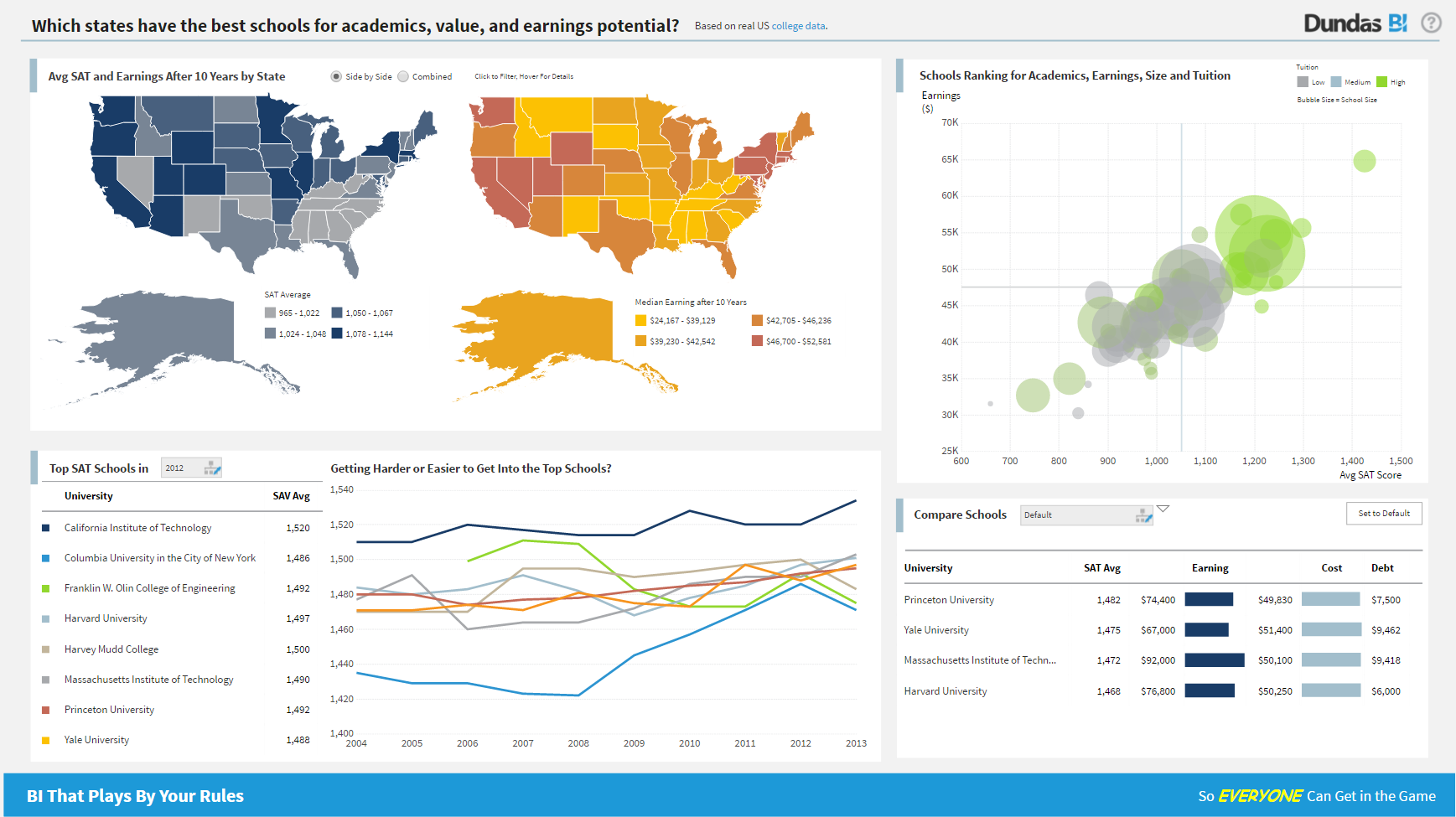 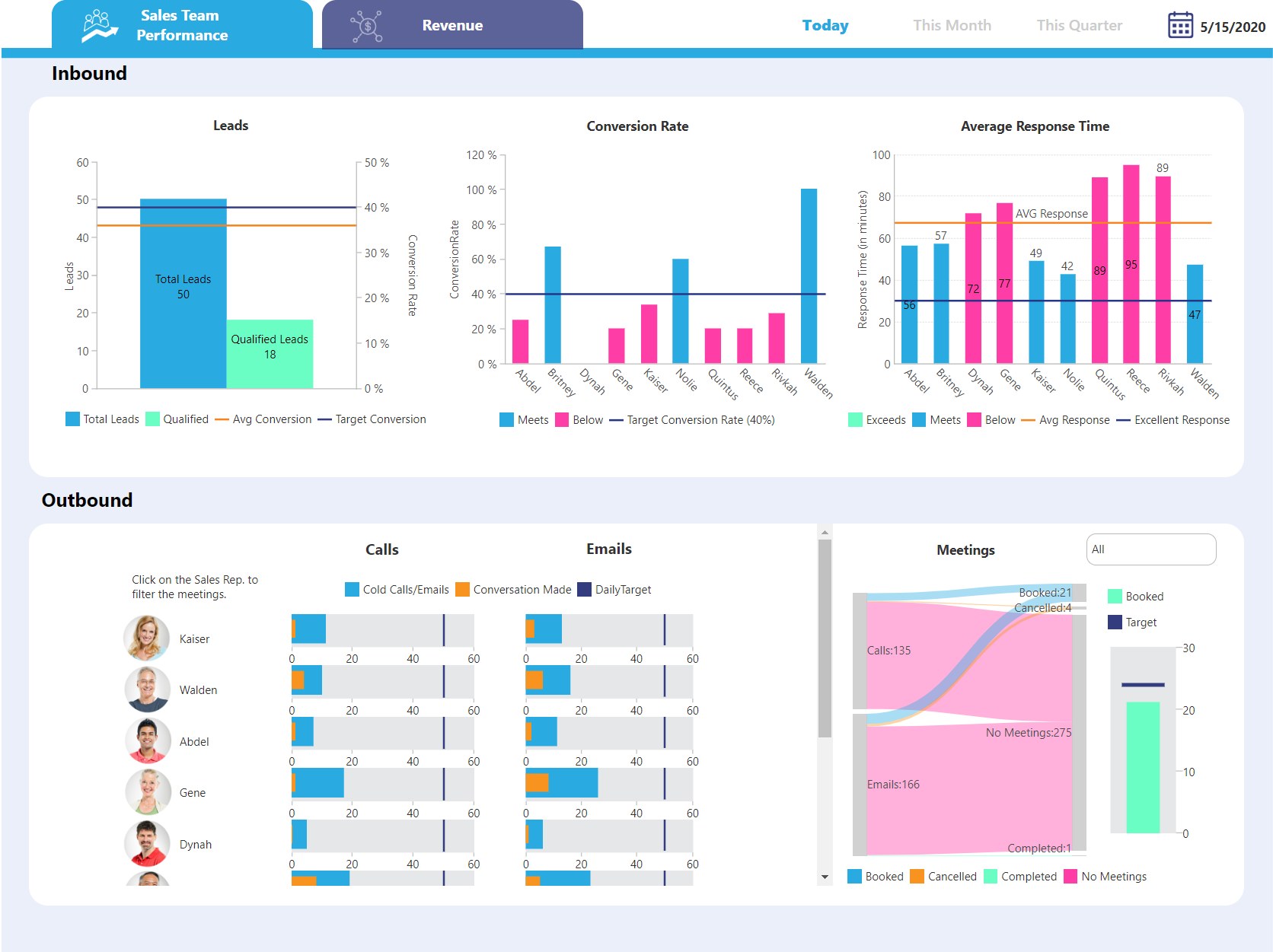  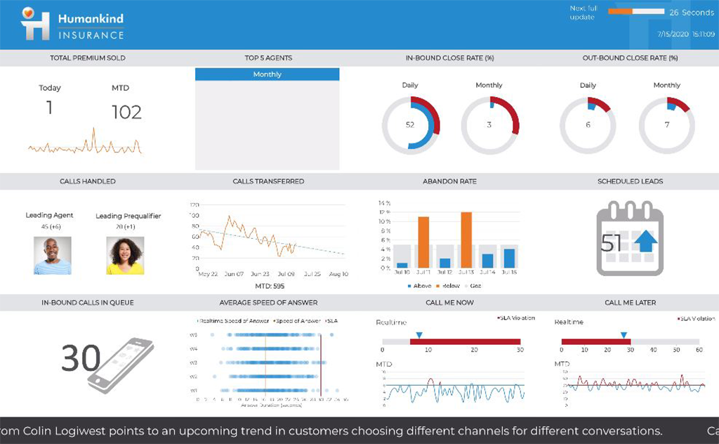   |

