Panorama Necto is a business intelligence solution that provides enterprises with new ways to collaborate and create unique contextual connections. Some key features include: Workboards/Dashboards, Advanced Analytics, and Contextual Discovery.
N/A
Cyfe
Score 4.0 out of 10
N/A
Cyfe is all-in-one dashboard software for analyzing data from online services like Google Analytics, Salesforce, AdSense, MailChimp, Amazon, Facebook, etc, from Traject.
$29
per month
Pricing
Panorama Necto
Cyfe, by Traject
Editions & Modules
No answers on this topic
Starter
$29
per month
Standard
$39
per month
Pro
$65
per month
Premier
$119
per month
Offerings
Pricing Offerings
Panorama Necto
Cyfe
Free Trial
Yes
Yes
Free/Freemium Version
No
No
Premium Consulting/Integration Services
Yes
No
Entry-level Setup Fee
No setup fee
No setup fee
Additional Details
—
—
More Pricing Information
Community Pulse
Panorama Necto
Cyfe, by Traject
Features
Panorama Necto
Cyfe, by Traject
BI Standard Reporting
Comparison of BI Standard Reporting features of Product A and Product B
Panorama Necto
7.3
24 Ratings
11% below category average
Cyfe, by Traject
6.6
28 Ratings
21% below category average
Pixel Perfect reports
6.022 Ratings
6.817 Ratings
Customizable dashboards
8.024 Ratings
4.028 Ratings
Report Formatting Templates
8.024 Ratings
9.120 Ratings
Ad-hoc Reporting
Comparison of Ad-hoc Reporting features of Product A and Product B
Panorama Necto
8.0
24 Ratings
0% below category average
Cyfe, by Traject
7.2
26 Ratings
11% below category average
Drill-down analysis
9.023 Ratings
8.715 Ratings
Formatting capabilities
7.024 Ratings
8.120 Ratings
Integration with R or other statistical packages
8.017 Ratings
10.09 Ratings
Report sharing and collaboration
8.022 Ratings
2.026 Ratings
Report Output and Scheduling
Comparison of Report Output and Scheduling features of Product A and Product B
Panorama Necto
7.2
22 Ratings
13% below category average
Cyfe, by Traject
5.0
23 Ratings
49% below category average
Publish to Web
7.821 Ratings
4.015 Ratings
Publish to PDF
6.722 Ratings
4.021 Ratings
Report Versioning
7.116 Ratings
6.89 Ratings
Report Delivery Scheduling
7.021 Ratings
1.017 Ratings
Delivery to Remote Servers
00 Ratings
9.04 Ratings
Data Discovery and Visualization
Comparison of Data Discovery and Visualization features of Product A and Product B
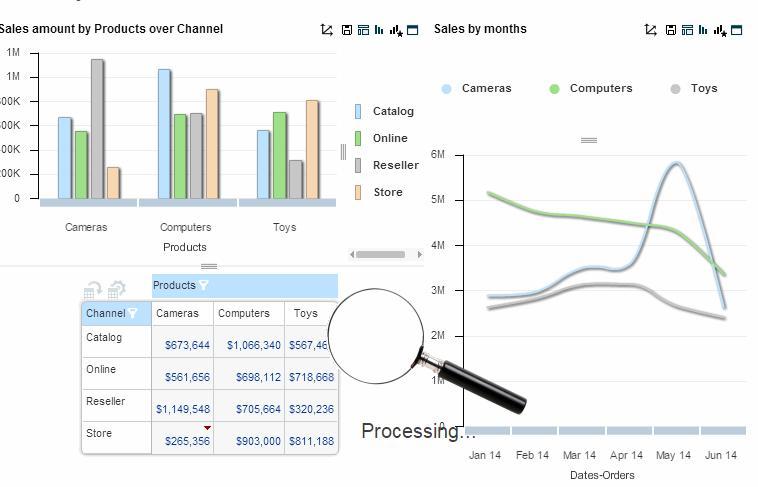
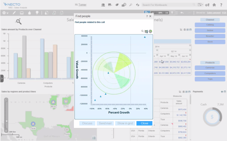
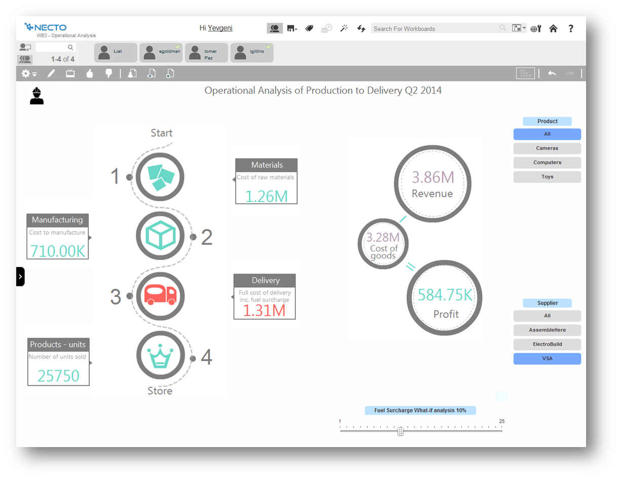
Panorama Necto 14 is well suited where BI is built to support social collaboration so that its analytics features can be shared to improve decision making by incorporating various organizational input. Additionally it supports an infographic display for information review which is unlike most of its competitors.
Cyfe might be for you if you are looking for a cost-effective way to display all of your marketing metrics in one place. If you are looking for a detailed, fine-tuned, niche, or extremely specific metrics, this might not be the best solution. Cyfe is good for a general health check-up of marketing, but not a finely tuned examination.
Comes with lot of option to modify and build the smart infographic. Uses innovative pictures and charts to create the dashboards
Helps you identify why you are succeeding and where you should shift your focus to.
The maps are amazing and they just don’t act as control points rather you can populate various measures on them making it really efficient to understand the business in geographical info graph
This tool is relatively new to the current competitive BI market. Many organizations or business analyst are not yet aware of it's eye catching features.
Need more enhancement for predictive analysis.
Publishing reports as email attachment and mail server configuration is a little complicated process.
I'd love to see additional functionality to customize colors. The light/dark option is very nice, but a little more flexibility in the colors would go a long way, especially if it was possible at the dashboard level rather than just the account level. Along the same lines, being able to customize the charts a little more, for example being able to show an x-axis on single data type graphs, could make them easier to read in some cases.
Being able to choose to report on converted clicks or conversions in AdWords would be helpful.
Needs the ability to show the date range on the shared URL dashboards. Would be even better if the date range was adjustable on that view, too.
Some features are very basic and sometimes you can't add your own SQL query for custom reports. For Macs and Blackberry users this application is not helpful. Non-languages are not supported in info-graphics. They need to improve their forecast analysis. Report sharing is limited among the portal users only
It has become a part of our internal tools so unless a competitor comes out with similar functionality as a similar price point it is unlikely that we would not renew. One area that would cause us not to renew would be if a competing service came out with more third-party integrations that match our needs. Price at this point is no longer an issue as it would allow us to automate a somewhat manual process that we have now connecting Cyfe widgets to Google Sheets.
It provides all the features that are required and some that are not the basic requirements, but they represent a great additional capabilities, not available within the similar products
I gave it a rating of 7 because it does a good job at what it does, but there are missing that are missing which I would have benefited from. For instance, if I was able to drill down more on the specific metrics I was able to see, that would have been helpful.
Because I had a very minor question and I was able to speak directly to the founder through LinkedIn and through email. I know that as they grow this may not always be an option but the fact that he made himself available to answer my questions said a lot about his passion for the product.
Cyfe is a 15 minutes implementation, then some time to get your data sources created. This is an easy one person job that will not result in down time or unnecessary wasted man hours.
This is the next generation BI tool, which will be very helpful for small and medium businesses to kick start data exploration and visualization of their diverse databases, with less intervention from IT. This tool is more end user centric and gives way more power to the end user to perform data analysis
The Salesforce dashboard is comparably flexible and intuitive, but designed more to its internal CRM focus. SumAll shares the social media dashboard capabilities, but lacks all others. Its interesting feature is side-by-side graph analysis for cross-channel performance. Cyfe might borrow from SumAll's default weekly email summary of performance from the dashboard, but implementation could be too complex. Nuvi dashboard is exclusively for social media marketing, but lacks Cyfe's flexibility for third party integration and window customization settings.