Domo is a full self-service business intelligence software that combines several data analysis and reporting tools into one platform. It helps users connect to multiple data sources, create robust visual reports, manage their data, send messages in real-time, manage projects, and develop new apps.
N/A
Geckoboard
Score 9.0 out of 10
Mid-Size Companies (51-1,000 employees)
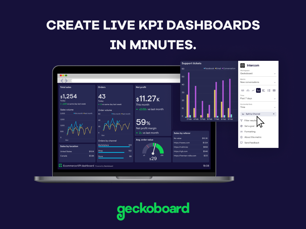
Geckoboard enables users to create real time dashboards using data from over 80 cloud services. It integrates with other products such as: AWeber, Basecamp, Campaign Monitor and HubSpot.
$35
per month
Looker Studio
Score 8.2 out of 10
N/A
Looker Studio is a data visualization platform that transforms data into meaningful presentations and dashboards with customized reporting tools.
Because Domo has high mobile and responsive features, we prefer Domo over the others. Because other products still lack features in terms of features, it slows us down. We hope that Domo continues to innovate continuously to become even better. Thank you Domo for providing many …
Much better than the previous system Tag which was Corvu which ended up being just a shell for Rocket Software. It also brings modern capabilities such as roles and security to the systems that we have, It is also a lot easier than the old one in which we needed to hire a …
Microsoft Excel has the ability to create spreadsheets and charts however it requires very complicated formulas and macros. Domo is a little more user friendly as far learning how to use the program without needing to understand complex formulations. Excel is also very touchy, …
Domo is on the higher side when it comes to price against the competition but it warrants it. It has all the features and capabilities you will need to execute an exceptional BI program across your organization. I'm not sure I'd recommend this if this is your first BI tool just …
Domo customer service is what sets it apart. This is something that we focus on because setup time for tools and downtime often causes issues. Having the support team being so responsive and able to help is a huge bonus.
Domo is a complete end-to-end platform that provides warehouse, ETL, and visualization features as against these other platforms which are mostly visualization platforms. Though other platforms have started providing data cleaning features, they do not provide connectivity to …
Domo is one of the best software out there simply because of the functionality and capability that it has over other software. The only downside with this is that it is a bit more expensive compared to other solutions out there, but this is because of the added functionality.
I wasn't personally involved with the selection of Domo as compared to other solutions. I am aware that the close proximity of the company to us gave them opportunities to be more personal in their presentation. Tableau was probably our second choice. But the customer service …
I have used Tableau, Hyperion, Micro-strategy, Crystal, and SSRS, nothing was as easy to use as Domo. It is also not one-off. I can create a new report based off of an existing dataset in a few minutes, and so can anyone else.
Domo is by far the industry leader. Other tools/platforms have unique strengths, but from an overall perspective, Domo is the most versatile and does an exceptional job in all areas. This is critical when it comes to "scale". A BI project may start with a siloed scope, but as …
I have never used Tableau, but I've spoken with colleagues who have used it. Tableau is good and probably a better experience for the report builder, but I know my executive team is satisfied with it and it does make it easy for them see how the company is performing as a whole.
We switched from Tableau to Domo because we believe Domo is a better tool for self-service business intelligence. After switching to Domo, we saw much stronger adoption from business users compared to Tableau.
We are a Google shop and our Analytics and Reporting team have and use GDS. However, Geckoboard can output some of the same types of data (albeit maybe not as granular) and can be used by a wide swath of our users (including project managers, account execs, developers, etc.). …
I find Geckoboard and Klipfolio to be in parallel in terms of performance and presentation. I will say that Klipfolio pulls slightly ahead as it allows for custom branding (great when sharing data with external stakeholders) and having access/edit control based on roles.
Business Analyst (Business Development/Market Valuation)
Chose Geckoboard
Geckoboard is a great dashboard that offers value and simplicity. It is easy to train and use right away. The other systems are more expensive but offer more details.
Looker Studio is great for free, simple Google-centric dashboards, while Power BI offers strong Microsoft integration, AI, and deep data prep (Power Query/DAX) for corporate users. Tableau excels in advanced visual exploration for complex data, though often much pricier. …
We have evaluated Power BI, Looker Studio, and Tableau for a short period. Looker Studio is easy to deploy and helpful for creating quick reports. However, for better performance, scale, and deeper analysis, we found Power BI.
A huge amount of backend data that you don't have access to via social media performance tracking platforms themselves. Opens the door to a better understanding of onward journeys from digital channels, and deeper knowledge of user behaviour and audience experience.
Looker Studio is easy to use and provides sufficient capabilities for setting up basic reporting. It's especially good for a marketing environment. We also use other tools for complex reporting, but when it comes to value for money, Looker Studio is one of the best BI tools on …
Very good imo, and really cost-effective. With Salesforce, there is too much stubbornness when importing data from Microsoft suite applications, and Power BI is really expensive for a mid-sized organisation. Hence, I feel Looker Studio is actually worth the investment for …
The main reason why Looker Studio was selected is because it was already integrated into the google ecosystem. But it actually once you start working with it, is really easy to get into. For really complex reports you will have to focus in building a good model in the database …
I liked Tableau, but it is a bit pricey, also there is no option to share the report online unless you add the team members. If your research is not really big and difficult, using Looker Studio is more practical and easy. I think it is very important to estimate how big and …
Looker Studio is far easier to implement, stand up, and learn. The interface is simpler and user-friendly for various levels of data visualization/analysis knowledge and experience. The biggest benefit of Looker Studio, however, is its ease of connection to GA data and speed. …
The free version of Looker Studio is still better than the leading enterprise-embedded BI tools, despite its weaknesses. The leading embedded BI platforms have terrible visualizations that can be spotted a mile away. They are also primarily locked to a grid, making it very hard …
Google Data Studio integrates data into visually appealing reports and can constantly update based on the linked data source (i.e., Google Analytics), a feature that neither of the platforms listed can do. However, sometimes Google Data Studio can't generate graphs based on my …
We selected Google Data Studio because it is easier to make connections with third-party data sources. Also Google Data Studio can understand connections between different tables and databases better that its competitors such as Power BI. Compared to Power BI you do not need to …
In comparison to Kibana , its much easier and being free its worth a lot. Apart from that it has flexibility of connecting to more than 300 connectors, which is not there in Kibana. Apart from that no doubt its much better that in terms of visualization of Data, analytics etc.
Data Studio is the
first step in your data visualization journey, as your data gets bigger and
your need for information grows you will have to move to something more powerful,
Google holds it's own against these competitors as they each have their own strengths and weaknesses. While Tableau provides user-interactive reporting, its formatting options can be quickly rigid and frustrating.
Google Data Studio provides a great feature set considering its price point, especially when compared to commercial options from Microsoft and Tableau. While it may not be as versatile when it comes to working with and developing complex datasets, there is enough charm in its …
Google Data Studio is a Google product and many other companies also use Google Suite (as Gmail), so it was easier to share reports to clients using it than Zoho Analytics (which needs a paid account to give access to any other user).
Google Analytics and Google Data studio work well with each other. They don't necessarily stack against each other, Google Data studio just makes interpreting the data more visual and concise. I recommend both and not one over the other. Both are free tools provided by Google, …
Google Data Studio is free, easily integrates with the Google Marketing Platform, and is simple to use. It's a better choice for most basic marketing reporting. Tableau is better for more BI and exploratory data analysis.
Obviously, Google Data Studio is an improvement over Google Charts, which I believe powers the chart modules used in Data Studio. I think of Data Studio as a convenient way to combine multiple Google Charts in one, easy-to-read report.
We are heavily within the Google ecosystem and therefore didn't really consider alternatives to Google Data Studio since it met our somewhat limited needs at the time of implementation. For outside presentations, we would probably lean towards something that allows us to more …
Domo is great when you want to see lots of values historically or see data you can see natively in a platform. As I mentioned earlier, Domo is the only way our Marketing and Sales teams can see when their emails were opened and compare the send time - this is an example of data I can't see natively.
A beautiful UI, with visuals that interest even those that hate staring at data. It's well suited for small to medium-sized businesses/corporations in which high-level sharing of data between teams is required -- the larger the distance between teams, the better as it's a great tool for level-setting on complex data. It would be less appropriate for small businesses, or those that do not need to summarize complex data to share with those not familiar with the data source
Fantastic for detailed data, especially for tracking user journeys from social media onto the website, for example. Great for use across multiple people in teams, even where only one or two people have a full understanding of the tool, as it is user-friendly once set up. Not hugely appropriate for presenting in and of itself, best as a source of raw data versus a tool to convey findings.
Provides data acquisition, transformation and visualization all administered from one cloud-based tool. No switching between tools or cobbling different products together.
Provides GUI and MySQL interfaces for data manipulation for both entry-level and advanced users.
Huge amount of data connectors out of the box, plus you can easily create your own custom connectors.
When changing cards from one dataset to another any beast modes are not carried over, it would often make life easier if there was an easier way to copy beast mode calculations from one dataset to another.
Domo documentation, university and Dojo are extremely helpful when we run into problems. However, when support beyond that is needed their help desk seems to have a hefty backlog - the amount of time to resolve tickets is frustrating sometimes.
Domo is a great up-and-coming product. There are many fantastic features that are extremely compelling to our end users, which makes Domo a great fit for our organization. As with many BI tools, there are items on the wish list that could make implementation, administration and usage easier, but I believe these will be addressed over time as the product matures and evolves. The overall concept and approach of this solution has definitely raised the bar in this area of expertise and I would like to see things advance in giving the enterprise tools that will make decision making easier and more robust in the future.
It is the simplest and least expensive way for us to automate our reporting at this time. I like the ability to customize literally everything about each report, and the ability to send out reports automatically in emails. The only issue we have been having recently is a technical glitch in the automatic email report. Sadly, there is almost no support for this tool from Google, but is also free, so that is important to take into consideration
A business management platform has to be flexible to provide solutions for customers from any business environment, but that flexibility has to be delivered without requiring complex business process re-engineering and massive data conversion efforts. Domo’s web-based architecture and wealth of connectivity options allow rapid setup for any business. If your marketing company is wrestling with channel return on investment or your educational organization is drowning in data, Domo has the tools and capability to use your data and turn it into something useful for you
With a simple interface and available templates, creating basic dashboards is easy. Obviously depending on the data you want to visualize, there may be higher learning curves. That being said, they have a huge amount of integrations and extensible frameworks. If you are using anything made in the past ten years there is an API function or integration that can get it talking to the platform. As such, it's pretty easy to hit the main data points you want and get it on a cheap display in front of your team.
Looker Studio is easy to use, and it offers a sufficient variety of predefined visualizations to choose from. It's easy for us, and anyone can set up basic reporting without extensive data visualization skills. The interface layout is easy to understand, and it doesn't take long to get used to.
Pretty responsive. It took a while to get a response in selecting data points for our particular cards. Might have taken about a month? I am not sure if this was something on our end or Domo's end. But haven't had any other issues yet that required additional support from Domo.
The support levels vary based on the level of plan that you have but that's to be expected. Virtually everything except the Enterprise plan has basic chat/email support. While they are responsive they are not going to be much assistance in helping you figure out API calls or implementing 3rd party integrations. That is to be expected and the support community can pretty much get you in the right direction if you look.
I give it a lower support rating because it seems like our Dev team hasn't gotten the support they need to set up our database to connect. Seems like we hit a roadblock and the project got put on pause for dev. That sucks for me because it is harder to get the dev team to focus on it if they don't get the help they need to set it up.
It is a true web-based application so implementation is much easier and smoother compared to other non-web based BI solutions. Also, they offered consulting services during the implementation process, which was helpful. Also, they provided lots of on-demand training courses and videos, which I liked.
Domo is by far the industry leader. Other tools/platforms have unique strengths, but from an overall perspective, Domo is the most versatile and does an exceptional job in all areas. This is critical when it comes to "scale". A BI project may start with a siloed scope, but as the project bares fruit, others begin to ask how they can participate/leverage the tool/platform for their own projects - because of this, Domo's versatility is incredibly important
We are a Google shop and our Analytics and Reporting team have and use GDS. However, Geckoboard can output some of the same types of data (albeit maybe not as granular) and can be used by a wide swath of our users (including project managers, account execs, developers, etc.). We can also save and reuse boards for similar products and get our data in front of the eyes that need to see it quickly without a lot of fuss.
Looker Studio is great for free, simple Google-centric dashboards, while Power BI offers strong Microsoft integration, AI, and deep data prep (Power Query/DAX) for corporate users. Tableau excels in advanced visual exploration for complex data, though often much pricier. Fullstory is a different beast, focusing on user experience (UX) session replay for product teams, not traditional BI
Domo has allowed us to see much more clearly what is working for students on our programs, and what is not. This enables us to consolidate success and further develop where there are areas of concern.
The verbatim comments in Domo makes the reports especially attractive to staff, since they are able to engage directly with students' personal opinions and not just with rating scales.
While we originally used this as an internal IS tool, we eventually have expanded it to be used by nearly every department.
Because pricing is monthly, we can grow or decrease our usage based on our current client needs.
Because it is low cost and easy to deploy, we can utilize it in place of considerable resources in analytics and reporting by delivering snapshots of data without pulling reports.